This is a great book for both amateur and professional textile and mixed-media artists. The book reads well, has great quality full-color photos and there are plenty of techniques and ideas that I'll be trying out in my artwork.
THE BOOK'S CORE
The book explores
how to fragment and deconstruct mostly salvaged, recycled and reused cloth,
paper and objects before repairing and reassembling them into a new
artistic whole or series. This is achieved by using different techniques: manipulation, weathering, washing,
soaking, burying, abrasion, staining, burning, scorching, making
holes, fragmenting, reassembling, folding, deconstructing,
reconstructing, repairing, and collage, among others. Working small allows extensive experimentation and exploration before taking on large pieces of projects.The message is:"Do not discard
things that are fragmented or seemingly mundane, as they can provide
inspiration for drawing and mark-making and may be included in finished
work. Looking closely and embracing imperfection can lead to stimulating
and visually exciting work. Allow traditional methods of repair to
inspire and stimulate innovative, contemporary ways to join and
reassemble. Finally, remember that everything can be altered and
adjusted – if something is not working, it can be reworked, and often
the results will be far more dynamic and exciting than the original."
(p. 283)
Shelley Rhodes'
work is strongly influenced by Japanese, Bangladeshi and Korean
textile and paper techniques, concepts and aesthetics as well as by
Western quilting, patchwork and mixed media art.
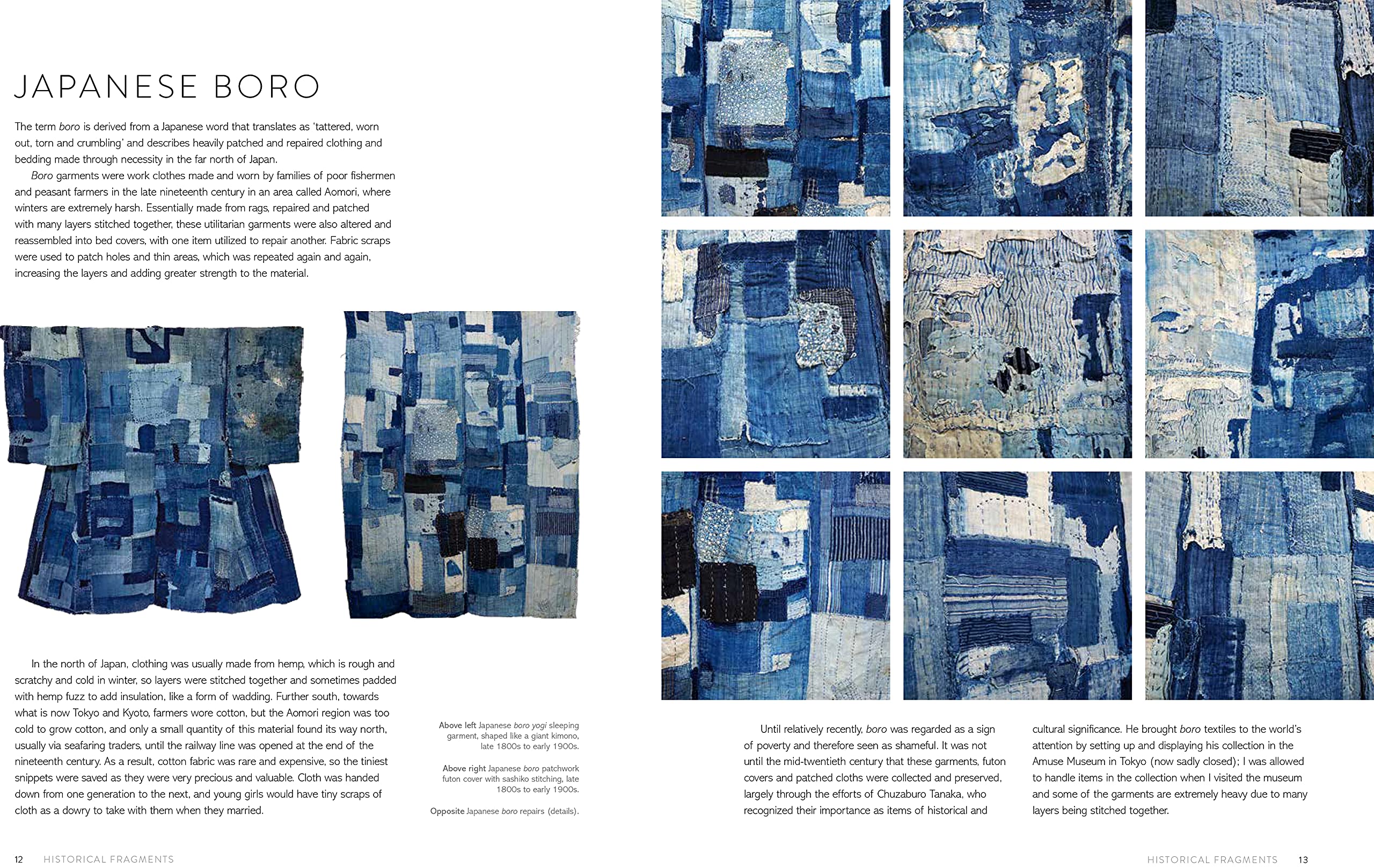
-- Japanese Boro (heavily
patched and repaired clothing and bedding made through necessity in the
far north of Japan and worn by poor fishermen and peasant families in
the late 19th century. They're made from rags, repaired and patched with
many layers stitched together using fabric scraps to patch holes and
thin areas). Sakabukuro sake bags, Wabi-sabi (the aesthetic that finds beauty in imperfection and impermanence), the concept of Mottainai (or using every last scrap of fabric), Momigami (the art of paper kneading, which involves the repeated scrunching, crumpling and unfolding of paper) and Washi paper printing techniques. -- Bangladeshi Kantha double-sided embroideries created from worn-out saris and dhotis. -- Korean Jogakbo,
a style of patchwork traditionally used to make wrapping cloths by
sewing together geometric scraps in an irregular, improvised way, using a
special seaming technique to create a flat seam, which gives the cloth
the appearance of a stained-glass window.
Beyond her own work, Shelley Rhodes comments on other artists' artwork at length: Beverly Ayling-Smith, Sharon Brown, Jenny Bullen, Elizabeth Couzins-Scott, Alice Fox, Matthew Harris, Debbie Lyddon, Sian Martin, Jan Miller, Sally Payne, Wen Redmond, Dorothy Tucker, and Donna Watson. Their websites or Instagram are mentioned at the end of the book. I really got inspired by some of the techniques and ideas that Rhodes mentions throughout the book, as well as by seeing examples from her own and other artists' work showing these put into practice. All the 'Things to try' suggestions in the book are really inspirational, as well as other well-explained techniques and experiments that Rhodes mentions. Her creativity and dedication to her trade are amazing. The book is also great explaining how art pieces are conceived, tried out and made. Besides, Rhodes provide invaluable guidance on how to present, display and exhibit artwork.
IMPROVABLE
Some of the techniques mentioned in the book are difficult to replicate due to the need of specific tools, materials/mediums and working space that aren't ready available without expending a bit. Just an example, the Devoré paste recipe. I'd rather have this mentioned and then an alternative product mentioned as substitute.
Some of the explanations that Rhodes gives or her own or other artists' work are full of jargon and unnecessarily complicated.
Although the quality of the photos
is excellent, I would have loved having full page photos because the current sizing, in both my android and PC, aren't the best to enjoy the artwork at its best.
KINDLE EDITION
>> On the bright side:
-- No typos on view and the edition of the book is excellent overall.- There are plenty of good quality photos, which display well by double tapping.
-- The book comes with a subject index, which is properly hyperlinked to the pages the different entries relate to.
>> On the downside:
-- The footnotes and the hyperlinked references in the text aren't well linked and take us to an area or page that are the correct one, at least on my Kindle for Android. I guess that this changes from device to device, phone screen size to another, and whether you read the book on a smartphone, tablet or computer, but ain't sure.
-- The chapter Making Changes has two sets of 11 samples photos experimented with, which are shown before and after the experimentation. However, they aren't displayed side by side, and, even worse, the samples aren't numbered on the photo.
IN SHORT
A great inspirational well-edited art book that has given me plenty of tools and ideas to put into practice in my own artwork, which is more than what I get for most mixed-media art books.
I was super excited to get this art journal as I love Krans' tarot imagery and artwork. The excitement lasted while I browsed the book, but then, when the reality of the journal quality sank in, I felt equally disappointed.
EXCITED
> The whole journal design, colour scheme and Krans' artwork are very much of my liking.
> This a great practice journal to get your creativity started, flourished or regained. You can use the journal to write, paint or collage, or all of them, whatever you want.
> I see this journal as suitable for children and beginner artists.
> The cover image (an eye in the centre of the labyrinth) really resonates with me because the creative process is just an insight into a soulful labyrinthine path that expresses itself through our eyes, psyche, and hands.
> Great hard-cover binding. The journal can be fully opened without you feeling that the pages are going to come off at the turn of the page. Besides, the hard cover makes the journal more elegant and durable.
> White-page fear no more.
> I can use some of the pages in the book as collage paper into my artwork.
DISAPPOINTED
> The journal is intimidating, in a way, as the author's artwork is already done, and, in my case, I feel like a frog beside a princess.
> The paper is not especially good for anything liquid or inky unless you apply translucent/white gesso primer beforehand. Pencils are OK. Oil pastels need of a fixative as they don't hold well onto this paper surface.
> I don't find that prompts help me create anything meaningful to me. In that regard, to me, the journal is more a level-up colouring book than a journal.
> The hieroglyphs (decipher exercises) in the book, which I find delightful, are wrongly done. If you create a symbol and give them an equivalent letter, as Krans does, you then transcribe any text following this system. However, that's not the case here; if you use the same equivalents you won't be able to transcribe some of the texts because the same symbols are given different equivalents in different pages.
> No ribbon bookmark. How could the editor forget that?!
OVERALL
I Love Krans' introduction and artwork, but the bad quality paper and the simplistic prompts do not help me create on this book. However, I owe to this journal the rekindling of my artistic pursuits on proper paper surfaces and with my own intuition as prompt. I will be using some of the pages to transfer images into my artwork or to incorporate them into my own artwork or just as an inspiration.
This
is a very enjoyable, simple-to-read sound book with great advice for
artists (from beginners to emerging) on how to develop our artistic
voice. It delves into what an artistic voice is, why is important having
one, how to find it, and the struggles to get one.
Ireally love Congdon's delightful
humorous illustrations spread throughout the book.
Our artistic voice is the art that we make when we listen
to our inner truth and convey it to the world in our personal way. Our
artistic voice is made of "all of the characteristics that make your
artwork distinct from the artwork of other artists, like how you use
colors or symbols, how you apply lines and patterns, your subject matter
choices, and what your work communicates." (p. 7).
Congdon says
that to find our voice we need to show up, make art every day, be
disciplined, practice-practice-practice, 'positivize' boredom and
embrace our fears and self-doubt. We also need tons of patience because,
as mastering a musical instrument takes years of hard work, so does
Art. Embracing our fears and doubts is especially important for
beginners, and, that being the case, we have to have compassion and
patience with ourselves and our mistakes, with the disasters and the ugly
pieces, because they're the stepping stones on which our artistic voice
is gonna be built. For the rest, all the interviewees agree on the fact
that hard work and expressing our personal truth, who we are, are
the recipe to find our artistic voice. Except for some 'geniuses', most
professional artists have to work at it. Congdon says, "The unfolding
of your voice requires showing up and working hard. It requires being
willing to create failures, to ask for feedback, and to go back and try
all over again. It requires staying open. It requires moving outside
what’s comfortable and being vulnerable." (p. 119).
STRATEGIES TO DEVELOP YOUR VOICE
Congdon recommends twelve strategies for developing our own artistic voice, and they are:
1/
Make art every day, even for a few minutes.
2/ When things get hard or tough don't stop; keep going.
3/ Embrace monotony and boredom to
break through and experiment.
4/ Create challenges and
stick to them, no matter who's paying attention to them, even if it's
just ourselves.
5/ Learn to practice mindfulness when we go outside
into the world to notice new things, new colours, curious weird stuff.
6/ Find a space to be alone to create.
7/ Find a feedback partner or
critique group.
8/ Take classes.
9/ Brainstorm.
10/ Develop your
vocabulary of interests, knowledge, and ideas.
10/ Support other artists
and learn from other artists.
11/ Stay open to all experiences.
The
book is intended mostly for artists who want to have an artistic career
or are professional artists. Yet, the advice is great also for
everyone, even beginners like me, who want to have a distinctive voice
and express their own world view through Art.
THINGS I MISSED
The
interviews with other artists are very interesting, but I see them
fitter for a blog or art magazine. Besides, some of the most important points
they make could have been summarized for the reader without the need to
go through the whole interview. Also, I would have loved having the
invited artists' artwork featured in the book (like 2-4 medium size
images per head) as well as their website and social media accounts
listed.
Some images simply work, they feel right to us. We don't consciously know what makes images work because many times, when we look at an image, we attribute value to what we like. However, an image works or doesn't regardless whether we like it or not. So, which elements or principles make an image work?
This is the premise for Picture This. Molly Bang asked herself this question 25 years ago, dived into the world of imagery and then came up with a series of principles that make any image work and give it more or less expression and emotional content.
BASIC PRINCIPLES SUMMARY
These are basic staple principles that Bang lists and are grounded in our instinctive positive or negative responses to the world. The concepts are always used in combination and within a given context.
> Smooth, flat, horizontal shapes give us a sense of stability and calm.
> Vertical shapes are more exciting and active. Vertical shapes rebel against the Earth's gravity. They imply energy and a reaching.
> Diagonal shapes are dynamic because they imply motion or tension.
> The upper half of a picture is a place of freedom, happiness and power; objects placed in the top half also often feel more spiritual. The bottom half of a picture feels more threatened, heavier, sadder or constrained. Objects placed in the bottom half also feel more grounded.
> The center of the page is the point of greatest attraction.
> The edges and corners of a the picture are the edges and corners of the picture-world.
> White or light backgrounds feel safer to us than dark backgrounds because we can see well during the day and only poorly at night.
> We feel more scared looking at pointed shapes and more secure or comforted looking at rounded shapes or curves.
> The larger an object is in a picture, the stronger it feels.
> We associate the same or similar colours much more strongly than we associate the same or similar shapes.
> Regularity and irregularity—and their combinations—are powerful.
> We notice contrasts as contrast enables us to see.
> The movement and import of the picture is determined as much by the spaces between the shapes as by the shapes themselves.I LOVED
> The book
feels fresh despite this being the 25th anniversary of the first
edition. > The book is short and sweet and gives artists some tools to consciously create images and scenes that work. Some of these rules might sound simplistic, but most of us would not come up with this conclusions when looking at any sort of artistic imagery. //
> Bang explains everything in simple language and using minimal imagery that shows, without a doubt, how and why images work.
> The initial chapter "Building Emotional content of Pictures" in which Bang uses simple shapes, basic colours and an exploratory approach to build an image for Red Riding Hood. as she verbalizes her art process. I also loved the example she gives at the end of the book, with imagery from her illustration book When Sophie Gets Angry—Very, Very Angry, exploring her depiction of the arch of feelings in the book.
> The exercises mentioned at the end of the book. Even if I haven't done them yet, because the advice given is sound when creating an effective picture. One of my takes from this section is also the fact that, sometimes, we tend to focus on the details in a picture, but the question is, are the details necessary and contribute to enhance the feeling or message or emotional impact of the picture, or a distraction?
DOWNSIDES
> The epigraphs font size is too big and there is no gradation in sizing when there are sub-epigraphs or big sections. That's an edition problem that can be easily fixed in the Kindle edition.
> Bang mentions that the principles are a work in progress. Since these principles were explored and listed 25 years ago, I would have loved Bang mentioning if any others can be added .
> I would have loved having some famous paintings being analyzed following each of the principles listed, so that we could see them working in action. This would have rounded the book beautifully and it is easy to do digitally.
 Hilli's book is both a source of inspiration and a constant frustration to read. This could have been a great book if anyone had bothered to edit the book for content. It has great advice and concepts, but it is too wordy and repetitive and feels amateurish.
MAIN CONCEPTS
> Zero to One, there is more distance or space between zero and one, than from one to two, two to three. In art, this means that the most difficult thing to do is starting anything. That is why a blank canvas can be terrifying and we postpone or delay working on it.
> The adjacent possible shows that any option that we make, whether in life or art, leads to something else that was unpredictable or unknown. It is something like the butterfly effect. So a new mark or line in a canvas might create, for example, a shape that inspires us to create something else that we hadn't thought about. For that to happen, the artist has to be ready for the unknown, dive into the unknown, allow the unknown to materialize by opening to it, and leave the predictable, the rules and the comfortable behind.
> Exploration and experimentation are at the core of creativity, and are the basis to progress, grown and evolve as an artist as complacency gets artists stagnant.
> Ugly art is necessary and teaches us invaluable lessons. We need to get comfortable with our ugly stuff and see that as a stepping stone for improvement and growth.
THINGS THAT I REALLY LIKED
Beyond the concepts mentioned above I liked some of the points that the author made. Here some of them:> Not being a known artist is actually a blessing, as this allows to create good art. However, even professional artists benefit for the approach of obscurity: What would you create if you were invisible? How would you sing if no one were watching? What if you were unself-conscious in your art making? What risks would you take if the outcome didn’t matter? > It is never pleasant when someone is critical of your art. The worst part: however, is when a part of you agrees with the criticism.(p. 60). > Advice on how to keep track of our art. > The questions to make a self-assessment of our art.> The technique trap: No amount of technique will move you closer to expressing your deepest art. Technique is painting from the outside in, rather than the inside out" (p. 148). > Learning that Joseph Campbell wasn't the father of the concept of the hero's journey.but Edward Burnett Tylor. > The fact that luck is related to two habits: changing up daily routines and avoiding over-scheduling. > I thought that the best chapters in the book, due to their content, structure and clarity, are: -- 12 Three tips for artists (keep a journal, just start, and work in a series).
-- 13 Three massive mistakes even the pros make (painting paralysis, the tyranny of technique, and empty virtuosity).
-- 14 Four traps artists face where old beliefs are replaced with new ones ( the critique trap,
the imposter trap, the judgement trap, and the technique trap).
-- 15 Three invisible paradoxes ( the refusal, the perils, and he dark night of the soul).
Finally, I also liked the recaps at the end of some chapters, some of the simple exercises advised and the fact that any major point discussed in the book has a real life story attached to it. NOT SO GOOD
This is a self-published book and, unfortunately, shows terribly. The book lacks a good structure, lack of cohesiveness in structure to be precise, as repeats the same ideas na concepts over and over, ad nauseam. One gets exhausted after the same ideas are repeated ad nauseam for nearly 200 pages.
Some of the more scientific concepts are unnecessary discussed in scientific jargon when in fact the simple explanation given at the beginning is sufficient. I thought that the description of what the hero's journey is was too long. Also, Hillis has a tendency to divert from the discourse at hand to then go back to it.
For the rest, the book seems addressed to professional or established artists not as much to beginner artists.
KINDLE EDITION
The Kindle edition is well edited except for some minor typos. Some of the ones I've noticed:
-- p. 78 short dashes should be replaced with long ones.
-- p. 155 there is the 3rd item of a list, mistake number 3, but is mistakenly labelled as mistake #1 .
-- p. 215, an hyphen is used instead of a long dash.
IN SHORT
The core of the book is as follows: start something even though that's the most
difficult part. Experiment, be fearless, accept your mistakes and learn
from them. Do art that reflects who you are not what other people want
to see. Keep open to experimentation and the unknown as these are
the keys to artistic growth. Technique serves art and it is not art per se.

Without a good composition, images simply don't work.
I'm a fan of Wakley's art products so I thought I'd give this book a try. This is a short enjoyable read, great to understand basic rules of composition and colour. Everything is explained in a very simple effective way, in a language that has no technicalities or complexity. Wakley also shows how to break the rules and when to do it. By the end of the book, one gets to understand why some images work and others not. Subjects discussed in the book are: symmetry/asymmetry, white space, continuance, closure, proximity, dominance, repetition, colour basics, contrast with colour, and colour as composition tool.
THINGS I LOVE
> The book is a workshop on its own.
> Good for anyone wanting to start painting not just art journaling.
> The summaries at the end of each book with taglines about the major points discussed.
> Everything Wakley says is exemplified by images coming from her own artwork, so it is not just theoretical talk.
> Each chapter has a tutorial, simple but beautiful, really well explained and photographed.
> Each page has prompts to put some of the points discussed in practice.
> Although the book is for beginners, it has plenty of value for intermediate artists.
> Great Kindle edition and quality images.
I DIDN'T LIKE
> The fact that a sewing machine is one of the tools needed. I don't have one, and I don't think this is really necessary. Some of the things Wakley does with the machine can easily be achieved with a marker or pen, so why not providing this alternative?
> Although I love Wakley's artwork, I would have loved having visual examples from other artists exemplifying what she says.
MIND
> This is a book thought for beginners, so take it as such.
> This is a book about mixed media not drawing or painting per se.
This is a lovely selection of art journal pages and images from authors around the world although most authors come from the US. In the introduction, the author confesses that she did choose some of her favorite authors and pages while the majority were chosen after an online call out for submissions.
Most of the artwork is of my liking, and I got inspired by some of the interviews and pages in the book, which is the reason I got it in the first place. There is a mix of techniques and media (illustration, painting, collage and mixed media) and styles (whimsical, dark, abstract, surrealist, visual diary, etc.). The interviews with the featured artists are short and sweet and very encouraging for non-professional artists.
I hesitated about whether to buy the Kindle or hard copy edition. I'm happy that I chose the former. The kindle edition is great and allows me to zoom in without loosing quality image, so I can appreciate the smallest details and lettering in each work.
DONWSIDES
> This Kindle edition does not allow page bookmarking.
> The structure of the book is not of my liking. It's organized alphabetically, by country of origin, which is fair enough, but I'd rather have it by types of art (conceptual, abstract, whimsical, etc.) as I would personally focus on specific areas.
> The book reads like a published blog. This being the case, it lacked insight on the creative process. Each image is accompanied by a generic list of elements, but that's also simplistic.
> Although there are many authors and styles in the book, I missed some avant-garde or dark journaling.
> There is a heavy weight on US authors, so the world overview is, in the end, quite unbalanced.
 Deborah Blake, who has authored numerous fiction and non-fiction books on modern witchcraft, hit the jackpot with this Tarot deck, first published in 2017 and the mini format in 2020. This is one of my fav Tarot decks because of the general jolly vibe, the overall narrative, and the artwork.
I LOVE
> Elisabeth Alba's juicy imagination and artwork that adjusts to the structure of the RSWT Tarot but creating a wizard world that's unique and colorful not dark or gothic. We are allowed into a magic world of modern boho witches and wizards, whose lives are full of fun, adventures, dangers and challenges. Alba is an amazing illustrator and, if this wasn't a Tarot deck, this would make a stunning graphic book. > The imagery is rich enough to get my intuitive juices flowing even if I didn't anything about Tarot.
> Good quality card stock.
> Great quality printing.
> Cute card back illustration.
> The deck shuffles beautifully.
> Easy to carry in a small camera bag.
> Good for people with small hands.
> Children's friendly re size and imagery.
> Cat lovers' delight. If you, like me, love cats, you'll be delighted with the important role that cats play in each card image, and with the way they are depicted.
SO-SO
> Bad quality box, which arrived with the corners squeezed and slightly damaged.
> No booklet/leaflet. I have the app with the digital book, so that's fine with me. However, if you aren't familiar with the deck, you might need to get the full size deck with the accompanying guidebook.
> The card back gives away whether the card is coming straight or reversed.
> People with average-size hands might struggle with the sizing as this deck is more a tiny deck than a mini deck.
> Unlike Blake's Everyday Witch Oracle, this deck has no ethnic/racial diversity whatsoever, which is inexcusable as the deck was first published in 2017.
MIND
> Based on the RWST, with some adjustments in the imagery, the most noticeable being the female Hyerophant.
> Teen and youngster vibe overall.
Belinda Grace's oracle is a soulful exploration of romantic relationships that will be useful for singles or partnered people. The imagery draws on issues that affect and influence relationships for good or bad. Some of the imagery uses well-known world myths to illustrate couple dynamics and qualities of relating. This being the case, the cards can be used in counseling or therapeutic settings.
Lori Banks' artwork is just my cup of tea: colorful symbolic paintings that are pregnant with meaning and very intuitive to use. However, what makes this decks so lovely to me is not just the cute artwork, is the quality of the guidebook and the texts that accompany eachc card.
FAB QUALITY
RockPool demonstrates, once more, that other Tarot publishing houses have much to learn on how to produce affordable good-quality decks.
> Beautiful keepsake box with magnetic clip.
> The quality of the booklet is amazing. Premium glossy paper, color illustrations, good-sized lettering.
> Flexible good quality glossy cards, easy to shuffle and handle. Despite the size, the deck is light and not bulky.
> Good value for money.
ON THE FLIP SIDE
> The cards are a big too big for people with small hands.
> No ethnic or gender diversity.
> Three of the full body frontal images have wrong proportions between head and body, thus, the characters look a bit dwarfish: The Divine Masculine, Chivalry and the Sacred Woman.
The Wild Unknown Tarot pocket size in a tin, is just a great good quality deck.
This tarot deck has Kim Krans unique unmistakable atmospheric illustration style, which is immediately recognizable because of the simplicity of the elements, abstract predominantly B&W imagery with splashes of bright colors. The imagery relates to the natural world, the woods and the animals that populate it. This is a night-time-vibe Tarot, as the night scenes dominate most of the images and, overall, it has a strong night energy.
Beyond the imagery, there are other things that I like about this deck:
> The sizing is fantastic, really good for people with small hands.
> The cards shuffle and fly off beautifully and the deck is not heavy at all.
> The tin design is just fabulous.
> The major arcana, aces and court cards are really beautiful, but the deck, overall, is just artistically congruent and fabulous. I also love the snake-skin card back.
ON THE FLIP SIDE
> The card stock is a bit flimsy.
> The booklet is mass produced, bound too tightly and using bad quality paper.
> Some of the imagery used for the minor arcana seemed too abstract.
> Despite the fact that I admire this deck, I cannot connect with it. Said differently, I love the artwork, but it doesn't work for me. I find it too dark in mood and lacking warmth.
> Not a deck for beginners.
> Not an intuitive deck.
I actually returned the deck to the seller, because although I loved the artwork, I thought I would not use this deck and would sit on my shelves untouched.
MIND
The deck follows
the structure of the RSWT but the court cards are daughters (pages), sons (knights), mothers (queens) and fathers (kings).
This is a very cute little oracle based on the secret life of plants, to call it something.
THE GOOD STUFF
> Original concept.
> Very intuitive cards, something that I love. They can be really straightforward with their answers and it reminds me of the linearity in question-answer that I find in Kipper oracles.
> Beautiful vintage-looking children-book illustrations.
> Booklet has good quality paper and nice text.
> Good quality beautiful sturdy keepsake box.
NOT SO GOOD
> Very small number of cards.
> The cards coating makes them stick to each other so shuffling is deficient.
> The back has poor contrast between background image and lettering.
> Cards aren't numbered, but they are numbered in the booklet. As the cards are not alphabetically ordered in the booklet and are numbered, and the card has no number, you'll have to go through the whole index to find your card.


.png)
.png)


.png)
.png)
.png)


