True Vision: Authentic Art Journaling by L.K. Ludwig (2008, 2011)
, 08 January 2023
Despite the years elapsed since this book was first published, True Vision is still the book I'd recommend to people to start with if they're new to mixed media, art journaling or both. This work was first published in 2008 and the Kindle edition I used to read is from 2011; yet, it's the most compressive work I've found for art journaling while being authentic to who you are, without copycatting anyone. I find the book both inspiring and helpful.
THE STRUCTURE
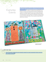
The book is structured in chapters evolving about different journaling themes, which Ludwig analyzes extensively: The written word, relationships, currents events, places and spaces, self-explorations, spirituality and dreams. Each chapter contains information about how to explore the theme as well as sections devoted to techniques, visual and journaling prompts, as well as intermezzos with interviews with different art journalists.
.png)
.png)
>> The Visual Toolbox sections make you learn new techniques
and/or increase your proficiency level in art journaling. Some of them were borrowed years later by other more popular
art journal artists, like Dina Wakley. These techniques are: Making a stencil portrait. --
Text onto metal mesh. -- Writing with fluid acrylics. -- Adding
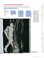
Structured Texture to an Art Journal Page. -- Silhouette figure study.
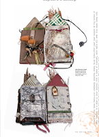
-- Altering a child's board book. -- Faux landscape painting. --
Photographic self-portrait. -- More than the sum of our parts. --
Ink-jet transfer. -- Patina on paper. -- Blind contour drawing. --
Carving a self-portrait into a printing block. -- Altering scrapbook
papers.
>>
The Insight Activity sections describe some techniques to journaling and filling a journal page: Unblanking the blank page. -- Using
your best stash items. -- Automatic writing. -- Creating and using a
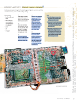
vision deck. -- Creating an imaginary musical alphabet. -- Using old
notebooks as a substrate or collage element for your artwork. --Using
poems. -- Creating versions of the same item (circumstance, day,
happenstance). -- Creating a page that summarizes your week. -- Creating
abstracts. -- Being a tourist in your own town and using using the
experience to journal. -- Building our sense of home. -- Using dream
characters to create pages.
>> Take a Closer Look is where Ludwig interviews other artists whose journals fit the theme under examination: Bee Shay, Nina
Bagley, Traci Bunkers, L. K. Ludwig (herself), Juliana Coles and
Loretta Marvel. Many more artists are mentioned throughout the book, and
their art showcased, to exemplify what's being taught.
>> The appendix contains the Vision Deck for printing, a list of contributors (names, websites and/or email addresses), and a list of resources (art supplies, books and magazines as well as artists to look up).
.png)
.png)
THE GOOD
>> Despite the many years elapsed since first written,
the book has aged well and is still relevant and my first recommendation for anyone wanting to start journaling or improve their journaling.
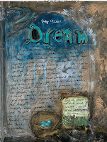
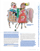
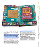
>> Beautifully designed book, from the color palette (which changes from chapter to chapter) to the flourishes, the font type and sizing, as well as the overall layout. It is a very stylish book. Everything is just well thought and visually rendered.
>> Excellent photo quality and sizing. The images almost feel 3D.
>> Ludwig not only tells you how to journal and about what subjects, but also gives you tools and techniques that allow you to journal and to grow as an artist.
>> I find some of queries at the bottom of each section not only good for journaling but also to know thyself.
>> I love all the attention devoted to dreams as source of inspiration for journaling, especially because Ludwig has a clear Jungian and Gestal approach.
>> Most of the small tip boxes are really helpful and great. Like, they aren't obvious things.
.png)
.png)
>> The Interviews with other artists whose artwork isn't appealing to me. Yet, they also provide with invaluable feedback on different people's creative process.
>> I don't see the need of constant quoting. If you have to say anything, just be brave to own your own opinions. I confess that some of the ones chosen here supplement the idea under discussion well and they aren't the usual quotes repeated everywhere either, so that's OK. Yet, I don't like constant quoting.
>>The Photographic self-portrait visual toolbox is good but seems redundant
in this Selfies Era.
>> In this overwhelmingly age of the image, I miss a photo-by photo tutorial of the Visual Toolbox section. Ludwig describes the steps clearly and concisely, but I'd rather have a photo tutorial.
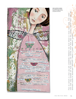
>> The
prompts vertically written on the right hand side of some pages are very
difficult to read if you're using a digital copy unless you totally
twist your head. They're great, so I've copied them at the bottom end of
this review.
>> Some of the prompts asking about things that happened when we were in second grade or very long time ago. Unless you have a savant memory, it's difficult to remember what happened unless you're picking up the book, say, in High School.
>> The book ends abruptly without conclusion or final words.
.png)
.png)
- >> Usurp an ordinary object for artistic purposes—a fork, perhaps. Bend the outside tines into a loop until they touch the fork, then spread the two middle tines apart. Is this a fork or a flower? Anything can be used. Think beyond the ordinary.
- >> Use serendipity. When something you read or experience dovetails with important things in your life, use it as topic about which to create. Messages from the universe should not be overlooked!
- >> Start out on one subject and wend your way around to another completely unrelated topic using a series of images copied to the same size. Start somewhere and end somewhere else.
- >> Map your path to work, the coffee shop, or the grocery store. Create an actual map, by drawing doodles of buildings, landmarks, squiggly trees... Make the scale how long it feels to get to a place, not the actual distance
- >> Place 4” (10 cm) squares of white, cream, and gray paper in a well-lit room. Notice how the light affects the colors as it changes over the course of the day. Try replicating these effects in your journal using watercolors.
- >> Empty an anxious heart onto your pages. Clip, paint, snip, scribble, splatter, write. Don’t consider the appearance of your page, just release your burden onto the paper. If this isn’t a page you want to commit to having in your journal, do it on scrap or deli paper.
- >> Take an old book from your hoard to use as a new journal. Instead of using it the way it opens, turn it 90 degrees and use it from that direction
- >> Turn up the volume: go for brighter versions of the colors you were going to use. Whatever you were going to do, do it bigger. Spill it off the page. Make it so big as to be unrecognizable. Make it so loud in color that anything else is hard to see, or so black that it could be a cave. Bigger, bolder, more volume!
- >> New journals can be daunting. Break in pages by dipping the book into a bowl of coffee, tea, or watered down ink. Hold the book by the cover boards to dip. Fan open to dry.
- >> Glue an envelope to a journal page. Write a love letter to someone, perhaps yourself, tuck it inside and seal it shut.
- >> When using text on a page, give it visual punch by creating words that jump off the page through their arrangement, color, or style.
- >> Find one image or object that is the quintessential distillation of someone or some place you cherish and create a page that supports the image or object.
- >> Make a photocopy of your palm. Head to the library and look up palmistry. Give yourself a palm reading and Create a page about what your palm has to say. Are secrets there?
- >> In second grade, what did you want to be when you grew up? What other things did you want to be when you grew up? Have you done any of those things? Do you still want to do any of those things?
- >> Try on different handwriting styles.
- >> Construct a page that interacts with the viewer. Try pull tabs, flaps, and small doors.
- >> Prove you exist.
- >> Collect doorways, or rather, images of doorways. Thinking about the nature of doorways can lead into some interesting journal work.
- >> Tear a piece of newspaper or tissue into rectangles and strips. Adhere these pieces to your page with acrylic medium. For additional texture, crumple the pieces before attaching them.
- >> Coat a page in wax and scratch marks or text into the surface. Rub graphite or charcoal into the scratches.
- >> Folding pages adds new perspectives. Fold before starting, to create separate spaces. Fold after, to create texture and dimension.
- >> Save your doodles. You can enlarge and copy them to create interesting backgrounds.
- >> Vagary. Despite its naughty sound, a vagary is a whim, an odd or eccentric idea. For one week, collect all your odd ideas, not just those that are art-related. Now choose one, two, or more and make pages about them
- >> Gravity. Use it. Spill coffee or paint onto a page, even one in progress.
- >> Create a visual joke, something that makes you smile each time you see it.
.png)
.png)


.png)
.png)
.png)


