I have many oracle and tarot decks and this became an instant favourite. Oftentimes, I purchase a deck that I've seen used by online readers, I get excited because when I order the deck, I have already the imagery and style in mind and I know how it works in general readings. What often also happens is that, when I get the product, I get disappointed: the cards are too stiff, or too big, or the colors very different from the promotional photos or how they look on camera, or they don't shuffle well, or simply the energetic connection in person is not there. Yet, this Tarot was a great exception to the norm. The Light Seer's Tarot was love at first sight for me. Published by Hay House,
an editorial home that has been producing average quality decks for
years and, by doing so, ruining some great oracle and tarot decks, has
done the right thing and followed the artist's heart. This being the
case, the end result is not only a beautiful quirky Tarot, it is also a
good quality enjoyable usable deck.
The Rider White Smith Tarot by Pamela Colman is so ubiquitous and well-known that reinventing the tarot still being true to it is not a simple task. However, here she comes, another female artist, Chris-Anne, a "spiritualpreneur" as she calls herself, who does just that. It is not only that, with this deck, she has reinvented and modernized the Tarot, it is that she has done this successfully because the end result is not a curio that sits on display in collectors shelves, but a widely used deck by Tarot readers and aficionados use and connect with. The
Light Seer's Tarot, is a deck that outshines most of modern Tarot
decks, because it s true to the core of what Tarot is, reverse meanings
included, but it gathers and reflects contemporary energies and imagery
that the reader can easily connect and relate to. This Tarot and the Urban Tarot by Robin Scott are my favorite reinvented contemporary Tarot decks.


GOOD THINGS
> Great size cards, that good to handle for people with small or large hands.
> Cards shuffle and fly out beautifully.
> The card back design is elegant and perfectly geometric so it doesn't give away whether the card is coming upright or reverse.
> Amazing printing quality and colors.
> Wonderful boho indie expressive artwork, which is very much my cup of tea.
> Very modern feeling without loosing the essence of what traditional Tarot is.
> Multiracial, multi-gender multi-age deck. This is is so rare, that it has to be pointed out.
> Beautiful good-quality keepsake box.
> Good quality printing booklet on soft thick paper.
> Booklet text and meanings are really great. You will find both the general known meanings of the card upright and reverse, but also why the artist has interpreter the card the way she has, and also how the energies are applied to modern New Age spirituality.
> Wonderful deck for proper Tarot readings and intuitive readings. Actually, you can use this deck as an oracle as well.
SO-SO
> The card stock is beautiful, but a better coating was needed because the edges deteriorate easily.
> No gilded, silvered or colored edges. Why not? It would have rounded up the product beautifully.
> The booklet is bound too tightly, so it is difficult to open it and read it comfortably. > A bit pricey.
MIND
> The deck is very New Age, so it might not resonate with everyone.
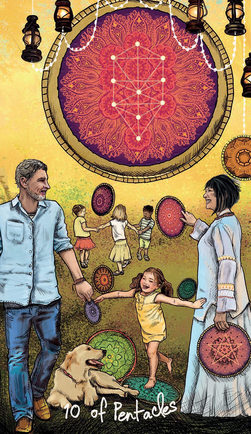
> The cards are sometimes inspired in the images in the RSWT, but reinterpreted and modernized (see the 10 of pentacles above(, while others are quite different but capture the mean meaning given to those cards (see the ace of cups above).
This deck has been such a great disappointment. Jungian Psychology, archetypes and Tarot are something I feel passionate about. I found the concept of the deck brilliant, as I thought that the Tarot archetypal nature would be further explored and developed from a Jungian lens o view, not only to favour the use of Tarot on therapeutic settings but also as a tool of self exploration. I honestly thought that this deck would just provide us with further insights into the archetypes of the Tarot. Unfortunately, that didn't happen for me.This deck is a companion to a book by the same author, so the book might be a better buy.
GOOD THINGS
> Very good size cards for people with small or large hands.
> Good quality cardboard.
> Cards shuffle well.
> Deck is not heavy at all.
> Lovely cardboard keepsake box.
> Wonderful printing quality and colors.
> The Major arcana are beautifully illustrated.
> Stunning card back printing.
> Small booklet with the meaning of each card. Texts are short and sweet and perfect for beginners. They have the added information about the astrological sign each card relates to and the archetypes that the major arcana embody.
DISAPPOINTING
> White people figures all of them, mostly blonde, with some brown-hair figures. No cultural diversity whatsoever.
> The card back gives away whether the card is upright or reverse.
> No reverse meanings in the booklet.
> Most of the Court and suit cards are simplistic, not much thought seems to have been put into them, not much symbolism, and you can call them Jungian if you want, but I call them bland unimaginative Tarot cards. Other tarots will better allow you to use them in Jungian therapy, the RSWT to start with, for example.
> Meanings given to each card are the usual if you know a bit about Tarot...
> Overall product concept, design and quality doesn't justify the price.
Colette is "the" Oracle master so I imagined that, if she had to create a Tarot deck, was never going to be a replica of the RW Tarot. The structure of this deck is, however, that of the classic tarot, but the imagery has been freely interpreted and simplified. Also a very feminine vibe has been added, as well as characters of different ages and ethnic backgrounds made part of the deck. Colette says in the booklet that she has added some LOA and positive psychology principles, but I am not sure is this is just blah blah blah. For sure, the deck has a positive vibe as reversals are gone as well as any 'distressing' imagery. The LOA and PPsy is more clearly found in the meanings in the booklet.
THINGS I LOVE
> The concept is perfect for beginners as there aren't reversals.
> The "frightening" images in the RWT are not there, so all the imagery has a positive feeling.
> The artwork by DellaGrotaglia is stunning once again. Her layering, textures and colouring are superb. Despite the sophisticated symbolism of her imagery and the richness of symbolic elements, the images feel clean and sophisticated at the same time. The imagery has a wonderful oneiric fairy-tale feeling that I love.
> The interpretation given to each card is short and sweet and captures the essence of what the original card meant upright.
> The fancy lettering describing the suit card and number is fanciful wonderful.
> Beautifully simple card back.
> The
Good Tarot has a mythological ethereal whimsical archetypal feel that
roots in the Tarot and in traditional fairy tales and angelic realms.
> The cards Strength and Love are wonderfully related with the women first controlling the beast and then falling in love with it. Like Beauty and the Beast.
> Sturdy beautiful keepsake box.
THINGS THAT BOTHER ME
>
This deck is massive and extremely difficult to shuffle even if you
have average-size hands, so it's really a pain for people with small hands.
> The cards gloss coating makes them stick together so they are difficult to shuffle. Shuffling well and easy is at the core of any reading, so if the cards don't shuffle well, what's the point?
> The booklet printing quality and paper stock are average.
> Some of the cards are slightly blurry.
> The major arcana card numbers aren't placed on a fix position, something that really annoys me.
> The blue tones from air and water suits are so similar that is difficult to identify which suit is which one by the color. The same re the earth and fire suits. Why not having completely distinct suit color palette for each suit?
> Too many winged beings in this deck. The air suit with angelic winged beings and the earth suit with butterfly-ish fairy beings and there are wings everywhere, really.
MIND
> The overall feminine tone of the deck might not speak to male readers or tarot aficionados. The only male figures are the Kings plus the hanged man and the page of earth. Figures that are usually depicted as male in the RW Tarot like the knights (messengers) and the Hierophant are here feminine as well.
> This is a simplification of the Tarot most common meanings, so it is not as rich and deep as the original.
SUGGESTION TO THE PUBLISHER
US Games Systerms has the best card stock in the market. It not only make shuffling a pleasure, it is good enough to have any artwork really pop up and display the right way. I think Hay House should just copycat the card stock, because most of HH Tarot decks, like this one, are too bulky, too heavy and to mass-produced.
This is my least favorite mini deck by Rockpool Publishing. Although the quality of the product regarding quality of the packaging and cards is undeniable, the rest is a bit disappointing. Perhaps because the other Rockpool mini-decks I have are just really motivational, inspirational and intuitive, the messages in these cards feel artificial and too vague to be of any use.Perhaps fun to use at a party, not for divination readings.
GOOD STUFF
> Beautiful colorful deck.
> Perfect deck for people with small hands.
> Good quality glossy flexible cards that shuffle beautifully.
> Very good quality keepsake box with upper non-detachable magnetic clasp.
> Instructions of how to use the cards are written on the inner lid.
> Great portability.
> The keepsake box is just gorgeous and eye catching.
> Beautiful printing overall.
DOWNSIDES
> Tiny deck, so if you have big hands, it might not be for you.
> Deficient contrast between lettering and background.
> The upper side of the cards has one standard image, so it is not very artistic or as artistic as other decks in this Rockpool deck series. I get that the main focus is the affirmations not the artwork, but I would loved having more varied Chinese imagery on each card.
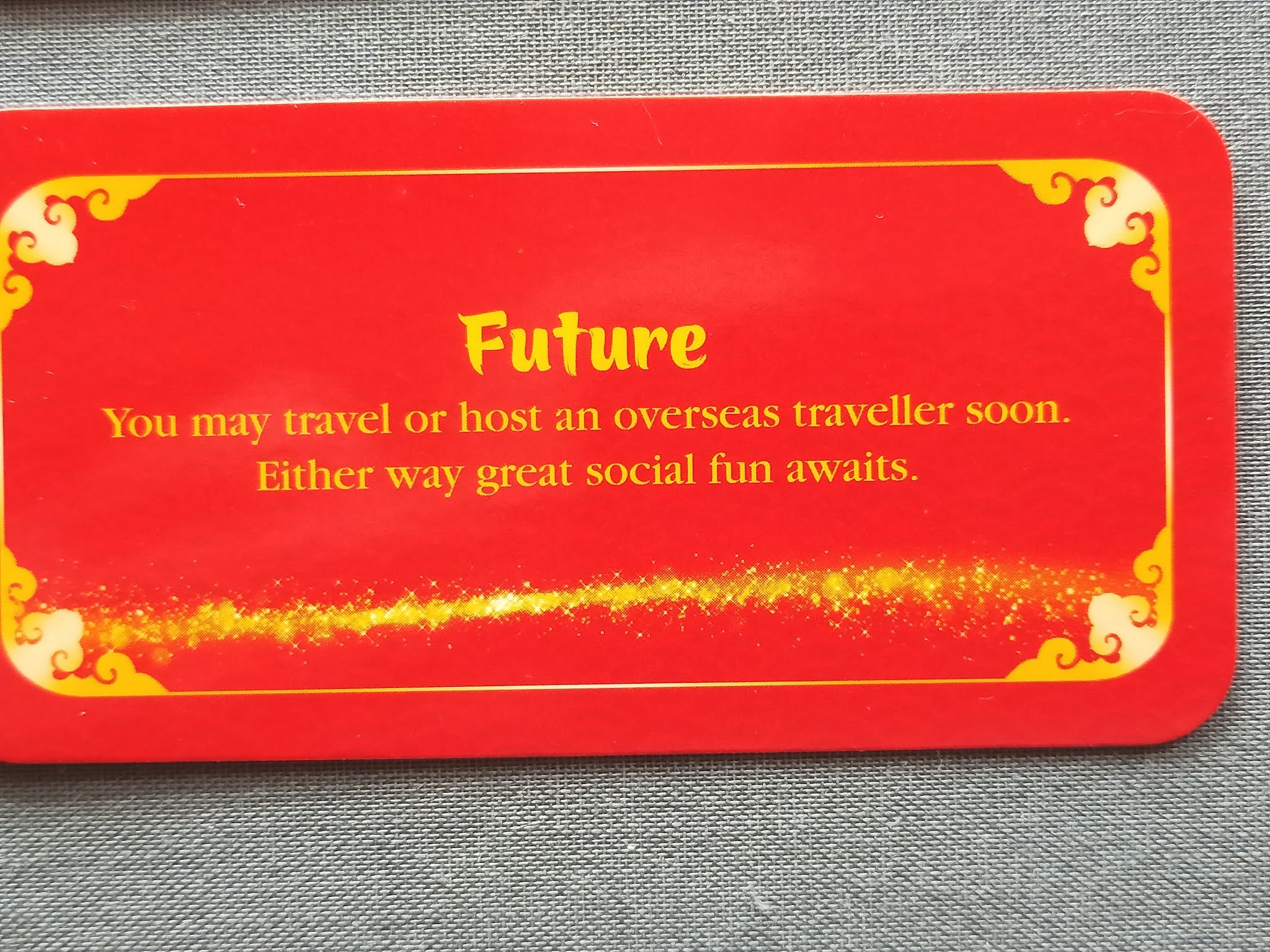
> For example, one of the cards has the following message, "Opportunities, a stranger is about to change your life. Exciting times and plenty of action, plus a special family reunion looks likely". Pardon me, my family is overseas, so it is unlikely. Exciting times and plenty of action means nothing, it is too generic, so unless you mention an area of life, work, family, friends, sports etc. it means nothing.. The first item it is a proper fortune divinatory message. Other cards are equally vague and nonsensical.
> I expected the messages in the cards be really as short as the ones in fortune cookies.
> "You will be amazed by their accuracy" is just nonsense, sorry.