 Deborah Blake, who has authored numerous fiction and non-fiction books on modern witchcraft, hit the jackpot with this Tarot deck, first published in 2017 and the mini format in 2020. This is one of my fav Tarot decks because of the general jolly vibe, the overall narrative, and the artwork.
I LOVE
> Elisabeth Alba's juicy imagination and artwork that adjusts to the structure of the RSWT Tarot but creating a wizard world that's unique and colorful not dark or gothic. We are allowed into a magic world of modern boho witches and wizards, whose lives are full of fun, adventures, dangers and challenges. Alba is an amazing illustrator and, if this wasn't a Tarot deck, this would make a stunning graphic book. > The imagery is rich enough to get my intuitive juices flowing even if I didn't anything about Tarot.
> Good quality card stock.
> Great quality printing.
> Cute card back illustration.
> The deck shuffles beautifully.
> Easy to carry in a small camera bag.
> Good for people with small hands.
> Children's friendly re size and imagery.
> Cat lovers' delight. If you, like me, love cats, you'll be delighted with the important role that cats play in each card image, and with the way they are depicted.
SO-SO
> Bad quality box, which arrived with the corners squeezed and slightly damaged.
> No booklet/leaflet. I have the app with the digital book, so that's fine with me. However, if you aren't familiar with the deck, you might need to get the full size deck with the accompanying guidebook.
> The card back gives away whether the card is coming straight or reversed.
> People with average-size hands might struggle with the sizing as this deck is more a tiny deck than a mini deck.
> Unlike Blake's Everyday Witch Oracle, this deck has no ethnic/racial diversity whatsoever, which is inexcusable as the deck was first published in 2017.
MIND
> Based on the RWST, with some adjustments in the imagery, the most noticeable being the female Hyerophant.
> Teen and youngster vibe overall.
Belinda Grace's oracle is a soulful exploration of romantic relationships that will be useful for singles or partnered people. The imagery draws on issues that affect and influence relationships for good or bad. Some of the imagery uses well-known world myths to illustrate couple dynamics and qualities of relating. This being the case, the cards can be used in counseling or therapeutic settings.
Lori Banks' artwork is just my cup of tea: colorful symbolic paintings that are pregnant with meaning and very intuitive to use. However, what makes this decks so lovely to me is not just the cute artwork, is the quality of the guidebook and the texts that accompany eachc card.
FAB QUALITY
RockPool demonstrates, once more, that other Tarot publishing houses have much to learn on how to produce affordable good-quality decks.
> Beautiful keepsake box with magnetic clip.
> The quality of the booklet is amazing. Premium glossy paper, color illustrations, good-sized lettering.
> Flexible good quality glossy cards, easy to shuffle and handle. Despite the size, the deck is light and not bulky.
> Good value for money.
ON THE FLIP SIDE
> The cards are a big too big for people with small hands.
> No ethnic or gender diversity.
> Three of the full body frontal images have wrong proportions between head and body, thus, the characters look a bit dwarfish: The Divine Masculine, Chivalry and the Sacred Woman.
The Wild Unknown Tarot pocket size in a tin, is just a great good quality deck.
This tarot deck has Kim Krans unique unmistakable atmospheric illustration style, which is immediately recognizable because of the simplicity of the elements, abstract predominantly B&W imagery with splashes of bright colors. The imagery relates to the natural world, the woods and the animals that populate it. This is a night-time-vibe Tarot, as the night scenes dominate most of the images and, overall, it has a strong night energy.
Beyond the imagery, there are other things that I like about this deck:
> The sizing is fantastic, really good for people with small hands.
> The cards shuffle and fly off beautifully and the deck is not heavy at all.
> The tin design is just fabulous.
> The major arcana, aces and court cards are really beautiful, but the deck, overall, is just artistically congruent and fabulous. I also love the snake-skin card back.
ON THE FLIP SIDE
> The card stock is a bit flimsy.
> The booklet is mass produced, bound too tightly and using bad quality paper.
> Some of the imagery used for the minor arcana seemed too abstract.
> Despite the fact that I admire this deck, I cannot connect with it. Said differently, I love the artwork, but it doesn't work for me. I find it too dark in mood and lacking warmth.
> Not a deck for beginners.
> Not an intuitive deck.
I actually returned the deck to the seller, because although I loved the artwork, I thought I would not use this deck and would sit on my shelves untouched.
MIND
The deck follows
the structure of the RSWT but the court cards are daughters (pages), sons (knights), mothers (queens) and fathers (kings).
This deck has been such a great disappointment. Jungian Psychology, archetypes and Tarot are something I feel passionate about. I found the concept of the deck brilliant, as I thought that the Tarot archetypal nature would be further explored and developed from a Jungian lens o view, not only to favour the use of Tarot on therapeutic settings but also as a tool of self exploration. I honestly thought that this deck would just provide us with further insights into the archetypes of the Tarot. Unfortunately, that didn't happen for me.This deck is a companion to a book by the same author, so the book might be a better buy.
GOOD THINGS
> Very good size cards for people with small or large hands.
> Good quality cardboard.
> Cards shuffle well.
> Deck is not heavy at all.
> Lovely cardboard keepsake box.
> Wonderful printing quality and colors.
> The Major arcana are beautifully illustrated.
> Stunning card back printing.
> Small booklet with the meaning of each card. Texts are short and sweet and perfect for beginners. They have the added information about the astrological sign each card relates to and the archetypes that the major arcana embody.
DISAPPOINTING
> White people figures all of them, mostly blonde, with some brown-hair figures. No cultural diversity whatsoever.
> The card back gives away whether the card is upright or reverse.
> No reverse meanings in the booklet.
> Most of the Court and suit cards are simplistic, not much thought seems to have been put into them, not much symbolism, and you can call them Jungian if you want, but I call them bland unimaginative Tarot cards. Other tarots will better allow you to use them in Jungian therapy, the RSWT to start with, for example.
> Meanings given to each card are the usual if you know a bit about Tarot...
> Overall product concept, design and quality doesn't justify the price.
Colette is "the" Oracle master so I imagined that, if she had to create a Tarot deck, was never going to be a replica of the RW Tarot. The structure of this deck is, however, that of the classic tarot, but the imagery has been freely interpreted and simplified. Also a very feminine vibe has been added, as well as characters of different ages and ethnic backgrounds made part of the deck. Colette says in the booklet that she has added some LOA and positive psychology principles, but I am not sure is this is just blah blah blah. For sure, the deck has a positive vibe as reversals are gone as well as any 'distressing' imagery. The LOA and PPsy is more clearly found in the meanings in the booklet.
THINGS I LOVE
> The concept is perfect for beginners as there aren't reversals.
> The "frightening" images in the RWT are not there, so all the imagery has a positive feeling.
> The artwork by DellaGrotaglia is stunning once again. Her layering, textures and colouring are superb. Despite the sophisticated symbolism of her imagery and the richness of symbolic elements, the images feel clean and sophisticated at the same time. The imagery has a wonderful oneiric fairy-tale feeling that I love.
> The interpretation given to each card is short and sweet and captures the essence of what the original card meant upright.
> The fancy lettering describing the suit card and number is fanciful wonderful.
> Beautifully simple card back.
> The
Good Tarot has a mythological ethereal whimsical archetypal feel that
roots in the Tarot and in traditional fairy tales and angelic realms.
> The cards Strength and Love are wonderfully related with the women first controlling the beast and then falling in love with it. Like Beauty and the Beast.
> Sturdy beautiful keepsake box.
THINGS THAT BOTHER ME
>
This deck is massive and extremely difficult to shuffle even if you
have average-size hands, so it's really a pain for people with small hands.
> The cards gloss coating makes them stick together so they are difficult to shuffle. Shuffling well and easy is at the core of any reading, so if the cards don't shuffle well, what's the point?
> The booklet printing quality and paper stock are average.
> Some of the cards are slightly blurry.
> The major arcana card numbers aren't placed on a fix position, something that really annoys me.
> The blue tones from air and water suits are so similar that is difficult to identify which suit is which one by the color. The same re the earth and fire suits. Why not having completely distinct suit color palette for each suit?
> Too many winged beings in this deck. The air suit with angelic winged beings and the earth suit with butterfly-ish fairy beings and there are wings everywhere, really.
MIND
> The overall feminine tone of the deck might not speak to male readers or tarot aficionados. The only male figures are the Kings plus the hanged man and the page of earth. Figures that are usually depicted as male in the RW Tarot like the knights (messengers) and the Hierophant are here feminine as well.
> This is a simplification of the Tarot most common meanings, so it is not as rich and deep as the original.
SUGGESTION TO THE PUBLISHER
US Games Systerms has the best card stock in the market. It not only make shuffling a pleasure, it is good enough to have any artwork really pop up and display the right way. I think Hay House should just copycat the card stock, because most of HH Tarot decks, like this one, are too bulky, too heavy and to mass-produced.
 GOOD STUFF
> Great affirmations that go to the point, aren't too short or too lengthy, and have substance.Due to the fact that doors are the main theme, the deck as a 'transitional' vibe and messages. > Very small deck, so it's perfect for people with small hands.
> Beautiful real-life photography of unique doors from around the world.
> Elegant design of the back,on the affirmations side, in white-marble and gold colors.
> Good quality glossy flexible cards that shuffle beautifully.
> Very good quality keepsake box with upper non-detachable magnetic lid.
> Instructions of how to use the cards are written on the inner lid. > Great portability.
SO-SO
> Tiny deck, so if you have big hands, it might not be for you.
> There is no guidebook or booklet explaining why the door theme was chosen. Because really, there must be one. It
might be the case that Engracia came with the messages after choosing
the photos himself and meditating on them, but we don't know about the
concept that inspired the deck anywhere. A bit of background on the
concept might have been wonderful. > Contrast between lettering and background is deficient on the inner lid.
> Most photos are stock photos from Pexels, Shutterstock except for four of them attributed to Melissa Lee Vernali. There seems not to be much effort put beyond choosing the photos and Engracia's lovely messages on the back.
This is another beautiful tiny deck by Rockpool Publishing. It has the house trademarks:
> Small stylish deck.
> Motivational messages.
> Gorgeous illustrations/photos/artwork.
> Portability.
> Great quality glossy card stock
> Sturdy practical keepsake box with upper self-closing lid.
> Pleasurable shuffling
ALSO GREAT
> The illustrations are all beautiful Aboriginal motifs in earthy colours. The deck has artistic congruence, as well.
> However, what stands out to me, having as many motivational decks as I have, is that the messages in the cards aren't the same-old messages. On the contrary, the they are original nuggets that will make you ponder.
SO SO
> Aboriginal artwork has a multitude of ocher and earthy tones that makes it both rich and earthy, but this deck lacks colour depth and feels a bit flat in that regard.> A bit pricey for what they are.
> Perhaps, not good for people with big hands.
This is really a tiny mini deck, perfect for people with small hands or children, and you can fit it in your pocket or in a small handbag. It comes with a mini-booklet that is surprisingly good. If you want a portable RWS this does the job to perfection.
US Games Systems consistently produce cards that have the perfect card stock thickness and coating, so shuffling is natural and pleasurable. This deck is another example of the house savoir faire in that regard.
ON THE FLIP SIDE
> The RWS imagery is in the public domain, so not artistic effort was put to produce this deck. Besides, the keepsake box is not especially good. This being the case, I regret not buying a similar RWS mini deck from Lo Scarabeo as the latter printing house produces better quality mini decks for a similar price.
> Perhaps because I'm used to the Radiant RWS, this deck feels a bit too pale and not as appealing.
This is a cute small oracle deck devoted to Kuan Yin, the Divine Mother.
I LIKE
> Beautiful imagery by the talented Chinese fine-artist Wan Yiguang with an atmosphere that captures adventure, youth, playfulness, and has a marked Tibetan/Mongolian vibe.
The young Kuan Ying,seems to be floating over the Earth playing with her yak, moving around happy and free with her loyal companion as The Fool in the Tarot would do.
> Fairchild's texts in this deck really resonate with me. In this deck, Fairchild's usual writing is deprived of her usual flourished never-ending verbose style and the meanings goes to the point without losing depth.
> A great oracle to start your day.
> No need of guidebook as the oracle message is written in the card back.
> Light, easily-to-shuffle deck.
> Hard keepsake box.
> Perfect for people with small hands.
ON THE FLIP SIDE
> The Divine Mother is a bit too young in the imagery. The character is not a woman yet. The story seems that of a young spirited girl who travels the world with her yak in a very playful mood more than that of the Asian goddess.
> The imagery and the text on the cards do not relate much. Other images might have been used, unrelated to the Asian goddess, and it would have not mattered. This being the case, this is more a text oracle than an intuitive oracle that relies on imagery, as the latter seems more decorative that intuitive.
> Cards coating makes them stick together, which is very annoying.
> Not many cards in this oracle.
> The quality and overall product does not justify the price.
This is such a well-known oracle, ubiquitous on YouTube tarot-reader channels that is difficult to say something that it hasn't been said before.
The oracle is personified in the human head/face that appears on the back as well as blended in in most front cards.
THINGS I LIKE
> Beautiful digital artwork by DellaGrottaglia, a digital artist with whom Colette collaborates and has a wonderful eye for intuitive imagery in divination decks. Overall, the whimsical surrealist clean imagery is wonderful: polished, simple but rich enough to be used on its own or with the guidebook interpretations. The deck has a strong presence of spirit animals and fairies, and it's embedded with tenderness and sense of humor.
> Presence of racial diversity in the characters depicted on the cards.
> The symmetric colorful back is a stunner.
> The guidebook contents. Each card has an oracle message, a relationship message, a prosperity message (career, business, work, projects) and a protection message, so it's not only practical but versatile and in-depth.
> Good quality card stock
> Sturdy keepsake box.
I DON'T LIKE
>
At the end of the day, what matters the most when using any oracle
deck is that things flow and your answers are replied with precision. You ask a query about work and the card imagery and/or guidebook
text are spot on and go to the core of the matter. I tend to ask any
deck, when I first start using it, questions about things I know the answer about or things about myself that I obviously know. Unfortunately, I have a mix bag of results with my queries on that regard and the oracle has been less magnificent than expected.
> The beautiful flourished numbering is not positioned on the same spot on each card. Sometimes, it's on the right hand side (in most cards) but not always at the same height. In one case, it's on the middle tip, while in other cases, the numbering is located on the left hand side but at different heights. This is simply bad design.
> The card stock isn't flexible enough and the glossy coating makes cards stick to each other, and, as a consequence, shuffling it's not natural or pleasurable.
> Average guidebook printing quality and paper stock.
> 23 cards have a flag garland on the top while the rest have none.Why? Does the flags signal something different on those cards that have them?
> The cards are on the large side so they're easy to shuffle if you have small hands.
This is one of the most interesting oracles I've come across lately. The deck relies and draws on a very-strong feminist array of women archetypes. All of them are writers with lives that are/were out of the ordinary. Their life and work is the basis for the symbolic portraits (major arcana if you wish), while their materials (symbols associated with their writing and/or lives) are in the sepia simple icon-like cards.
CLAP CLAP CLAP
> Original concept. > Amazing 'odd' women and writers from different cultures, races, sexual orientations and historical periods (from historical figures to living legends), so the deck feels contemporary and in tune with the need of cultural diversity in our world.
> Beyond some renowned female writers, you'll get to know some others that are equally remarkable but not so well known.
> Horan's art is just great. The illustrations of the witches are the most evocative and helpful for intuitive readings. I'll give you an example:
I asked, 'What I have to know in my relationship with guy X?" The card that came up was Octavia E Buttler's The Future. The image depicts a woman opening a young man's chest, at the heart level, as if she was healing a wound or just a opening his heart. The man seems to be dreaming, surrounded by darkness and subject to the hold of subconscious tentacles. The man is white and the woman is black, so she might be his shadow side. Can you see the beauty of the card and how this would work on a romantic question? You don't really need to know who Octavia E. Buttler is to use the cards because the imagery is rich and multi-layered. You can still go to the booklet, look up Octavia's story and add some further elements. The summary says, for example, that she wrote novels that reflected on power dynamics about sexes, so you could see that the woman on the card has the upper hand in this relationship, she's bigger than the man perhaps she has power over him, she has power over his heart or is more mature, or more conscious. In other cases, the enquirer might find that the image depicts a woman breaking the guy's heart, for example. I took two other cards to clarify the message and I got the cat (a being that comes and goes, who attaches to people freely but needs its own space) and the snail (a being that is slow in movement, has a shell, and has a small house). Just beautiful, isn't it?
- Indie wonderful design.
- Elegant practical keepsake box, beautifully designed inside out. The box has an inner pull-up ribbon to help get the cards out.
- Great quality card stock with flexible textured luxurious cards that shuffle beautifully and don't stick to each other.
- Good printing quality.
> The deck seems to works for me. It gives precise answers to my questions. I have tried it with questions about people I know well, and then asked the cards, and boom, the answers have been spot-on.
THUMBS DOWN
> I get that this is a spin-off of the eponymous book, but this booklet doesn't say much. The summary about each artist is good enough, and the Wikipedia surely has more information. The booklet basically says, use your intuition with this deck, which is great, but doesn't help explain the concept behind the oracle. So, what's the point of producing an oracle that has no oracle guidance? And really, I don't want to buy the book just to understand the deck.
> Some design issues. For example, the witches cards have their name and keyword on the front; however, the materials cards have the keywords in the booklet. That's bad design because it doesn't seem to show design congruence.
> The materials cards relate to the witches, yet, we aren't told why and which materials belong to to each witch.
> The keyword attributed to each writer isn't always intuitive for me. Emily Dickinson is the epitome of the hermit and solitude. However, she's given the keyword 'soul' instead of 'solitude' which is given to Alejandra Pizarnik. This would not matter if both writers were unknown, but Dickinson is well known for her solitary life.
> Lettering in the booklet is diminutive and you might need a magnifying glass to read the text.
MIND
> The strong feminist blueprint might not be some people's cup of tea and men with strong male energy might not relate to the deck at all.
> This deck is bulky and the cards are on the large size so people with small hands might struggle shuffling.

GOOD STUFF
> Ceccoli's amazing artwork, which is a mix of toned up pastel oneiric surrealist art that is just my cup of tea. Each card is a piece of art.
> For whatever
reason I see this deck as very in tune with subconscious themes and
matters, and something that can be used in therapeutic settings as an
oracle or conversation started for people with trauma.
> Stunning printing quality.
> Great quality cardboard.
> Cards shuffle wonderfully.
> Sturdy keepsake box.
> Booklet in several languages (English, Spanish, French, Italian, and German.)
> Perfect for people with small hands or when you want to have a deck to carry around in a small purse.
> A wonderful collectable.
DISAPPOINTING
> Despite the beauty of the deck, this feels like an odd Tarot deck and more a collection of beautiful art cards made fit in into a Tarot and not images created to be part of a Tarot. This is just my impression, at least with some of the cards. Some of them fit well with their RWS counterparts at least in spirit, but others do no do at all.
> Not a beginners tarot.
> As the booklet is so small and limited, one gets lost in the beauty of the imagery and gets lost in it.
MIND
> If you really love this Tarot, get the full edition with the guidebook.
> If you have big hands this might not be your size.
Sandra Anne Taylor is really a master in creating decks that resonate with me, and this is another example.
This is one of the best decks I've purchased from Hay House in a long time regarding the quality of the artwork, deck design and production. It is overall a very feminine oracle, but also a very shamanic one, both very earthy and magical. Images of spirit animals, powerful feminine archetypes, natural forestry settings and Indigenous shamanic imagery blend together to perfection to bring us an oracle that will speak to people with strong feminine essence and into alternative spirituality.
THE ARTWORK
Webber's fine-art paintings for the deck are amazing. They are multilayered and richly metaphoric, exuberant but still sophisticated. The imagery has a predominance of earthy colors: ocher, golden, browns and greens that convey well the connection with Mother Earth and the world of spirit/totem animals. You could have any of the images in large format hanging from your walls. OTHER GOOD STUFF
> Although there are many oracles and decks devoted to the divine feminine, this one shines over the rest because of its mix of Gaian, Pagan, Wicca, Native-American, shamanic and reiki-like elements, which will resonate with anyone into alternative forms of spirituality and energy work.
> I love that this oracle imagery doesn't relate to Tarot major arcana as much as other oracles do. In that regard, this is not only an original deck, but also a true oracle.
> Imagery is potent enough to be used on its own in intuitive readings.
> A contemporary diversity-sensitive deck that depicts characters from several races and color skins.
> The cards stock is wonderful.
> Despite its size, the deck is not heavy or bulky.
> Very pleasurable easy shuffling.
> Great design and production from the interior of the keepsake box to the quality of the paper used to print the guidebook.
> Guidebook is wonderful. The quality of the paper is great and the texts are good. Each card meaning ends with a lovely affirmation.
OK STUFF
> No surprise, but except for the divine masculine card, all cards are feminine, so this is not a deck for men with strong masculine essence and energy.
> Cards are large-ish, so, people with small hands might find shuffling them a bit difficult.
> The card edges deteriorate easily with little shuffling.
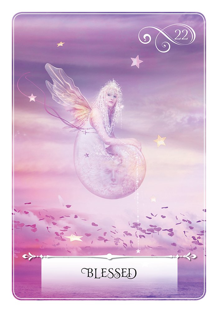
> There is a lack of synchrony between some of the images and the meanings given to them. I'd say that the deck is 50% congruent and 50% non-congruent. In some cases, the concepts the cards relate to are difficult to convey visually. In other cases, the connection is not clear to the user even though it might have been for Taylor. Take for example cards 38 sensuality (not very sensual), 25 go with the flow (character seems concerned and apprehensive more than going with the flow), 22 Telepathy (it takes two to tango for telepathy), 49 Achievement (It looks more like power/strength) or 33 Building your World (it looks like an hermit) , just to mention some of the cards that I don't think represent well the concepts. would loved more if they had not keyword associated as they don't seem to match. For the rest, card 14 seems out of tune with the rest of the lot, and looks more like a painted photograph. It reminds me of some countryside scenes that I saw in Turkey or the Middle East years ago. Taylor says that she chose the artwork and then channeled the energies to create the deck, so the artwork wasn't specifically created for the deck, or so it seems.
> In the guidebook, I miss a reproduction of each card before each card meaning..
MIND
> The authors recommend reading the whole guidebook before using the cards.
> Order of the cards was chosen randomly and intuitively and some of them, looking very similar, were put together, even though they relate to different matters.


