This book grew on me from the first pages, when I quite disliked it, to when I finished, which I really liked it. This isn't a tutorial kinda book, it's a book to harness your intuition for artistic purposes and give you tips, prompts and techniques that will translate that into your paintings.
I DID LIKE
>>
The lovely design and style of the book, from the lettering to the
doodles incorporated into the pages to the gradient boxes with the
exercises. The book has high quality full-color reproductions, too.
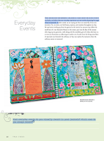
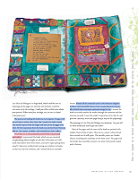
>> Some of Bowley's artwork displayed on the book.>.
The technique prompts in the first chapters of the book are excellent,
especially for beginners and something that I haven't seen in other
teaching Art books. Prompts cover the use of water spray bottles,
fingers, rags, etching, stamping, and small brushes and foam brushes. I also loved the tip on how to create a glass palette
>> Bowley provides us with a great selection of exercises to harness our intuition for artistic purposes. This is actually the best part of the book and something I haven't found in other Art books out there. We're given tools on how to approach a painting, how to go through the hurdles when we get stuck, how to finish a painting, when should we finish it, and how to create from our inner voice.
>> The fact that Bowley advises us to ask ourselves 'what's working' (instead of what's not working) when we're stuck or when a painting isn't working.
>>
How simply but effectively color theory is explained in p. 59 and the
examples of which color combinations create/don't create mud in p. 69.
>> The Taking
Stock section on page 120 contains 13 questions for us to ask ourselves before deciding whether a painting is finished or not.
SO-SO
>> " Remember, only you can paint like you". (Page 112).
-- This isn't totally true. There are people painting The Monalisa like Da Vinci at the dozen in China and they're really great. Also, remember the forfeiting paint industry, which needs of super-qualified experts to distinguish the original from the copy.
>> The Blindfolded finger painting exercise is fab, but what about if we don't paint on canvas and use A4 or A3 watercolor paper instead?
>> "Make sure you always have at least two canvases in progress at all times (...) as it allows one canvas to dry as you work on the other." (Page 66).
-- Not sure if this is valid for paper either.
>> "It’s tempting, and very natural, to want to know what your paintings are going to look like before they are finished, but the truth is you never really know what the future holds. Incredible amounts of energy are wasted by chasing what you cannot catch." (Page 28).
-- I see this sort of statement repeated everywhere these days but it doesn't ring 100% true to me. Many artists and art masters in the past have painted and paint on commission and within strict guidelines, or like to produce whatever final product, like a realistic portrait of the Queen, just to mention something. I don't think that all artists let their creativity go wild.
>> Bowley's paintings in the book aren't named or dated.
I DIDN'T LIKE
>> The book has 129 pages, but the written part of it covers half of the book. Many pages contain full-page photos, most of the others have half-page photos and 1-2 columns of text or 1 exercise boxes.
>> Too many quotes, covering half page. I like them, but, are they necessary? No!
> The positive-thinking New-Age Law of Attraction spiritual philosophy that pervades the book. It's like something I've read gazillion times in other places for other purposes. Ready-made sentences that mean little to me. Not every painter is spiritual. Not every painter who's spiritual is into New Age or yoga or whatever. You can be a good teacher and be agnostic and in a wheel-chair. You know what I'm a saying?
> Relax by taking a bath... I haven't seen a bath in urban rentals in the huge city I live in for decades. Not even in many of the newly-built small houses.Having a bath is like a fantasy these days, like a luxury, but the sentence comes up so often together with relax that's annoying.
>> "Human aliveness is inseparable from creativity. We are all artists already… each and every one of us." (Page 13).
-- I don't agree with this. We are all creative and creators for sure, not all of us are artists. Not every painter who lives out of their sales is an artist either. I think there are not many true artists around these days.
>> The About
the Author section at the end of the book is vague/generic, and says that Bowley has works published in books, albums and in paintings in galleries.
So, which galleries, which albums and which books? It reads more
like a FB, Amazon or Fivver profile trying to impress customers than something fit for a book bio. In fact,
Bowley's profile elsewhere is more specific and mentions just books not galleries or albums. Vague biographies rest credibility
to any author. Also, I would have loved knowing whether Bowley studied
Art in Art School or a self-taught painter.
TYPOS
Overall the book is well edited, but I noticed, on page 117,the following:
"If you premeditate on using a word before you’ve started your painting, you run the risk of your words seeming contrived. ask yourself whether your words feel forced, or whether they are a natural extension of your process?
Notice that ask should be in capital and that the interrogation mark is unnecessary in this sentence as it's phrased.
Despite the years elapsed since this book was first published, True Vision is still the book I'd recommend to people to start with if they're new to mixed media, art journaling or both. This work was first published in 2008 and the Kindle edition I used to read is from 2011; yet, it's the most compressive work I've found for art journaling while being authentic to who you are, without copycatting anyone. I find the book both inspiring and helpful.
THE STRUCTURE
The book is structured in chapters evolving about different journaling themes, which Ludwig analyzes extensively: The written word, relationships, currents events, places and spaces, self-explorations, spirituality and dreams. Each chapter contains information about how to explore the theme as well as sections devoted to techniques, visual and journaling prompts, as well as intermezzos with interviews with different art journalists.
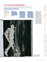
>> The Visual Toolbox sections make you learn new techniques
and/or increase your proficiency level in art journaling. Some of them were borrowed years later by other more popular
art journal artists, like Dina Wakley. These techniques are: Making a stencil portrait. --
Text onto metal mesh. -- Writing with fluid acrylics. -- Adding
Structured Texture to an Art Journal Page. -- Silhouette figure study.
-- Altering a child's board book. -- Faux landscape painting. --
Photographic self-portrait. -- More than the sum of our parts. --
Ink-jet transfer. -- Patina on paper. -- Blind contour drawing. --
Carving a self-portrait into a printing block. -- Altering scrapbook
papers.
>>
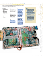
The Insight Activity sections describe some techniques to journaling and filling a journal page: Unblanking the blank page. -- Using
your best stash items. -- Automatic writing. -- Creating and using a
vision deck. -- Creating an imaginary musical alphabet. -- Using old
notebooks as a substrate or collage element for your artwork. --Using
poems. -- Creating versions of the same item (circumstance, day,
happenstance). -- Creating a page that summarizes your week. -- Creating
abstracts. -- Being a tourist in your own town and using using the
experience to journal. -- Building our sense of home. -- Using dream
characters to create pages.
>> Take a Closer Look is where Ludwig interviews other artists whose journals fit the theme under examination: Bee Shay, Nina
Bagley, Traci Bunkers, L. K. Ludwig (herself), Juliana Coles and
Loretta Marvel. Many more artists are mentioned throughout the book, and
their art showcased, to exemplify what's being taught.
>> The appendix contains the Vision Deck for printing, a list of contributors (names, websites and/or email addresses), and a list of resources (art supplies, books and magazines as well as artists to look up).
THE GOOD
>> Despite the many years elapsed since first written,
the book has aged well and is still relevant and my first recommendation for anyone wanting to start journaling or improve their journaling.
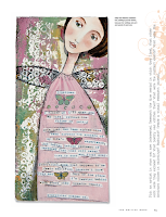
>> Beautifully designed book, from the color palette (which changes from chapter to chapter) to the flourishes, the font type and sizing, as well as the overall layout. It is a very stylish book. Everything is just well thought and visually rendered.
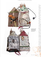
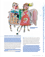
>> Excellent photo quality and sizing. The images almost feel 3D.
>> Ludwig not only tells you how to journal and about what subjects, but also gives you tools and techniques that allow you to journal and to grow as an artist.
>> I find some of queries at the bottom of each section not only good for journaling but also to know thyself.
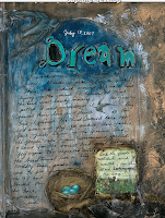
>> I love all the attention devoted to dreams as source of inspiration for journaling, especially because Ludwig has a clear Jungian and Gestal approach.
>> Most of the small tip boxes are really helpful and great. Like, they aren't obvious things.
>> The Interviews with other artists whose artwork isn't appealing to me. Yet, they also provide with invaluable feedback on different people's creative process.
>> I don't see the need of constant quoting. If you have to say anything, just be brave to own your own opinions. I confess that some of the ones chosen here supplement the idea under discussion well and they aren't the usual quotes repeated everywhere either, so that's OK. Yet, I don't like constant quoting.
>>The Photographic self-portrait visual toolbox is good but seems redundant
in this Selfies Era.
>> In this overwhelmingly age of the image, I miss a photo-by photo tutorial of the Visual Toolbox section. Ludwig describes the steps clearly and concisely, but I'd rather have a photo tutorial.
>> The
prompts vertically written on the right hand side of some pages are very
difficult to read if you're using a digital copy unless you totally
twist your head. They're great, so I've copied them at the bottom end of
this review.
>> Some of the prompts asking about things that happened when we were in second grade or very long time ago. Unless you have a savant memory, it's difficult to remember what happened unless you're picking up the book, say, in High School.
>> The book ends abruptly without conclusion or final words.
- >> Usurp an ordinary object for artistic purposes—a fork, perhaps. Bend the outside tines into a loop until they touch the fork, then spread the two middle tines apart. Is this a fork or a flower? Anything can be used. Think beyond the ordinary.
- >> Use serendipity. When something you read or experience dovetails with important things in your life, use it as topic about which to create. Messages from the universe should not be overlooked!
- >> Start out on one subject and wend your way around to another completely unrelated topic using a series of images copied to the same size. Start somewhere and end somewhere else.
- >> Map your path to work, the coffee shop, or the grocery store. Create an actual map, by drawing doodles of buildings, landmarks, squiggly trees... Make the scale how long it feels to get to a place, not the actual distance
- >> Place 4” (10 cm) squares of white, cream, and gray paper in a well-lit room. Notice how the light affects the colors as it changes over the course of the day. Try replicating these effects in your journal using watercolors.
- >> Empty an anxious heart onto your pages. Clip, paint, snip, scribble, splatter, write. Don’t consider the appearance of your page, just release your burden onto the paper. If this isn’t a page you want to commit to having in your journal, do it on scrap or deli paper.
- >> Take an old book from your hoard to use as a new journal. Instead of using it the way it opens, turn it 90 degrees and use it from that direction
- >> Turn up the volume: go for brighter versions of the colors you were going to use. Whatever you were going to do, do it bigger. Spill it off the page. Make it so big as to be unrecognizable. Make it so loud in color that anything else is hard to see, or so black that it could be a cave. Bigger, bolder, more volume!
- >> New journals can be daunting. Break in pages by dipping the book into a bowl of coffee, tea, or watered down ink. Hold the book by the cover boards to dip. Fan open to dry.
- >> Glue an envelope to a journal page. Write a love letter to someone, perhaps yourself, tuck it inside and seal it shut.
- >> When using text on a page, give it visual punch by creating words that jump off the page through their arrangement, color, or style.
- >> Find one image or object that is the quintessential distillation of someone or some place you cherish and create a page that supports the image or object.
- >> Make a photocopy of your palm. Head to the library and look up palmistry. Give yourself a palm reading and Create a page about what your palm has to say. Are secrets there?
- >> In second grade, what did you want to be when you grew up? What other things did you want to be when you grew up? Have you done any of those things? Do you still want to do any of those things?
- >> Try on different handwriting styles.
- >> Construct a page that interacts with the viewer. Try pull tabs, flaps, and small doors.
- >> Prove you exist.
- >> Collect doorways, or rather, images of doorways. Thinking about the nature of doorways can lead into some interesting journal work.
- >> Tear a piece of newspaper or tissue into rectangles and strips. Adhere these pieces to your page with acrylic medium. For additional texture, crumple the pieces before attaching them.
- >> Coat a page in wax and scratch marks or text into the surface. Rub graphite or charcoal into the scratches.
- >> Folding pages adds new perspectives. Fold before starting, to create separate spaces. Fold after, to create texture and dimension.
- >> Save your doodles. You can enlarge and copy them to create interesting backgrounds.
- >> Vagary. Despite its naughty sound, a vagary is a whim, an odd or eccentric idea. For one week, collect all your odd ideas, not just those that are art-related. Now choose one, two, or more and make pages about them
- >> Gravity. Use it. Spill coffee or paint onto a page, even one in progress.
- >> Create a visual joke, something that makes you smile each time you see it.
.png)
.png)

As the title reveals, this is a book written to showcase the creative process and teachings that Alena Hennessy follows with her students on the online program A Year of Painting. I'm sure that the online workshop is fun and encouraging, but since I'm reviewing the book, I can only say that I'm happy that the book was handed on to me and I didn't spend any money on it.
The book is structured following the four seasons. There is a seasonal checkup with journaling prompts and suggestions, activities and ideas for each month of the year, plenty of quotes, artwork by the author and her students as well as a detailed tutorial for each month.
GOOD THINGS
> Very pretty book edition overall and no typos or odd things on view.
> I love some of the naif paintings showcased throughout the book.
> Good quality photos.
> Greatly photographed step-by-step tutorials, which are great for beginners.
> Easy to follow tutorials even for people who have not much experience painting or with mixed media.
> The suggested list of materials is short and sweet. The reader won't feel overwhelmed by the demand for huge stash or super-duper specialized products.
> The Journaling prompts on the seasons check-up section are great.
> Hennessy's comments on the beginner's' mind, on putting in the work and the hours, and on holding back the inner critic in us are all good advice. >
"Certainly don’t feel bad if you want to mimic a work you see—you will
still make it your own and your style will grow stronger with time.
(Page 8)." I think this valid for beginners and it's brave for her to say it. It's not about copycatting
anyone style/voice but about practicing techniques and experimenting having
an end in mind. For sure, it won't help you find your creative
voice, but it will get your hands loose.
> Basic glossary of art terms.
> A traditional index at the back.
NOT SO GOOD> Not a good book for intermediate or professional painters. Like, it's too basic. It feels more a book targeted at craft painters than anything else. I think this is also highlighted by the overall quality of the artwork showcased in the book.
> Some of the monthly and seasonal projects are totally unimaginative, uninspired and even childish. Like create a work of art about love in February for St Valentine's, or a holiday theme for Xmas in December, or paint Spring flowers in Spring or Summer flowers in Summer.
> After each tutorial, there are several artworks from Hennessy's students showcased to further inspire the reader on the suggested theme. Yet, in many cases those pieces don't relate at all or very vaguely to that theme.
> The author says "This book is a bit different than other how-to painting books out there. It is inspired by my popular online course, A Year of Painting, and includes the work of many of the wonderful artists who participated in the course, so you’ll receive an array of approaches and styles as examples for each monthly lesson." (Page 8). That's quite pretentious and not true, at least in year 2023, when there are gazillion art books inspired in online workshops showcasing students' artwork.
> "If you are an experienced painter, allow this book to get you to try new things within your own style. My experience is that it can only deepen a portfolio and add to your creative toolbox. (Page 8)." Also pretentious. If you're an experienced painter, you don't need to open this book, you know more than the author.
> The Art Terms, i.e. the art glossary, is located at the beginning of the book and not at the end, which is a commonplace in edition. Many readers won't certainly need it while others will definitely do. This being the case, placing the glossary at the end makes even more sense.
> The "What You need" sections at the beginning of each tutorial have, at least in the digital edition, way bigger font than the text accompanying each month prompt and the tutorial written steps.
> Over-presence of 'paint flowers' suggestions and artwork. I love the theme, and I get that this is part of Hennessy's thing, but I would have also loved a bit of more variety.
> In the March prompt Hennessy says "The experienced artist will also enjoy this lesson for it allows us to “paint” with paper—not something commonly done by painters.(Page 41)." That's utter nonsense.
> Advising being intuitive while telling you how to follow a tutorial and make a painting that represents who she is, it is just counterintuitive. There are not hints on how to work with your intuition, especially in a book that follows the seasons and is quite linear and uninspired.
> The structure of the months follows the Northern Hemisphere not those of the Southern Hemisphere. So Xmas and Summer go together there, but this isn't considered.
> Too many unnecessary quotes that add barely anything to the book.
It's a OK book for beginners. One of the many naif art books out there with nothing original that you cannot learn elsewhere, on YouTube for example. Overall, I find it amateurish and a bit pretentious, but also useful for craft painters and people who have never tried mixed media. I have no doubt
that the online course is way more fun. You can look up the author name on YouTube and find some of her tutorials. See if it's your cup of tea and whether the book is for you or not.
This 2008 digital edition of Frankl's 1945 book is a must read for every human being who wants to lift their spirit in moments of despair.
The book is structured in three different parts. The first one (Experiences in a Concentration Camp) and the Postscript (The case for a Tragic Optimism) fit beautifully together, and are the basis of Frankl's philosophy and psychotherapy system called Logotherapy. They are narrated in a very conversational way because they are, after all, a memoir. They differ greatly in style and tone from the second part (Logotherapy in a Nutshell), which is a summary of Frankl's therapy system, partially based on Frankl's experiences and observations as Auschwitz inmate, and partially on techniques and views of the world that he had started elaborating before he was sent to the concentration camp. This part is drier in style, way more technical and not as approachable for the reader, unless the reader is really into therapy or a therapist.
Harold Kushner's preface to this 2008 edition is a good summary of the book main points, while Frankl's preface to the 1992 edition summarizes well how the book and Logotherapy came to be.
The book has many pearls of wisdom, and is very uplifting despite the brutality of what we read. In all honesty, I already expected that when I picked up the book. Some prisoner's stories are utterly poetic despite their tragedy. I'm glad that those people's historical memoirs had been so beautifully preserved. On the other hand, this is a survivor's first-person narration of the events, so that allows for invaluable insights into the reality of the extermination camps and into the inmates' mental/emotional state and fortune.
Since we live in 2021 and we're pretty aware of the Nazis' atrocities against the Jews, most of the things that Frankl tells about his experience are somewhat lessened by the impact on the reader of dozens of documentaries and movies on WW2. It might have been chilling reading the book in the postwar era, when all the atrocities were still unfolding and the world came to realize what had really happened. What we didn't know before reading the book is that a new therapeutic model, Logotherapy, was greatly influenced by the Jew's suffering in Auschwitz, and that there is hope even in the biggest moments of despair.
For the rest, Frank's take on life is admirable and full of wisdom, whether you are into Logotherapy or not. I especially liked his comments on love, the youth and unemployment, as they are still, more than half a century later, valid.
LOGOTHERAPY, SOME CORE PRINCIPLES AND POINTS I LIKE
>
The great task for any person is to find meaning in his/her life.
Frankl saw three possible sources for meaning: Work (doing something
significant), Love (caring for another person), and Courage in difficult
times.
> Suffering is meaningless; we give our suffering meaning by the way in which we respond to it.
>
You cannot control what happens to you in life, but you can always
control what you will feel and do about what happens to you.
> Logotherapy aims to curing the soul by leading it to find meaning in life.
> What matters is to make the best of any given situation.
> Man’s main concern is not to gain pleasure or to avoid pain but rather to see a meaning in his life.
> The aim of life is not to be happy as the seeking of happiness can increase someone's unhappiness.
> Suffering is unavoidable, is part of life, and we need to accept it and re-frame it.
> Tragic optimism, i.e., one remains optimistic in spite of the “tragic triad, or those aspects of human existence
which may be circumscribed by: (1) pain; (2) guilt; and (3) death and that we should say 'yes' to life in spite of all that.
> We may also find meaning in life even when
confronted with a hopeless situation, when facing a fate that cannot be
changed. For what then matters is to bear witness to the uniquely human
potential at its best, which is to transform a personal tragedy into a
triumph, to turn one’s predicament into a human achievement. When we are
no longer able to change a situation—just think of an incurable disease
such as inoperable cancer—we are challenged to change ourselves. (p.
116).
> To suffer unnecessarily is masochistic rather than heroic.
> Success cannot be pursued but it is an end result that the unintended side-effect of one’s dedication to a
cause greater than oneself or as the by-product of one’s surrender to a
person other than oneself.
>
“Unemployment neurosis” originated in a twofold erroneous identification: being jobless was
equated with being useless, and being useless was equated with having a
meaningless life.
> Depression, aggression, and addiction in young people are due to what is
called in logotherapy “the existential vacuum,” a feeling of emptiness
and meaninglessness.
>
But even if each and every case of suicide had not been undertaken out
of a feeling of meaninglessness, it may well be that an individual’s
impulse to take his life would have been overcome had he been aware of
some meaning and purpose worth living for.(p. 143).
SOME CRITIQUE
Frankl poignantly mentions that despite all the inmates being subject to the harsh situations (food and sleep deprivation, hard-work labor, extreme cold, beatings, etc.) some died and some survived, and he ways that, many of those who died did so because they gave up on life and lose hope in getting alive out of the camps and resuming their lives after the war.
I love most of what Frankl says and his attitude towards life. However, we cannot say that Frankl survived just because he had a specific mindset, hopes of getting alive, finding his family and publishing the basics of Logotherapy included in this edition, which he had already started writing before being taken to the camp. First of all, he was an intellectual and a psychiatrist, i.e. a person with a strong mind, mentally stable with enough intellectual harnesses to re-frame anything in his head to give it meaning. He certainly was an optimistic, like it's in his nature. Not everyone was so well equipped mentally and emotionally. What's more, there must have been other people who, like him, had hopes of surviving, seeing their families and doing something with their lives in the outside world, but they never made it because, I can only hypothesize, their physique and immune system, as well as their mental state weren't Frankl's.
MIND
This edition published in 2008 by Rider, but digitally in 2013. Published in 2004 in Great Britain by Rider, an imprint of Ebury Publishing. A Random House Group company First published in German in 1946 under the title Ein Psycholog erlebt das Konzentrationslager Original English title was From Death-Camp to Existentialism.
This is a workshop packed in a small book that teaches how to doodle and how to go from doodling to mixed-media painting in simple steps.
THE BOOK IN A NUTSHELL
1/ We collect all our doodles and make connections between them re style and themes. We upgrade their presentation by framing them or putting them in the center of a sheet of paper.
2/ We make doodles using just lines. They can be thick, thin, tall. short, curvy, straight, dotted, dashed, etc.
3/ Then we make small doodles by just using our hand and fingers; sticky notes are perfect for this. Then, we make medium-sized ones by moving the wrist and forearm; paper sheets are perfect for it. Finally, we make large doodles by moving the full arm and even the whole body; big rolls of butcher paper attached to the wall are perfect. We can use three sheets of paper one for each king of doodling size and also mix the three doodle movements in a single piece of paper.
3/ Now we explore doodling by mixing circles and lines, starting with 7 of each,mixing and matching them in different ways and layouts.
4/ This is the time to start a doodle from the left side of the page and keep going, as if we were writing without a stop; when we reach the end of the line, we move to the one below, starting from the right side. We fill in a page this way.
5/ Doodle while reading is the following exercise. With one hand we hold the book we're reading and with the other, without looking, we doodle automatically and without much thinking.
6/ Now is the time to pick a theme and doodle about it repeatedly: flowers, animals, things, leaves, trees, birds, landscapes, everything goes.
7/ Take a line for a walk, inspired by Paul Klee's work, is a variation of the exercise described in point 4. We walk the line all around the page, starting with a black pen or marker, and then we fill in the white spaces with colors. We can use different colored pages as a substrate.
8/ Now we start preparing for the painting. We prepare the paper with gesso, add texture and color. There is a tutorial to build a simple lovely colored paper book where to doodle. We can also use old journals to create a substrate on where to paint.
9/ We then enlarge (or shrink) our doodles by zooming them out (or in) via photocopy or scan. Then we color them and apply warm, cool or neutral hues, or a mix of them.
10/ We use a wood panel, apply rice paper with gel medium and them copy one doodle, previously enlarged as follows: "Trace the doodle with the pointer finger of your non-dominant hand, and with your dominant hand, use a marker to simultaneously recreate the image on the rice paper." (Page 78). Then, we add acrylic color.
11/ Another exercise is to draw a grid and use it to position several doodles inside.
12/ We can practice the painting techniques described above to create a series. This can be done by using figurative or abstract doodles.
Voila!
GREAT
>> This is a simple easy-to-follow method that is both practical and enjoyable.
>> Culhane demonstrates that any humble doodle is important for art making and why.
>> The structure of the book is great and organic.
>> The step-by-step photographed tutorials.
>> The book has plenty of photos of the artist at work, of her doodling, and of the process and exercises she she explains
>> The easiness of the exercises and the fact that they don't require expensive art supplies.
>> The reuse of old notebooks for art purposes is brilliant.
>> The color wheels in page 74.
>> No typos or editorial oddities in view.
>> Very user-friendly digital edition.
>> I don't think you need wood panels to carry out the last part of the workshop unless you're a professional painter and/or want to sell or gift the outcome. I think watercolor paper will do the job at a fraction of the price and it's easily archivable.
>> Even though I love the idea, using bill rolls of paper attached to a wall is nothing renters can do, at least in the country I live in.
>> The Artist Gallery at the end of the book, is a bit too small. Also, I would have loved the author explaining the criteria used for the selection.
>> The digital price is a bit high for such a simple book.Just my opinion.
This is a great book for both amateur and professional textile and mixed-media artists. The book reads well, has great quality full-color photos and there are plenty of techniques and ideas that I'll be trying out in my artwork.
THE BOOK'S CORE
The book explores
how to fragment and deconstruct mostly salvaged, recycled and reused cloth,
paper and objects before repairing and reassembling them into a new
artistic whole or series. This is achieved by using different techniques: manipulation, weathering, washing,
soaking, burying, abrasion, staining, burning, scorching, making
holes, fragmenting, reassembling, folding, deconstructing,
reconstructing, repairing, and collage, among others. Working small allows extensive experimentation and exploration before taking on large pieces of projects.The message is:"Do not discard
things that are fragmented or seemingly mundane, as they can provide
inspiration for drawing and mark-making and may be included in finished
work. Looking closely and embracing imperfection can lead to stimulating
and visually exciting work. Allow traditional methods of repair to
inspire and stimulate innovative, contemporary ways to join and
reassemble. Finally, remember that everything can be altered and
adjusted – if something is not working, it can be reworked, and often
the results will be far more dynamic and exciting than the original."
(p. 283)
Shelley Rhodes'
work is strongly influenced by Japanese, Bangladeshi and Korean
textile and paper techniques, concepts and aesthetics as well as by
Western quilting, patchwork and mixed media art.
-- Japanese Boro (heavily
patched and repaired clothing and bedding made through necessity in the
far north of Japan and worn by poor fishermen and peasant families in
the late 19th century. They're made from rags, repaired and patched with
many layers stitched together using fabric scraps to patch holes and
thin areas). Sakabukuro sake bags, Wabi-sabi (the aesthetic that finds beauty in imperfection and impermanence), the concept of Mottainai (or using every last scrap of fabric), Momigami (the art of paper kneading, which involves the repeated scrunching, crumpling and unfolding of paper) and Washi paper printing techniques. -- Bangladeshi Kantha double-sided embroideries created from worn-out saris and dhotis. -- Korean Jogakbo,
a style of patchwork traditionally used to make wrapping cloths by
sewing together geometric scraps in an irregular, improvised way, using a
special seaming technique to create a flat seam, which gives the cloth
the appearance of a stained-glass window.
Beyond her own work, Shelley Rhodes comments on other artists' artwork at length: Beverly Ayling-Smith, Sharon Brown, Jenny Bullen, Elizabeth Couzins-Scott, Alice Fox, Matthew Harris, Debbie Lyddon, Sian Martin, Jan Miller, Sally Payne, Wen Redmond, Dorothy Tucker, and Donna Watson. Their websites or Instagram are mentioned at the end of the book. I really got inspired by some of the techniques and ideas that Rhodes mentions throughout the book, as well as by seeing examples from her own and other artists' work showing these put into practice. All the 'Things to try' suggestions in the book are really inspirational, as well as other well-explained techniques and experiments that Rhodes mentions. Her creativity and dedication to her trade are amazing. The book is also great explaining how art pieces are conceived, tried out and made. Besides, Rhodes provide invaluable guidance on how to present, display and exhibit artwork.
IMPROVABLE
Some of the techniques mentioned in the book are difficult to replicate due to the need of specific tools, materials/mediums and working space that aren't ready available without expending a bit. Just an example, the Devoré paste recipe. I'd rather have this mentioned and then an alternative product mentioned as substitute.
Some of the explanations that Rhodes gives or her own or other artists' work are full of jargon and unnecessarily complicated.
Although the quality of the photos
is excellent, I would have loved having full page photos because the current sizing, in both my android and PC, aren't the best to enjoy the artwork at its best.
KINDLE EDITION
>> On the bright side:
-- No typos on view and the edition of the book is excellent overall.- There are plenty of good quality photos, which display well by double tapping.
-- The book comes with a subject index, which is properly hyperlinked to the pages the different entries relate to.
>> On the downside:
-- The footnotes and the hyperlinked references in the text aren't well linked and take us to an area or page that are the correct one, at least on my Kindle for Android. I guess that this changes from device to device, phone screen size to another, and whether you read the book on a smartphone, tablet or computer, but ain't sure.
-- The chapter Making Changes has two sets of 11 samples photos experimented with, which are shown before and after the experimentation. However, they aren't displayed side by side, and, even worse, the samples aren't numbered on the photo.
IN SHORT
A great inspirational well-edited art book that has given me plenty of tools and ideas to put into practice in my own artwork, which is more than what I get for most mixed-media art books.
I was super excited to get this art journal as I love Krans' tarot imagery and artwork. The excitement lasted while I browsed the book, but then, when the reality of the journal quality sank in, I felt equally disappointed.
EXCITED
> The whole journal design, colour scheme and Krans' artwork are very much of my liking.
> This a great practice journal to get your creativity started, flourished or regained. You can use the journal to write, paint or collage, or all of them, whatever you want.
> I see this journal as suitable for children and beginner artists.
> The cover image (an eye in the centre of the labyrinth) really resonates with me because the creative process is just an insight into a soulful labyrinthine path that expresses itself through our eyes, psyche, and hands.
> Great hard-cover binding. The journal can be fully opened without you feeling that the pages are going to come off at the turn of the page. Besides, the hard cover makes the journal more elegant and durable.
> White-page fear no more.
> I can use some of the pages in the book as collage paper into my artwork.
DISAPPOINTED
> The journal is intimidating, in a way, as the author's artwork is already done, and, in my case, I feel like a frog beside a princess.
> The paper is not especially good for anything liquid or inky unless you apply translucent/white gesso primer beforehand. Pencils are OK. Oil pastels need of a fixative as they don't hold well onto this paper surface.
> I don't find that prompts help me create anything meaningful to me. In that regard, to me, the journal is more a level-up colouring book than a journal.
> The hieroglyphs (decipher exercises) in the book, which I find delightful, are wrongly done. If you create a symbol and give them an equivalent letter, as Krans does, you then transcribe any text following this system. However, that's not the case here; if you use the same equivalents you won't be able to transcribe some of the texts because the same symbols are given different equivalents in different pages.
> No ribbon bookmark. How could the editor forget that?!
OVERALL
I Love Krans' introduction and artwork, but the bad quality paper and the simplistic prompts do not help me create on this book. However, I owe to this journal the rekindling of my artistic pursuits on proper paper surfaces and with my own intuition as prompt. I will be using some of the pages to transfer images into my artwork or to incorporate them into my own artwork or just as an inspiration.
.png)
.png)
.png)
.png)
.png)
.png)


.png)
.png)
.png)

.png)
.png)
.png)
.png)
.png)
.png)
.png)
.png)

.png)
.png)
.png)
.png)
.png)
.png)


.png)
.png)
.png)
.png)
.png)
.png)


