I have many oracle and tarot decks and this became an instant favourite. Oftentimes, I purchase a deck that I've seen used by online readers, I get excited because when I order the deck, I have already the imagery and style in mind and I know how it works in general readings. What often also happens is that, when I get the product, I get disappointed: the cards are too stiff, or too big, or the colors very different from the promotional photos or how they look on camera, or they don't shuffle well, or simply the energetic connection in person is not there. Yet, this Tarot was a great exception to the norm. The Light Seer's Tarot was love at first sight for me. Published by Hay House,
an editorial home that has been producing average quality decks for
years and, by doing so, ruining some great oracle and tarot decks, has
done the right thing and followed the artist's heart. This being the
case, the end result is not only a beautiful quirky Tarot, it is also a
good quality enjoyable usable deck.
The Rider White Smith Tarot by Pamela Colman is so ubiquitous and well-known that reinventing the tarot still being true to it is not a simple task. However, here she comes, another female artist, Chris-Anne, a "spiritualpreneur" as she calls herself, who does just that. It is not only that, with this deck, she has reinvented and modernized the Tarot, it is that she has done this successfully because the end result is not a curio that sits on display in collectors shelves, but a widely used deck by Tarot readers and aficionados use and connect with. The
Light Seer's Tarot, is a deck that outshines most of modern Tarot
decks, because it s true to the core of what Tarot is, reverse meanings
included, but it gathers and reflects contemporary energies and imagery
that the reader can easily connect and relate to. This Tarot and the Urban Tarot by Robin Scott are my favorite reinvented contemporary Tarot decks.


GOOD THINGS
> Great size cards, that good to handle for people with small or large hands.
> Cards shuffle and fly out beautifully.
> The card back design is elegant and perfectly geometric so it doesn't give away whether the card is coming upright or reverse.
> Amazing printing quality and colors.
> Wonderful boho indie expressive artwork, which is very much my cup of tea.
> Very modern feeling without loosing the essence of what traditional Tarot is.
> Multiracial, multi-gender multi-age deck. This is is so rare, that it has to be pointed out.
> Beautiful good-quality keepsake box.
> Good quality printing booklet on soft thick paper.
> Booklet text and meanings are really great. You will find both the general known meanings of the card upright and reverse, but also why the artist has interpreter the card the way she has, and also how the energies are applied to modern New Age spirituality.
> Wonderful deck for proper Tarot readings and intuitive readings. Actually, you can use this deck as an oracle as well.
SO-SO
> The card stock is beautiful, but a better coating was needed because the edges deteriorate easily.
> No gilded, silvered or colored edges. Why not? It would have rounded up the product beautifully.
> The booklet is bound too tightly, so it is difficult to open it and read it comfortably. > A bit pricey.
MIND
> The deck is very New Age, so it might not resonate with everyone.
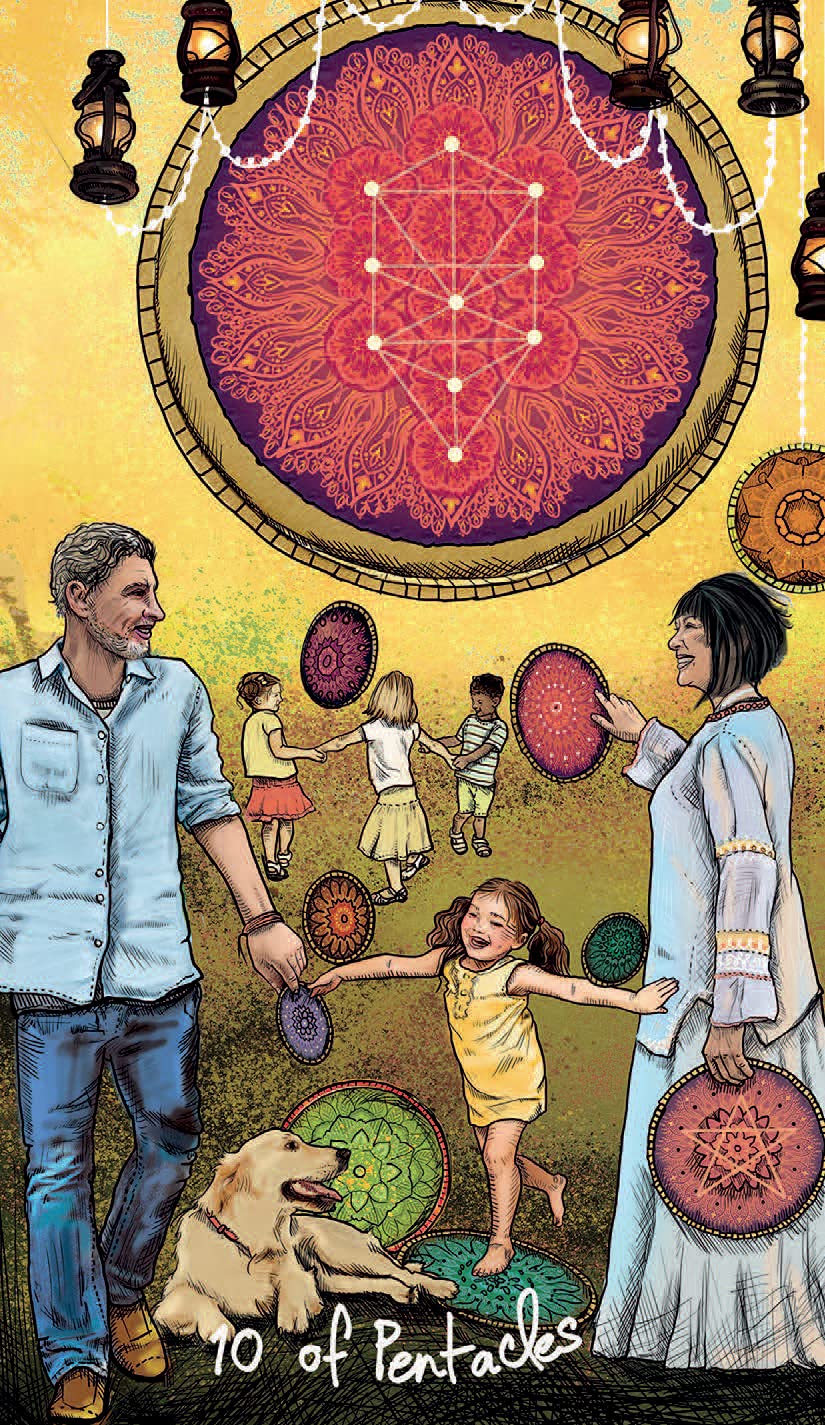
> The cards are sometimes inspired in the images in the RSWT, but reinterpreted and modernized (see the 10 of pentacles above(, while others are quite different but capture the mean meaning given to those cards (see the ace of cups above).
Colette is "the" Oracle master so I imagined that, if she had to create a Tarot deck, was never going to be a replica of the RW Tarot. The structure of this deck is, however, that of the classic tarot, but the imagery has been freely interpreted and simplified. Also a very feminine vibe has been added, as well as characters of different ages and ethnic backgrounds made part of the deck. Colette says in the booklet that she has added some LOA and positive psychology principles, but I am not sure is this is just blah blah blah. For sure, the deck has a positive vibe as reversals are gone as well as any 'distressing' imagery. The LOA and PPsy is more clearly found in the meanings in the booklet.
THINGS I LOVE
> The concept is perfect for beginners as there aren't reversals.
> The "frightening" images in the RWT are not there, so all the imagery has a positive feeling.
> The artwork by DellaGrotaglia is stunning once again. Her layering, textures and colouring are superb. Despite the sophisticated symbolism of her imagery and the richness of symbolic elements, the images feel clean and sophisticated at the same time. The imagery has a wonderful oneiric fairy-tale feeling that I love.
> The interpretation given to each card is short and sweet and captures the essence of what the original card meant upright.
> The fancy lettering describing the suit card and number is fanciful wonderful.
> Beautifully simple card back.
> The
Good Tarot has a mythological ethereal whimsical archetypal feel that
roots in the Tarot and in traditional fairy tales and angelic realms.
> The cards Strength and Love are wonderfully related with the women first controlling the beast and then falling in love with it. Like Beauty and the Beast.
> Sturdy beautiful keepsake box.
THINGS THAT BOTHER ME
>
This deck is massive and extremely difficult to shuffle even if you
have average-size hands, so it's really a pain for people with small hands.
> The cards gloss coating makes them stick together so they are difficult to shuffle. Shuffling well and easy is at the core of any reading, so if the cards don't shuffle well, what's the point?
> The booklet printing quality and paper stock are average.
> Some of the cards are slightly blurry.
> The major arcana card numbers aren't placed on a fix position, something that really annoys me.
> The blue tones from air and water suits are so similar that is difficult to identify which suit is which one by the color. The same re the earth and fire suits. Why not having completely distinct suit color palette for each suit?
> Too many winged beings in this deck. The air suit with angelic winged beings and the earth suit with butterfly-ish fairy beings and there are wings everywhere, really.
MIND
> The overall feminine tone of the deck might not speak to male readers or tarot aficionados. The only male figures are the Kings plus the hanged man and the page of earth. Figures that are usually depicted as male in the RW Tarot like the knights (messengers) and the Hierophant are here feminine as well.
> This is a simplification of the Tarot most common meanings, so it is not as rich and deep as the original.
SUGGESTION TO THE PUBLISHER
US Games Systerms has the best card stock in the market. It not only make shuffling a pleasure, it is good enough to have any artwork really pop up and display the right way. I think Hay House should just copycat the card stock, because most of HH Tarot decks, like this one, are too bulky, too heavy and to mass-produced.
This is a cute small oracle deck devoted to Kuan Yin, the Divine Mother.
I LIKE
> Beautiful imagery by the talented Chinese fine-artist Wan Yiguang with an atmosphere that captures adventure, youth, playfulness, and has a marked Tibetan/Mongolian vibe.
The young Kuan Ying,seems to be floating over the Earth playing with her yak, moving around happy and free with her loyal companion as The Fool in the Tarot would do.
> Fairchild's texts in this deck really resonate with me. In this deck, Fairchild's usual writing is deprived of her usual flourished never-ending verbose style and the meanings goes to the point without losing depth.
> A great oracle to start your day.
> No need of guidebook as the oracle message is written in the card back.
> Light, easily-to-shuffle deck.
> Hard keepsake box.
> Perfect for people with small hands.
ON THE FLIP SIDE
> The Divine Mother is a bit too young in the imagery. The character is not a woman yet. The story seems that of a young spirited girl who travels the world with her yak in a very playful mood more than that of the Asian goddess.
> The imagery and the text on the cards do not relate much. Other images might have been used, unrelated to the Asian goddess, and it would have not mattered. This being the case, this is more a text oracle than an intuitive oracle that relies on imagery, as the latter seems more decorative that intuitive.
> Cards coating makes them stick together, which is very annoying.
> Not many cards in this oracle.
> The quality and overall product does not justify the price.
GOOD STUFF
> Ceccoli's amazing artwork, which is a mix of toned up pastel oneiric surrealist art that is just my cup of tea. Each card is a piece of art.
> For whatever
reason I see this deck as very in tune with subconscious themes and
matters, and something that can be used in therapeutic settings as an
oracle or conversation started for people with trauma.
> Stunning printing quality.
> Great quality cardboard.
> Cards shuffle wonderfully.
> Sturdy keepsake box.
> Booklet in several languages (English, Spanish, French, Italian, and German.)
> Perfect for people with small hands or when you want to have a deck to carry around in a small purse.
> A wonderful collectable.
DISAPPOINTING
> Despite the beauty of the deck, this feels like an odd Tarot deck and more a collection of beautiful art cards made fit in into a Tarot and not images created to be part of a Tarot. This is just my impression, at least with some of the cards. Some of them fit well with their RWS counterparts at least in spirit, but others do no do at all.
> Not a beginners tarot.
> As the booklet is so small and limited, one gets lost in the beauty of the imagery and gets lost in it.
MIND
> If you really love this Tarot, get the full edition with the guidebook.
> If you have big hands this might not be your size.
Sandra Anne Taylor is really a master in creating decks that resonate with me, and this is another example.
This is one of the best decks I've purchased from Hay House in a long time regarding the quality of the artwork, deck design and production. It is overall a very feminine oracle, but also a very shamanic one, both very earthy and magical. Images of spirit animals, powerful feminine archetypes, natural forestry settings and Indigenous shamanic imagery blend together to perfection to bring us an oracle that will speak to people with strong feminine essence and into alternative spirituality.
THE ARTWORK
Webber's fine-art paintings for the deck are amazing. They are multilayered and richly metaphoric, exuberant but still sophisticated. The imagery has a predominance of earthy colors: ocher, golden, browns and greens that convey well the connection with Mother Earth and the world of spirit/totem animals. You could have any of the images in large format hanging from your walls. OTHER GOOD STUFF
> Although there are many oracles and decks devoted to the divine feminine, this one shines over the rest because of its mix of Gaian, Pagan, Wicca, Native-American, shamanic and reiki-like elements, which will resonate with anyone into alternative forms of spirituality and energy work.
> I love that this oracle imagery doesn't relate to Tarot major arcana as much as other oracles do. In that regard, this is not only an original deck, but also a true oracle.
> Imagery is potent enough to be used on its own in intuitive readings.
> A contemporary diversity-sensitive deck that depicts characters from several races and color skins.
> The cards stock is wonderful.
> Despite its size, the deck is not heavy or bulky.
> Very pleasurable easy shuffling.
> Great design and production from the interior of the keepsake box to the quality of the paper used to print the guidebook.
> Guidebook is wonderful. The quality of the paper is great and the texts are good. Each card meaning ends with a lovely affirmation.
OK STUFF
> No surprise, but except for the divine masculine card, all cards are feminine, so this is not a deck for men with strong masculine essence and energy.
> Cards are large-ish, so, people with small hands might find shuffling them a bit difficult.
> The card edges deteriorate easily with little shuffling.
> There is a lack of synchrony between some of the images and the meanings given to them. I'd say that the deck is 50% congruent and 50% non-congruent. In some cases, the concepts the cards relate to are difficult to convey visually. In other cases, the connection is not clear to the user even though it might have been for Taylor. Take for example cards 38 sensuality (not very sensual), 25 go with the flow (character seems concerned and apprehensive more than going with the flow), 22 Telepathy (it takes two to tango for telepathy), 49 Achievement (It looks more like power/strength) or 33 Building your World (it looks like an hermit) , just to mention some of the cards that I don't think represent well the concepts. would loved more if they had not keyword associated as they don't seem to match. For the rest, card 14 seems out of tune with the rest of the lot, and looks more like a painted photograph. It reminds me of some countryside scenes that I saw in Turkey or the Middle East years ago. Taylor says that she chose the artwork and then channeled the energies to create the deck, so the artwork wasn't specifically created for the deck, or so it seems.
> In the guidebook, I miss a reproduction of each card before each card meaning..
MIND
> The authors recommend reading the whole guidebook before using the cards.
> Order of the cards was chosen randomly and intuitively and some of them, looking very similar, were put together, even though they relate to different matters.
 GOOD THINGS
 > Fully portable.
> Light deck.
> Perfect for small hands and for children.
> Lovely illustrations overall. The back is really pretty and doesn't give away whether the card is coming upright or reverse.
> Deck shuffles well overall.
> Very good quality full-color guidebook with good basic content. Perhaps I like the booklet more than the deck.
> Good quality printing overall
> Multilingual wording on the cards: English, Spanish, Italian, French and German.
> Compact well-thought packaging
> It makes a nice inexpensive lovely gift.
NOT SO GOOD
> Quality of cardboard is deficient.It is more thick paper than cardboard so the cards start deteriorating after a few shuffles, especially the edges.
> Because the cardboard is so thin, cards tend to stick to each other.
> I Illustrations are wonderful but have a strong child-like vibe, so it might suit children and teens but not some adults, me in this case. Also, the proportions of the the heads in those characters depicted full body aren't natural. I know this is an artistic license, but this exacerbates the child-like vibe of the deck and it's not my cup of tea. .
> No racial diversity, so that might not resonate with some people.
> Deck has a strong dominant masculine energy overall.
I've find Baron-Reid's oracles magnificent. Some of the best oracles in the market to me, due to the accuracy and depth of the answers given to my queries.
What is the Wisdom of the House of Night? It is a world between worlds, the fantasy world created by novelist P. C. Cast. The story is loosely based on the Greek myth of the Godless Nyx, the Goddess of the Night. Mother of Hypnos (Sleep), Tanathos (Death), The Oneroi (Dreams) and Erebus (Darkness) among other mythological characters. Nyx's realms are liminal, those interstitial spaces between he day and the night, waking life and dreams, the conscious and the unconscious. In short, those in which the occult dwells. It is still nothing really dark or Lovecraft-ish. The cards, on the other hand, draw on Norse runes, Tarot, Greek mythology and I-Ching elements.
GOOD
> Very original concept.
> Good quality cards. Flexible, light and glossy, the cards glide beautifully in your hands.
> Excellent quality printing.
> Wonderful atmospheric artwork. The deck has artistic harmony and
integrity, an the images seem to connect to each other well.
> I
also love that the oracle has 50 cards and not just 40.
> Silver edges.
> Good size card, not too big, not too small. Perfect for everyone's hands.
> Decent quality guidebook with a nice description of the Nyx's story on which this oracle card is based.
> Durable deck. I have had this for several years now and is still in a good condition.
> Good quality packing box.
> This is overall, one of the best decks, re quality, I own.
> Pointy square edges.
>
Some of the images and the meaning attributed to them do not match. In
my case, those are: Loyalty, Denial, Invisible, Rigid, Honesty.
Complicated, Hope, Individuality, Understanding, Confidence,
Fulfillment, and Listening.
> The cards not always respond to my queries, that's why I don't use them as often as other oracle decks.Sometimes the guidance is spot on, but others the cards have nothing to say or to advice on or, said differently, do not resonate with me. As other reviewers have commented, I might need to warm up to the deck. Sometimes decks have spoken to me at the beginning and stopped speaking to me later on, and vice versa. This might be the case with this deck.
> As the card back is glossy dark, your fingerprints will be visible right there as long as you have two eyes.
Ciro Marchetti is one of my favorite Tarot artists because he's not only a wonderful digital artist but he as a deep knowledge of the Tarot. I have several of his decks in digital app format and they are my go-to every time. I was really excited about getting this mini-deck not just because mini decks fit perfectly in my hands, but because it's a Marchetti's. Now that I have it in my hands, I have mixed feelings about it. and I wish I had ordered the full size version so I could enjoy the colours and many details of Marchetti's imagery in full.
THE GOOD
> Wonderful artwork, with amazing colorful multilayered images full of symbolism, so they are perfect for strict Tarot readings or just intuitive symbolism.Said differently, each card is a world in itself, pregnant with meaning.
> I love the way Marchetti portraits masculine and feminine energies (sexy, athletic rock-star warrior-like men, and sexy erotic dancing Venus-likes), that's personal, and not might be your case, but it's mine.
> Amazing backgrounds and details in each image. The Gilded Tarot has a strong bucolic vibe and countryside scenes and small animals are a recurrence in most images.
> Presence of characters of different ages an races, and, I'd dare to say, sexual orientation (see for example the Hanged Man and The Devil).
> Some of the imagery captures the meaning of the cards is not only explanatory and helpful for the newbie, but also absolutely artistic. Some images in this deck are among my favs in Tarot decks: The Strength, King of Cups, Nine of Pentacles, Ace of Pentacles, Two of Swords. or The Hermit, to mention some.
> Good for traveling and taking it around in your purse.
> Perfect for people with small hands.
> Lightweight deck.
> The cards shuffle wonderfully.
> Box looks flimsy, but it opens and closes well without getting damaged.
THE NOT SO GOOD
> Tiny more than mini. You'll struggle shuffling these if you have large hands, or just not small hands.
> The many details and colors of the original are lost in this mini cards.
> Printing quality is just OK, not especially neat. This is a huge problem because Marchetti's images are baroque in a way. As I've mentioned above, they are full of details, symbolic elements and this size just washes away part of the wonder that the original deck has
> Not gilded or luxurious. Why did they called gilded to start with?
> No booklet/guidebook.
> No black characters in deck. There is just a couple of mulattoes, not black people.
MIND
This is a RWS-inspired Tarot.
Nudity.
ADVICE
Get the full size version or the app format.
I
didn't know anything about this deck when I first picked it up, a decade ago. I just
liked the deck cover image. Talk about intuition! However, it has become of one of my
favourite and most reliable decks. This is one of my top 3 oracle decks, and that's basically based on the connection that I have with these cards, the way my energy connects with them, and the fact that the deck seems to respond to my queries quite accurately and quite on point.
I find amazing the way that the cards seem to reflect my mood, what is
happening in my life, what is coming next, and are able to give me
advice on pressing matters. This is what any oracle deck should be
doing, right?, but not many do.
This is a deck perfect for intuitive readings as the deck is not overtly focused on any specific energy (for ex. matters of the heart or career matters) just general life energies.
I've been using
this deck for about a decade, and I've recently bought a new hard copy
of the deck. I alternate use between the app version and the hard copy.
THE CONCEPT
The oracle is inspired, as others by Colette, on both the tarot, I-chin, and Norse culture. The deck was created as a companion to the book The Map, but it can be used without having to check the book out. That's my case and it has always worked for me. The texts are great, very much in tune with the magic realms or whatever you want to call that something that is nothing but compasses everything.
THE ARTWORK
The production design and artwork are excellent and, despite the decade it has elapsed since first came out to the market, the artwork feels modern and fresh. Colouring is excellent but the original edition of the deck was more chic.
The digital collages and illustrations by Jean Dellagrottaglia are colourful, whimsical and full of magic. They don't have that cheap-photoshop-pastiche feeling that puts me off with so many other decks. This deck is truly stylish and gorgeous.
CHANGES IN THE ORACLE
The edition I'm now reviewing is different from the one I first bought and the app that replicates it. The cards meaning marquee and the number have different style and lettering and the cards have no marquee. The old ones had an elegant golden marquee, and the meaning was inside a golden scroll marquee. So, the current edition is less polished and enchanted than the original.
Besides, three cards imagery has changed: 33, 36 and 52. Card 33 has a very similar scene but the jumping character is a black girl, and card 52 has also a totally different image with a black woman. Both changes are very much of my liking and reflect racial diversity. Besides, card 36 Commitment, which had a more romantic image in the original, has now a more neutral imagery in this deck edition.
THE DECK QUALITY
This is one of the old Hay House productions and you can see the difference in care and quality with HH current decks. This deck is just fabulous:
> Glossy flexible good quality cardboard that is light, so the deck is not heavy or bulky.
> Easy pleasurable deck to shuffle.
> Good quality box packing.
> The guidebook is printed on decent paper and has decent content re the concept behind the deck, how to use the cards, and upright and reverse card meanings.
DOWNSIDE
> Cards are on the large side and you might struggle shuffling them if you have small hands.
> This deck is less enchanted in design production than the original edition.


