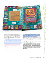
Despite the years elapsed since this book was first published, True Vision is still the book I'd recommend to people to start with if they're new to mixed media, art journaling or both. This work was first published in 2008 and the Kindle edition I used to read is from 2011; yet, it's the most compressive work I've found for art journaling while being authentic to who you are, without copycatting anyone. I find the book both inspiring and helpful.
THE STRUCTURE
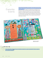
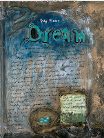
The book is structured in chapters evolving about different journaling themes, which Ludwig analyzes extensively: The written word, relationships, currents events, places and spaces, self-explorations, spirituality and dreams. Each chapter contains information about how to explore the theme as well as sections devoted to techniques, visual and journaling prompts, as well as intermezzos with interviews with different art journalists.
>> The Visual Toolbox sections make you learn new techniques
and/or increase your proficiency level in art journaling. Some of them were borrowed years later by other more popular
art journal artists, like Dina Wakley. These techniques are: Making a stencil portrait. --
Text onto metal mesh. -- Writing with fluid acrylics. -- Adding
Structured Texture to an Art Journal Page. -- Silhouette figure study.
-- Altering a child's board book. -- Faux landscape painting. --
Photographic self-portrait. -- More than the sum of our parts. --
Ink-jet transfer. -- Patina on paper. -- Blind contour drawing. --
Carving a self-portrait into a printing block. -- Altering scrapbook
papers.
>>
The Insight Activity sections describe some techniques to journaling and filling a journal page: Unblanking the blank page. -- Using
your best stash items. -- Automatic writing. -- Creating and using a
vision deck. -- Creating an imaginary musical alphabet. -- Using old
notebooks as a substrate or collage element for your artwork. --Using
poems. -- Creating versions of the same item (circumstance, day,
happenstance). -- Creating a page that summarizes your week. -- Creating
abstracts. -- Being a tourist in your own town and using using the
experience to journal. -- Building our sense of home. -- Using dream
characters to create pages.
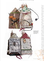
>> Take a Closer Look is where Ludwig interviews other artists whose journals fit the theme under examination: Bee Shay, Nina
Bagley, Traci Bunkers, L. K. Ludwig (herself), Juliana Coles and
Loretta Marvel. Many more artists are mentioned throughout the book, and
their art showcased, to exemplify what's being taught.
>> The appendix contains the Vision Deck for printing, a list of contributors (names, websites and/or email addresses), and a list of resources (art supplies, books and magazines as well as artists to look up).
THE GOOD
>> Despite the many years elapsed since first written,
the book has aged well and is still relevant and my first recommendation for anyone wanting to start journaling or improve their journaling.
>> Beautifully designed book, from the color palette (which changes from chapter to chapter) to the flourishes, the font type and sizing, as well as the overall layout. It is a very stylish book. Everything is just well thought and visually rendered.
>> Excellent photo quality and sizing. The images almost feel 3D.
>> Ludwig not only tells you how to journal and about what subjects, but also gives you tools and techniques that allow you to journal and to grow as an artist.
>> I find some of queries at the bottom of each section not only good for journaling but also to know thyself.
>> I love all the attention devoted to dreams as source of inspiration for journaling, especially because Ludwig has a clear Jungian and Gestal approach.
>> Most of the small tip boxes are really helpful and great. Like, they aren't obvious things.
>> The Interviews with other artists whose artwork isn't appealing to me. Yet, they also provide with invaluable feedback on different people's creative process.
>> I don't see the need of constant quoting. If you have to say anything, just be brave to own your own opinions. I confess that some of the ones chosen here supplement the idea under discussion well and they aren't the usual quotes repeated everywhere either, so that's OK. Yet, I don't like constant quoting.
>>The Photographic self-portrait visual toolbox is good but seems redundant
in this Selfies Era.
>> In this overwhelmingly age of the image, I miss a photo-by photo tutorial of the Visual Toolbox section. Ludwig describes the steps clearly and concisely, but I'd rather have a photo tutorial.
>> The
prompts vertically written on the right hand side of some pages are very
difficult to read if you're using a digital copy unless you totally
twist your head. They're great, so I've copied them at the bottom end of
this review.
>> Some of the prompts asking about things that happened when we were in second grade or very long time ago. Unless you have a savant memory, it's difficult to remember what happened unless you're picking up the book, say, in High School.
>> The book ends abruptly without conclusion or final words.
- >> Usurp an ordinary object for artistic purposes—a fork, perhaps. Bend the outside tines into a loop until they touch the fork, then spread the two middle tines apart. Is this a fork or a flower? Anything can be used. Think beyond the ordinary.
- >> Use serendipity. When something you read or experience dovetails with important things in your life, use it as topic about which to create. Messages from the universe should not be overlooked!
- >> Start out on one subject and wend your way around to another completely unrelated topic using a series of images copied to the same size. Start somewhere and end somewhere else.
- >> Map your path to work, the coffee shop, or the grocery store. Create an actual map, by drawing doodles of buildings, landmarks, squiggly trees... Make the scale how long it feels to get to a place, not the actual distance
- >> Place 4” (10 cm) squares of white, cream, and gray paper in a well-lit room. Notice how the light affects the colors as it changes over the course of the day. Try replicating these effects in your journal using watercolors.
- >> Empty an anxious heart onto your pages. Clip, paint, snip, scribble, splatter, write. Don’t consider the appearance of your page, just release your burden onto the paper. If this isn’t a page you want to commit to having in your journal, do it on scrap or deli paper.
- >> Take an old book from your hoard to use as a new journal. Instead of using it the way it opens, turn it 90 degrees and use it from that direction
- >> Turn up the volume: go for brighter versions of the colors you were going to use. Whatever you were going to do, do it bigger. Spill it off the page. Make it so big as to be unrecognizable. Make it so loud in color that anything else is hard to see, or so black that it could be a cave. Bigger, bolder, more volume!
- >> New journals can be daunting. Break in pages by dipping the book into a bowl of coffee, tea, or watered down ink. Hold the book by the cover boards to dip. Fan open to dry.
- >> Glue an envelope to a journal page. Write a love letter to someone, perhaps yourself, tuck it inside and seal it shut.
- >> When using text on a page, give it visual punch by creating words that jump off the page through their arrangement, color, or style.
- >> Find one image or object that is the quintessential distillation of someone or some place you cherish and create a page that supports the image or object.
- >> Make a photocopy of your palm. Head to the library and look up palmistry. Give yourself a palm reading and Create a page about what your palm has to say. Are secrets there?
- >> In second grade, what did you want to be when you grew up? What other things did you want to be when you grew up? Have you done any of those things? Do you still want to do any of those things?
- >> Try on different handwriting styles.
- >> Construct a page that interacts with the viewer. Try pull tabs, flaps, and small doors.
- >> Prove you exist.
- >> Collect doorways, or rather, images of doorways. Thinking about the nature of doorways can lead into some interesting journal work.
- >> Tear a piece of newspaper or tissue into rectangles and strips. Adhere these pieces to your page with acrylic medium. For additional texture, crumple the pieces before attaching them.
- >> Coat a page in wax and scratch marks or text into the surface. Rub graphite or charcoal into the scratches.
- >> Folding pages adds new perspectives. Fold before starting, to create separate spaces. Fold after, to create texture and dimension.
- >> Save your doodles. You can enlarge and copy them to create interesting backgrounds.
- >> Vagary. Despite its naughty sound, a vagary is a whim, an odd or eccentric idea. For one week, collect all your odd ideas, not just those that are art-related. Now choose one, two, or more and make pages about them
- >> Gravity. Use it. Spill coffee or paint onto a page, even one in progress.
- >> Create a visual joke, something that makes you smile each time you see it.
.png)
.png)

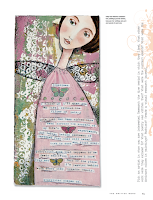
As the title reveals, this is a book written to showcase the creative process and teachings that Alena Hennessy follows with her students on the online program A Year of Painting. I'm sure that the online workshop is fun and encouraging, but since I'm reviewing the book, I can only say that I'm happy that the book was handed on to me and I didn't spend any money on it.
The book is structured following the four seasons. There is a seasonal checkup with journaling prompts and suggestions, activities and ideas for each month of the year, plenty of quotes, artwork by the author and her students as well as a detailed tutorial for each month.
GOOD THINGS
> Very pretty book edition overall and no typos or odd things on view.
> I love some of the naif paintings showcased throughout the book.
> Good quality photos.
> Greatly photographed step-by-step tutorials, which are great for beginners.
> Easy to follow tutorials even for people who have not much experience painting or with mixed media.
> The suggested list of materials is short and sweet. The reader won't feel overwhelmed by the demand for huge stash or super-duper specialized products.
> The Journaling prompts on the seasons check-up section are great.
> Hennessy's comments on the beginner's' mind, on putting in the work and the hours, and on holding back the inner critic in us are all good advice. >
"Certainly don’t feel bad if you want to mimic a work you see—you will
still make it your own and your style will grow stronger with time.
(Page 8)." I think this valid for beginners and it's brave for her to say it. It's not about copycatting
anyone style/voice but about practicing techniques and experimenting having
an end in mind. For sure, it won't help you find your creative
voice, but it will get your hands loose.
> Basic glossary of art terms.
> A traditional index at the back.
NOT SO GOOD> Not a good book for intermediate or professional painters. Like, it's too basic. It feels more a book targeted at craft painters than anything else. I think this is also highlighted by the overall quality of the artwork showcased in the book.
> Some of the monthly and seasonal projects are totally unimaginative, uninspired and even childish. Like create a work of art about love in February for St Valentine's, or a holiday theme for Xmas in December, or paint Spring flowers in Spring or Summer flowers in Summer.
> After each tutorial, there are several artworks from Hennessy's students showcased to further inspire the reader on the suggested theme. Yet, in many cases those pieces don't relate at all or very vaguely to that theme.
> The author says "This book is a bit different than other how-to painting books out there. It is inspired by my popular online course, A Year of Painting, and includes the work of many of the wonderful artists who participated in the course, so you’ll receive an array of approaches and styles as examples for each monthly lesson." (Page 8). That's quite pretentious and not true, at least in year 2023, when there are gazillion art books inspired in online workshops showcasing students' artwork.
> "If you are an experienced painter, allow this book to get you to try new things within your own style. My experience is that it can only deepen a portfolio and add to your creative toolbox. (Page 8)." Also pretentious. If you're an experienced painter, you don't need to open this book, you know more than the author.
> The Art Terms, i.e. the art glossary, is located at the beginning of the book and not at the end, which is a commonplace in edition. Many readers won't certainly need it while others will definitely do. This being the case, placing the glossary at the end makes even more sense.
> The "What You need" sections at the beginning of each tutorial have, at least in the digital edition, way bigger font than the text accompanying each month prompt and the tutorial written steps.
> Over-presence of 'paint flowers' suggestions and artwork. I love the theme, and I get that this is part of Hennessy's thing, but I would have also loved a bit of more variety.
> In the March prompt Hennessy says "The experienced artist will also enjoy this lesson for it allows us to “paint” with paper—not something commonly done by painters.(Page 41)." That's utter nonsense.
> Advising being intuitive while telling you how to follow a tutorial and make a painting that represents who she is, it is just counterintuitive. There are not hints on how to work with your intuition, especially in a book that follows the seasons and is quite linear and uninspired.
> The structure of the months follows the Northern Hemisphere not those of the Southern Hemisphere. So Xmas and Summer go together there, but this isn't considered.
> Too many unnecessary quotes that add barely anything to the book.
It's a OK book for beginners. One of the many naif art books out there with nothing original that you cannot learn elsewhere, on YouTube for example. Overall, I find it amateurish and a bit pretentious, but also useful for craft painters and people who have never tried mixed media. I have no doubt
that the online course is way more fun. You can look up the author name on YouTube and find some of her tutorials. See if it's your cup of tea and whether the book is for you or not.
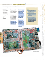
This is a workshop packed in a small book that teaches how to doodle and how to go from doodling to mixed-media painting in simple steps.
THE BOOK IN A NUTSHELL
1/ We collect all our doodles and make connections between them re style and themes. We upgrade their presentation by framing them or putting them in the center of a sheet of paper.
2/ We make doodles using just lines. They can be thick, thin, tall. short, curvy, straight, dotted, dashed, etc.
3/ Then we make small doodles by just using our hand and fingers; sticky notes are perfect for this. Then, we make medium-sized ones by moving the wrist and forearm; paper sheets are perfect for it. Finally, we make large doodles by moving the full arm and even the whole body; big rolls of butcher paper attached to the wall are perfect. We can use three sheets of paper one for each king of doodling size and also mix the three doodle movements in a single piece of paper.
3/ Now we explore doodling by mixing circles and lines, starting with 7 of each,mixing and matching them in different ways and layouts.
4/ This is the time to start a doodle from the left side of the page and keep going, as if we were writing without a stop; when we reach the end of the line, we move to the one below, starting from the right side. We fill in a page this way.
5/ Doodle while reading is the following exercise. With one hand we hold the book we're reading and with the other, without looking, we doodle automatically and without much thinking.
6/ Now is the time to pick a theme and doodle about it repeatedly: flowers, animals, things, leaves, trees, birds, landscapes, everything goes.
7/ Take a line for a walk, inspired by Paul Klee's work, is a variation of the exercise described in point 4. We walk the line all around the page, starting with a black pen or marker, and then we fill in the white spaces with colors. We can use different colored pages as a substrate.
8/ Now we start preparing for the painting. We prepare the paper with gesso, add texture and color. There is a tutorial to build a simple lovely colored paper book where to doodle. We can also use old journals to create a substrate on where to paint.
9/ We then enlarge (or shrink) our doodles by zooming them out (or in) via photocopy or scan. Then we color them and apply warm, cool or neutral hues, or a mix of them.
10/ We use a wood panel, apply rice paper with gel medium and them copy one doodle, previously enlarged as follows: "Trace the doodle with the pointer finger of your non-dominant hand, and with your dominant hand, use a marker to simultaneously recreate the image on the rice paper." (Page 78). Then, we add acrylic color.
11/ Another exercise is to draw a grid and use it to position several doodles inside.
12/ We can practice the painting techniques described above to create a series. This can be done by using figurative or abstract doodles.
Voila!
GREAT
>> This is a simple easy-to-follow method that is both practical and enjoyable.
>> Culhane demonstrates that any humble doodle is important for art making and why.
>> The structure of the book is great and organic.
>> The step-by-step photographed tutorials.
>> The book has plenty of photos of the artist at work, of her doodling, and of the process and exercises she she explains
>> The easiness of the exercises and the fact that they don't require expensive art supplies.
>> The reuse of old notebooks for art purposes is brilliant.
>> The color wheels in page 74.
>> No typos or editorial oddities in view.
>> Very user-friendly digital edition.
>> I don't think you need wood panels to carry out the last part of the workshop unless you're a professional painter and/or want to sell or gift the outcome. I think watercolor paper will do the job at a fraction of the price and it's easily archivable.
>> Even though I love the idea, using bill rolls of paper attached to a wall is nothing renters can do, at least in the country I live in.
>> The Artist Gallery at the end of the book, is a bit too small. Also, I would have loved the author explaining the criteria used for the selection.
>> The digital price is a bit high for such a simple book.Just my opinion.
This
is a very enjoyable, simple-to-read sound book with great advice for
artists (from beginners to emerging) on how to develop our artistic
voice. It delves into what an artistic voice is, why is important having
one, how to find it, and the struggles to get one.
Ireally love Congdon's delightful
humorous illustrations spread throughout the book.
Our artistic voice is the art that we make when we listen
to our inner truth and convey it to the world in our personal way. Our
artistic voice is made of "all of the characteristics that make your
artwork distinct from the artwork of other artists, like how you use
colors or symbols, how you apply lines and patterns, your subject matter
choices, and what your work communicates." (p. 7).
Congdon says
that to find our voice we need to show up, make art every day, be
disciplined, practice-practice-practice, 'positivize' boredom and
embrace our fears and self-doubt. We also need tons of patience because,
as mastering a musical instrument takes years of hard work, so does
Art. Embracing our fears and doubts is especially important for
beginners, and, that being the case, we have to have compassion and
patience with ourselves and our mistakes, with the disasters and the ugly
pieces, because they're the stepping stones on which our artistic voice
is gonna be built. For the rest, all the interviewees agree on the fact
that hard work and expressing our personal truth, who we are, are
the recipe to find our artistic voice. Except for some 'geniuses', most
professional artists have to work at it. Congdon says, "The unfolding
of your voice requires showing up and working hard. It requires being
willing to create failures, to ask for feedback, and to go back and try
all over again. It requires staying open. It requires moving outside
what’s comfortable and being vulnerable." (p. 119).
STRATEGIES TO DEVELOP YOUR VOICE
Congdon recommends twelve strategies for developing our own artistic voice, and they are:
1/
Make art every day, even for a few minutes.
2/ When things get hard or tough don't stop; keep going.
3/ Embrace monotony and boredom to
break through and experiment.
4/ Create challenges and
stick to them, no matter who's paying attention to them, even if it's
just ourselves.
5/ Learn to practice mindfulness when we go outside
into the world to notice new things, new colours, curious weird stuff.
6/ Find a space to be alone to create.
7/ Find a feedback partner or
critique group.
8/ Take classes.
9/ Brainstorm.
10/ Develop your
vocabulary of interests, knowledge, and ideas.
10/ Support other artists
and learn from other artists.
11/ Stay open to all experiences.
The
book is intended mostly for artists who want to have an artistic career
or are professional artists. Yet, the advice is great also for
everyone, even beginners like me, who want to have a distinctive voice
and express their own world view through Art.
THINGS I MISSED
The
interviews with other artists are very interesting, but I see them
fitter for a blog or art magazine. Besides, some of the most important points
they make could have been summarized for the reader without the need to
go through the whole interview. Also, I would have loved having the
invited artists' artwork featured in the book (like 2-4 medium size
images per head) as well as their website and social media accounts
listed.
Some images simply work, they feel right to us. We don't consciously know what makes images work because many times, when we look at an image, we attribute value to what we like. However, an image works or doesn't regardless whether we like it or not. So, which elements or principles make an image work?
This is the premise for Picture This. Molly Bang asked herself this question 25 years ago, dived into the world of imagery and then came up with a series of principles that make any image work and give it more or less expression and emotional content.
BASIC PRINCIPLES SUMMARY
These are basic staple principles that Bang lists and are grounded in our instinctive positive or negative responses to the world. The concepts are always used in combination and within a given context.
> Smooth, flat, horizontal shapes give us a sense of stability and calm.
> Vertical shapes are more exciting and active. Vertical shapes rebel against the Earth's gravity. They imply energy and a reaching.
> Diagonal shapes are dynamic because they imply motion or tension.
> The upper half of a picture is a place of freedom, happiness and power; objects placed in the top half also often feel more spiritual. The bottom half of a picture feels more threatened, heavier, sadder or constrained. Objects placed in the bottom half also feel more grounded.
> The center of the page is the point of greatest attraction.
> The edges and corners of a the picture are the edges and corners of the picture-world.
> White or light backgrounds feel safer to us than dark backgrounds because we can see well during the day and only poorly at night.
> We feel more scared looking at pointed shapes and more secure or comforted looking at rounded shapes or curves.
> The larger an object is in a picture, the stronger it feels.
> We associate the same or similar colours much more strongly than we associate the same or similar shapes.
> Regularity and irregularity—and their combinations—are powerful.
> We notice contrasts as contrast enables us to see.
> The movement and import of the picture is determined as much by the spaces between the shapes as by the shapes themselves.I LOVED
> The book
feels fresh despite this being the 25th anniversary of the first
edition. > The book is short and sweet and gives artists some tools to consciously create images and scenes that work. Some of these rules might sound simplistic, but most of us would not come up with this conclusions when looking at any sort of artistic imagery. //
> Bang explains everything in simple language and using minimal imagery that shows, without a doubt, how and why images work.
> The initial chapter "Building Emotional content of Pictures" in which Bang uses simple shapes, basic colours and an exploratory approach to build an image for Red Riding Hood. as she verbalizes her art process. I also loved the example she gives at the end of the book, with imagery from her illustration book When Sophie Gets Angry—Very, Very Angry, exploring her depiction of the arch of feelings in the book.
> The exercises mentioned at the end of the book. Even if I haven't done them yet, because the advice given is sound when creating an effective picture. One of my takes from this section is also the fact that, sometimes, we tend to focus on the details in a picture, but the question is, are the details necessary and contribute to enhance the feeling or message or emotional impact of the picture, or a distraction?
DOWNSIDES
> The epigraphs font size is too big and there is no gradation in sizing when there are sub-epigraphs or big sections. That's an edition problem that can be easily fixed in the Kindle edition.
> Bang mentions that the principles are a work in progress. Since these principles were explored and listed 25 years ago, I would have loved Bang mentioning if any others can be added .
> I would have loved having some famous paintings being analyzed following each of the principles listed, so that we could see them working in action. This would have rounded the book beautifully and it is easy to do digitally.
 Hilli's book is both a source of inspiration and a constant frustration to read. This could have been a great book if anyone had bothered to edit the book for content. It has great advice and concepts, but it is too wordy and repetitive and feels amateurish.
MAIN CONCEPTS
> Zero to One, there is more distance or space between zero and one, than from one to two, two to three. In art, this means that the most difficult thing to do is starting anything. That is why a blank canvas can be terrifying and we postpone or delay working on it.
> The adjacent possible shows that any option that we make, whether in life or art, leads to something else that was unpredictable or unknown. It is something like the butterfly effect. So a new mark or line in a canvas might create, for example, a shape that inspires us to create something else that we hadn't thought about. For that to happen, the artist has to be ready for the unknown, dive into the unknown, allow the unknown to materialize by opening to it, and leave the predictable, the rules and the comfortable behind.
> Exploration and experimentation are at the core of creativity, and are the basis to progress, grown and evolve as an artist as complacency gets artists stagnant.
> Ugly art is necessary and teaches us invaluable lessons. We need to get comfortable with our ugly stuff and see that as a stepping stone for improvement and growth.
THINGS THAT I REALLY LIKED
Beyond the concepts mentioned above I liked some of the points that the author made. Here some of them:> Not being a known artist is actually a blessing, as this allows to create good art. However, even professional artists benefit for the approach of obscurity: What would you create if you were invisible? How would you sing if no one were watching? What if you were unself-conscious in your art making? What risks would you take if the outcome didn’t matter? > It is never pleasant when someone is critical of your art. The worst part: however, is when a part of you agrees with the criticism.(p. 60). > Advice on how to keep track of our art. > The questions to make a self-assessment of our art.> The technique trap: No amount of technique will move you closer to expressing your deepest art. Technique is painting from the outside in, rather than the inside out" (p. 148). > Learning that Joseph Campbell wasn't the father of the concept of the hero's journey.but Edward Burnett Tylor. > The fact that luck is related to two habits: changing up daily routines and avoiding over-scheduling. > I thought that the best chapters in the book, due to their content, structure and clarity, are: -- 12 Three tips for artists (keep a journal, just start, and work in a series).
-- 13 Three massive mistakes even the pros make (painting paralysis, the tyranny of technique, and empty virtuosity).
-- 14 Four traps artists face where old beliefs are replaced with new ones ( the critique trap,
the imposter trap, the judgement trap, and the technique trap).
-- 15 Three invisible paradoxes ( the refusal, the perils, and he dark night of the soul).
Finally, I also liked the recaps at the end of some chapters, some of the simple exercises advised and the fact that any major point discussed in the book has a real life story attached to it. NOT SO GOOD
This is a self-published book and, unfortunately, shows terribly. The book lacks a good structure, lack of cohesiveness in structure to be precise, as repeats the same ideas na concepts over and over, ad nauseam. One gets exhausted after the same ideas are repeated ad nauseam for nearly 200 pages.
Some of the more scientific concepts are unnecessary discussed in scientific jargon when in fact the simple explanation given at the beginning is sufficient. I thought that the description of what the hero's journey is was too long. Also, Hillis has a tendency to divert from the discourse at hand to then go back to it.
For the rest, the book seems addressed to professional or established artists not as much to beginner artists.
KINDLE EDITION
The Kindle edition is well edited except for some minor typos. Some of the ones I've noticed:
-- p. 78 short dashes should be replaced with long ones.
-- p. 155 there is the 3rd item of a list, mistake number 3, but is mistakenly labelled as mistake #1 .
-- p. 215, an hyphen is used instead of a long dash.
IN SHORT
The core of the book is as follows: start something even though that's the most
difficult part. Experiment, be fearless, accept your mistakes and learn
from them. Do art that reflects who you are not what other people want
to see. Keep open to experimentation and the unknown as these are
the keys to artistic growth. Technique serves art and it is not art per se.
This is another great book for beginners by art journalist extraordinaire Dina Wakley. It's packed with very easy to follow (and well photographed) tutorials, encouragement to start or continue with your art journey, and plenty of mixed-media techniques, like creating your own stencils, just to mention one that I loved.
Each chapter tries to motivate us to leave fears aside and start creating and the advice given is simple and sound:
-- Fear: I don’t know what to write! And I don’t like my handwriting. Courage: Writing takes practice! Plus, the only person who doesn’t like your handwriting is you.
-- Fear: I can’t draw. Courage: You can draw once you know the formula. And once you commit to practice!
-- Fear: I don’t want to, or know how to, include my image in my work. Courage: Examining yourself is a time-honored artistic tradition that helps you learn and grow as an artist.
-- Fear: Layering is hard. I don’t know what to do next. Courage: Breaking down the layering process into tools and methods will help you layer with confidence.
-- Fear: You don’t have the newest, trendiest art supplies so you can’t make good art. Courage: You can use supplies in unexpected ways to keep your artwork fresh and exciting!
-- Fear: I have to have everything planned in my head before I work. Courage: By working organically and intuitively, you can create interesting art and push yourself to see more.
-- Fear: Working in my journal is comfortable, but I’m afraid to move on to other projects. Courage: Moving your art from the journal page to other substrates and mixed-media projects is satisfying and exciting!
The language used in the book is simple and effective, no technicalities. Even if you don't follow the tutorials to the letter or not at all, you'll still learn a lot of stuff that will improve your artwork.
The table at the end of the book with the properties, uses and downfalls of each media type is excellent.
Wakley, who has a huge range of mixed media products for sale in the craft market, doesn't promote them in the book at all, so that's really refreshing.
KINDLE EDITION
The Kindle edition is really good and the images have good resolution. Besides, the pages can be bookmarked and annotated easily, unlike other art books on Kindle.
DOWNSIDES
> The initial chapter on tools and materials is a copy-and-paste of Wakley's previous book Art Journal Freedom.
> Chapter Six starts with a big statement about the fact that we don't need expensive supplies to art journal or paint. Yet, in the tutorials included in this chapter include the use of very expensive PanPastels and Caran D'Ache Neocolors.
> I would have wanted a bit of more guidance on face shading because the book barely provides guidance on this subject.
TYPOS
Bold is missing from the words 'fear' and 'courage' at the start of chapter 6.
Without a good composition, images simply don't work.
I'm a fan of Wakley's art products so I thought I'd give this book a try. This is a short enjoyable read, great to understand basic rules of composition and colour. Everything is explained in a very simple effective way, in a language that has no technicalities or complexity. Wakley also shows how to break the rules and when to do it. By the end of the book, one gets to understand why some images work and others not. Subjects discussed in the book are: symmetry/asymmetry, white space, continuance, closure, proximity, dominance, repetition, colour basics, contrast with colour, and colour as composition tool.
THINGS I LOVE
> The book is a workshop on its own.
> Good for anyone wanting to start painting not just art journaling.
> The summaries at the end of each book with taglines about the major points discussed.
> Everything Wakley says is exemplified by images coming from her own artwork, so it is not just theoretical talk.
> Each chapter has a tutorial, simple but beautiful, really well explained and photographed.
> Each page has prompts to put some of the points discussed in practice.
> Although the book is for beginners, it has plenty of value for intermediate artists.
> Great Kindle edition and quality images.
I DIDN'T LIKE
> The fact that a sewing machine is one of the tools needed. I don't have one, and I don't think this is really necessary. Some of the things Wakley does with the machine can easily be achieved with a marker or pen, so why not providing this alternative?
> Although I love Wakley's artwork, I would have loved having visual examples from other artists exemplifying what she says.
MIND
> This is a book thought for beginners, so take it as such.
> This is a book about mixed media not drawing or painting per se.


.png)
.png)
.png)
.png)
.png)
.png)

.png)
.png)
.png)
.png)
.png)
.png)

.png)
.png)
.png)
.png)
.png)
.png)


.png)
.png)


.png)
.png)
.png)

.png)
.png)
.png)