Showing posts with label Sequential Art. Show all posts

Daytripper by Gabriel Ba & Fabio Moon, (2011)

, 15 Jun 2016


"I wanted to write about life, Jorge, and look at me now... All I write about is death.
Ahh, but you know all too welll that death is a part of life my friend.
You're right.. death is a part of life.
Yes
and so is family. " (p. 22-23)

Daytripper offers an harmonious symbiosis of graphic art, an interesting narrative and engaging story with enough surprises and elements of reflection to make it a winner. Two Brazilian artists are the creators of this beauty, twin brothers Fabio Moon and Gabriel Ba.

Daytripper is set in Brazil and tells the story of Brás de Oliva Domingos' life. He is a Brazilian journalist, working in the Obituaries section of a newspaper, an aspiring writer, son of the famous writer, and a man who wants to live life to the fullest. The novel presents his life in shuffled chapters that are not always chronological and some of them also have flashbacks to his past.. The chapters and ages are important events and life-changing experiences in Bras' life:
Chapter 1- presents us a 32y.o. Bras
Chapter 2 - ditto 21y.o.
Chapter 3- ditto 28y.o.
Chapter 4- ditto 41y.o. 
Chapter 5- ditto 11y.o.
Chapter 6-  ditto 33y.o. 
Chapter 7- ditto 38y.o.
Chapter 8-  ditto 47y.o.
Chapter 9- ditto in his 70s. 
Chapter 10- ditto 76y.o.

We are told of Bras' childhood and late years, his first kiss, his bad and good relationships, of his job and family life, of his dreams and angst, of his low and high moments and, most importantly, of his hunger for life, his quest to live his life in a way that fulfils him and helps him to be himself.

Each episode ends with the death of Bras and with a small obituary about him. There are many elements that make the novel different from other personal or family novels, but this is perhaps the one that intrigues readers the most, and the one that has generated more comments and analysis. 


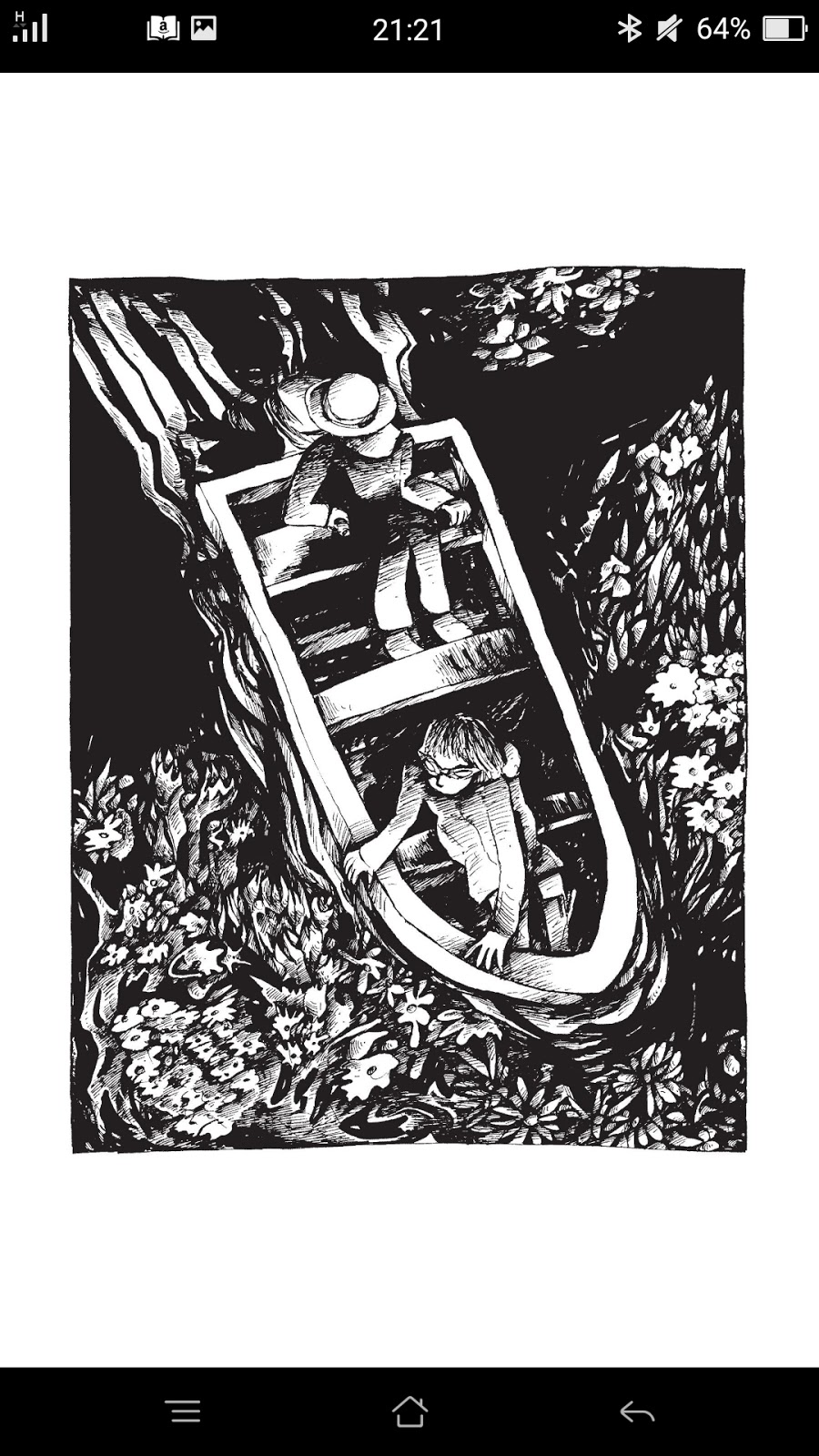
I found Daytripper very engaging visually as it has a great variety of scenes and subjects, with full page images and different styles of vignettes, day-night images, interior-exterior scenes, urban and countryside landscapes, black and white characters, all of them beautifully drawn and lighted.  I cannot stress enough how much I loved the colouring. Dave Steward (a nine-time Eisner Award-winning colourist) did a sensational job and took the novel to the next level. The colours are always appropriate, beautiful and bright at times, dark and moody  others, neutral when necessary. They never overwhelm the narrative, or the drawn images but are an intrinsic part of it. The bucolic images of Bras' childhood are glorious and among my favourite. The lettering is by Sean Konot. The text boxes, text balloons and typography are very classic, elegant and functional. The novel has a great deal of dialogues and text but, despite this, it rarely looks overcrowded, so that is Konot's merit. All the artists have contributed to create a wonderful piece of Art.

Regarding the narrative, I always love non-linear structures. Episodes 1-5 aren't chronological, and the others are, and I thought  that the first five were more exciting to read. Like a piñata you have to approach blindfolded to get the candy. The conversations are real as life itself, the sort of conversations you would hear from real people, a bit pointless sometimes, a bit necessary others, a bit philosophical others, not always 'exciting', we don't always talk about super-duper things, do we?

The characters are well-rounded, believable, almost real. Although there are many characters in the book, Moon & Ba focused their energy on those who really matter,  Bras firstly, his father and his dear friend Jorge. The authors say at the end of the novel:
" Firmly based in reality, the most difficult thing wasn't trying t create a world that would look real  No, the hardest thing was creating a world that would feel real". 
Indeed,  the story feels real, lived, and the feeling is there, in the images and story we are presented with, but also in the way the story makes us feel, the way that transports us, or at least me, to our emotional realms. I cried at the end of the book, moved by the lyricism of the last images and the story told.


The main themes touched in the book are timeless and will touch anybody wanting to listen. Meditations on life are universal no matter the format, approach or the origin of those who do them. We are all flesh and bones basically. The only particularity in this approach is that death is used to do that meditation on life. Not death per se, but as a standpoint on which to look ahead and understand what life is and to ground us in life, the right-here-right-now. Some of the questions posed by the story are:
# What is death?
# Which moments in life make us die inside?
# Which moments in our lives make us want to die?
# If we died today, right today, how would our life look like to other people?
# If we died today and we could write our obituary ourselves, how would we see our own life?
# If we knew we were going to die in a precise time, would our way of living change?
# Are life dreams necessary to live life better?
# Do our night dream say something about who we are and how we live?
# When faced with death, do we realise what matters the most, and if so, why don't we focus on what matters the most in our current life?
"Death gives us a whole new perspective on living and everything else... everything else seems so minor and silly" (p. 94)
Daytripper is also a very Latino novel. Latino as in the Latino culture-s shared by Portuguese and Spanish speakers on both shores of the ocean. It presents us with very strong family ties, extended families, a love to communicate around food, and a natural presence of death in our daily life. However, there are elements in this novel that are very Brazilian, the racial mixing and social differences, some of them hinted in some of the conversations with Jorge, and especially the religious syncretism, the Candomblé and Umbanda, and that powerful mix of Catholic and Yoruba beliefs. Thus, the presence and cult of the goddess Iemanja is clearly shown and integrated in the story. Two of the most important dreams Bras has in the novel are, indeed, related to calls from Iemanja -- the goddess of the sea, the protector or love and family, the creator of life. Although it could be said that Daytripper is also very Latino in its Magic Realism I have to disagree with the story being part of that genre. 


There is a sort of tendency among reviewers to call Magic Realism to anything produced in Latin-America where the narrative is not straightforward, with oneiric and surreal elements are present. I won't lecture anybody on what Magic Realism is. You can easily get that by reading a classic novel like One Hundred Years of Solitude and learn it in the best way possible. However, even the entry in Wikipedia gives a good overview about the genre and summarises the differences between Magic Realism and other genres like surrealism, fantasy and imaginary realism among others I think it is great to keep it in mind to approach and better to understand this novel. I mention all of this because this Magic Realism is used in many reviews to explain why Bras dies in each chapter. In reality, if you re-read the book or just pay attention to the details the first time you read it things are not what they look like.  

****This section might contain spoilers*****
 There are many clues in the book, even before your finish it, that show that what is happening is not always real. Part of it is a metaphor, part a fragment  of the story told as a whole. Here some clues. Ask yourself:


1/ Once you finish the book, look at the text boxes' shape and lettering. Which text boxes in the book match those at the very end?
2/ Who do you think wrote the obituaries?
3/ Who is writing the book and seating in front of a typewriter?
4/ After reading the chapter The Dream, and learning what is happening to  Bras, ask yourself what in the book is similar to that chapter?
3/ At the end of each chapter ask yourself, if the death of Bras wasn't real, which events or circumstances  would make Bras, or any other person, "die"?
If you are lazy, my answers are at the bottom of this review.
**** end of spoilers****

***

The short introduction by Craig Thompson, the author of Blankets, is very cute and cool!


Although I enjoyed the novel enormously, I found that the gap between Bras' 40s and 70s is a bit too wide and empty of content that the novel is a bit unbalanced. I would have loved seeing Bras and his family getting progressively older, and reshuffling the chapters a bit more to add a few more layers and produce a rounder  story. Also, we are presented with bourgeois characters, with predictable lives, who might not thrill all readers.

***

Daytripper is a comic with capitals. For those who don´t like reading superheroes comics and want to find something more interesting this might be a good way to start. There are plenty of oneiric and surreal images in the book, many mysteries and things out of the ordinary. However, what has stayed with me is the message of the story, live life to the fullest, and make every second in your life count. We are the same, we long for the same things. We worry about the same stuff, family, job, relationships, food. We are born, we live we die. We cannot do anything about the first two, but we can live our lives in ways that fulfil us. Life is also full of failure, disappointment and dead ends and we have to accept that those are going to be there and are also part of life, as death is. 

 ***

 ****get spoiled :)****
Here are my answers
Bras says nearly the end of the book: "My name is Bras de Oliva Domingos. This is the story of my life." The typography used and the text boxes used in these pages are the same as those we see at the end of each chapter when Bras dies, so it is not just Brass writing the whole book of his life, he is the one writing the obituaries of those supposed deaths. In the chapter The Dream we are told .that he has been diagnosed with brain tumours, which are affecting the way his awakened and oniric life work, they seem to mix past and present, and overlapping things. If you see the book as a whole this is just the structure of the book, an overlapping of moments in Bras' life in which things that seem magic or fantastic are just a creation of his sick mind but most of them aren't so. I don't think Bras dies in each chapter at all. He dies or is killed inside, or rather, a part of him dies, which part?:  
chap, 1-he "dies" because he loses trust in people and in their goodness. 
chap. 2. he is dying to find love.
chap. 3-he dies when a relationship fails. Even more when he lets an opportunity pass by because he isn't ready to take a chance,.
chap. 4- he dies because his heart is broken after the death of his father.
chap. 5- he dies, but not in a negative way, when he loses his innocence and starts to leave childhood behind. 
chap. 6- he dies when he loses his best friend. 
chap. 7-he dies when his best friend betrays him. 
chap 8- he dies when he is away from the people he loves the most.
You can also interpret part of his biography as part of that mix of dream-reality that the tumours Bras have are producing in him when trying to write his own life and obituary. 
Life sometimes kills but not always makes you die :)).
The beauty of the story is that you might interpret it differently. That is always awesome.

Descender Vol. 2: Machine Moon (2016)

, 8 Jun 2016

Descender vol. 2, like the first instalment of this galactic saga, is a graphic novel with amazing visuals and an entertaining story. It is like one of those comfort-foods that you want to eat over and over again because, although it is not gourmet, original or new it tastes good, warms your belly and makes you feel good.

I'm always mesmerised by Nguyen watercolour and drawing mastery and artistry. I love his use of colour and the way he creates lights an shadows using positive/background space. I love how good he is a creating landscapes and characters that can be painted with great detail or just sketched and deconstructed but, visually, still fully there. That is the case of his long distance images and background crowd images; the more you look at them the more they look like blotches of colour, but they are masterly shaped to create the illusion of a full image. Like in Descender 1, Descender 2 has a cohesive colour palette, with colours and hues that are consistently used, some of them are there to depict the environment where the action is happening, but there is a preference for different hues of white, blue, pink and dark greys, with other bright colours popping up secondarily, like red and orange. I don't know if it is a coincidence, but a dark hue of pink is always in the image when Tim-21 experiences special moments in the story. Descender 2  story has more action than  Descender 1 so Nguyen plays more with the composition and layout of the vignettes to create dynamism and tension. Like in the previous volume, memories from the past are drawn in sepia tones with a superposition of scenes or developed scenes that have no vignettes; that is the way the mind and memory work -- as an amalgamation of images, words and feelings that are never square or structured. If you are into the Arts you will linger on each page, slowly sipping the watercolour work and Nguyen's artwork.


Once again the typography used in the book is very dynamic with different fonts being used to differentiate noise and ambience sounds, machine speech, robot speech, human speech, static signing, informative narration text and so on. This enhances the reading and makes the text more engaging and enjoyable.

As I mentioned for Descender 1, I love Lemire but I don't think Descender is his best work. Descender 2's narrative, character's depiction and dialogues  are still science-fiction déjà vu and cliches. Some characters are crowding the pages without contributing to anything and wasting a time and space that could be devoted to a more in-depth depiction and analysis of the main characters. Descender 2 is better at doing so than Descender 1, though, as there is a bit of more digging into who the characters are, albeit superficial and not deep enough to create round unique characters that don't remind you of anything you haven't seen or read before. Some of the characters that were a bit annoying, distracting and unnecessary in volume 1 are toned down and almost gone in volume 2, like Driller the Killer. However, we see others occupy that same annoying spot, like the funny-ugly predictable Blugger in volume 2.  Is he necessary to the story? Does he contribute to the story? To me, he doesn't, at least so far. The same happens with some of the dialogues, which are uninspired and a bit blah, and heard gazillion times in any other comic on planet earth. I found a bit ridiculous calling Effie the Queen in Between, jeez, I would have expected a bit of more creativity, a one word name that means just that...  


On the sunny side of things, the story seems to follow places that, a priori, we are lead to think that it would not happen. Like Andy popping up. We, or at least I, feared that Tim-21 quest would be met with disappointment, but Andy pops up in this volume and there is a great joy and intrigue. Andy is perhaps the most developed character in the story so far and I am intrigued about his motives. We get to meet some of the leading robots known as the harvesters, enter their mechanic moon, and get to know who they are, what they want and what they believe in. I enjoyed the mix of Huxley meets New Age beliefs that the leading robots have; there is a bit of gold buried there and I hope we dig it out in the next volume.  Although there aren't oneiric images in this volume, some of them are oneiric-like, especially those related to the fall into Planet Phages, and very lovely.  Finally, the story touches many interesting important themes: self-identity, individuality, race, alterity, ethical behaviour, what life is, what being human means, and what makes us connect. The more I read Descender, the more I see it as a quest for the ideal brotherly love and for connection, whatever form this might take and whomever is the being one connects with. The worlds in the Descender galaxy are multifaceted and interesting despite the flaws of the story.

The ending of this volume, although not a cliffhanger, gets me interested, and, once again, I will be buying the next volume hoping that the story follows unexpected paths, that we get some u-turns and surprises and that some characters have more depth, and being sure that Nguyen's artwork will keep me going no matter what.   


I read this book it on Comixology and the digital copy is fantastic. It makes you appreciate all the details of the artwork, and even the ruggedness and pores of the paper used for the paintings. One gets the impression of having the original in front of the eyes. I love that touchability of the images.


How to be Happy by Eleanor Davis (2014)

, 2 Feb 2016

HTBH is an anthology of comic strips and stories published by Davis in different publications, drawn both in colour and black and white.  

How to be Happy sounds like the title of a motivational or self-help book but. as the author herself reveals in the foreword, this book is not a book on how to be happy. The cover certainly helps to convey the same idea.  Despite the stories being quite different in style an tone, the book has a few main themes. Most of the stories are very introspective, and revolve about people looking inside to get their suppressed emotions out, people struggling to feel, numbed people, depressed people, over-emotional people. One of the stories in the book provides us with what I think would have been a great title for the book: "No tears, no sorry. No sorry no joy". Also "Let the sorry out. Let the joy in". Those titles are way closer to what the stories in this anthology are  about. I think giving the book a title closer to what the vignettes are about would have been more honest, even if less marketable-savy.


Davis is an amazing versatile visual artist. The collection of strips in the book showcases her talent. Her images go from the very simple linear and sketchy, to the very painterly and detailed paintings, from the classic naturalistic drawings to the vectorial compositions, from the ezine-like comic strips to the surreal, from the slice of life to science fiction. Some of her stories transport us to Sendak-ish magic worlds that one would like to explore in long books. She is good with black and white, and even better when she uses colours and  sepias. Her colours are glorious.    

From a narrative point of view, Davis is able to create stories that focus on the inner world of her characters: their feelings, emotions and thoughts, their approach to life, the way they 'see' and 'feel' the world. Her narrative is concise, precise and poignant, introspective, but also expressive and full of humour. Some of the texts in the book are brilliant despite their brevity. I especially like the "Darling, I've realised I don't love you", "I used to be so unhappy" and the statue of the best self, but there are a few brilliant mini-texts in this book, some of them really philosophical and to ponder way after you finish the book.

I hated the story of the skinning of a fox, revolting to me, and the comic strips of the trip from Georgia to Los Angeles  and Mr Strong are  OK. 


This book was included in several lists of best graphic books of the 2015 I've come across. I think the inclusion is well deserved as this book showcases Davis' brilliance as both visual artist and story teller. Among other distinctions, the book has received: NPR's and Publishers Weekly's Best Books of 2014; Shortlist, Slate's 2014 Cartoonist Studio Prize for Best Print Comic of the Year and 2015 Ignatz Award Winner: Outstanding Anthology or Collection.

I found the price for the Kindle/Comixology edition a bit too much, because this digital edition does not require of the use of paper, ink or manufacture. Besides, these stories were previously published pieces not new for the book. Finally, I have to pay for the downloading of the bulky file to my Internet provider. I love that artists make a living out of their talent, but digital books like this should be sold at a fairer price.    


Wicked Chicken Queen by Sam Alden (2014)

, 31 Jan 2016

Wicked Chicken Queen is an example of how 25 pages of simple imagery and very mindful text can create an epic story that will resonate with many people, and keep readers in wonder afterwards. You might need to re-read the book several times to get it. And the book offers a few readings or interpretations, something I always love.

I love Alden visual style made of sinuous lines that move elegantly, in a continuum, converging, diverging and intersecting in a whimsical dance, creating a rich and colourful world and characters out of simple-not-so-simple black and white drawings. There is grace, fluidity, and freshness in Alden's Universe, as if the book was  for children. His book touches, though, on subjects that aren't childish or simple. There are also hints of humour in the book, and a sprinkle of provocation. If you take the time to look at the drawings properly, you will find delightful mini-scenes.

What will captivate you will not only be the art in this tale, but the overall story. I have read a few reviews saying that the story didn't need of text, well, I think it quite differently. I would have loved this a silent book, that is for sure, but in this case the text just takes it to the next level, and allows the reader to explore a world of treasures that are hidden right in front of their nose.

So, what is WCQ all about? Oh, figuring that out is the best part of the book! Here are  a few questions that readers can ask themselves to go through the book and 'squeeze' it a bit:
> What is the first reaction the cover has in you? Is the chicken good or bad?
> If the title was "wicked!" as in awesome, or wicked as in witchy, would the meaning of the story change?
> What changes dramatically in the depiction of the kingdom from the first image to the last one?
> What changes if any are in the relationship between the queen and her subjects?
> Re-read the last piece of text out loud several times. Then wander the space where the queen lived her final years. How do you think she felt? Why was she alone?
> What does the main human character think is missing from her life?
> Why do you think there is a shift in the story, from the story of the island to the story of one of the islander? Anything in the images that can help you answer the question?
> Which sort of Society does the book depict at the beginning and at the end?
> Which sort of vibe or feelings change from the beginning to the end?
> If the chicken queen wasn't a character but an "element", which element would it be? 
> If the chicken queen wasn't a character but a feeling, which feeling would it be?
> Do you see any phases in the relationship between the chicken and her  subjects? 


This is a little-grand modern fable for the young and the old that will leave you  in awe, in ohhhhh I would say, even though you might get the ohhhhh, as I did, minutes after I had finished the book.

This is the first book I read by Alden, and I am impressed. I came across this while perusing some lists of best graphic books of the 2015, and I truly think deserves to be there despite its 25 pages.

 Although totally different, in style and characters this story  reminds me of an Indie BW German short animated film I saw a few years ago, that impacted me profoundly, called Bärenbraut by Derek Roczen. 

Waterwise by Joel Orff (2004)

, 30 Jan 2016

Waterwise, might be presented as a surreal and apocalyptic story by the editorial house, but that is misleading.The only thing I consider a bit surreal is the cover of the book, and not even that.

Waterwise is the visual narration of the unplanned meeting of two childhood friends, Jimbo and Emily, in their native town. Jimbo is visiting after breaking up with his girlfriend in a crossroads sort of situation in her personal life. Emily is leaving town next day to start a new life and a new job. He is an artist, she is a computer analyst. They couldn't be more different, but they have a strong connection despite not having seen each other since High School. Waterwise is the story of the night these two friends spend together, remembering their childhood, and talking about the past, the present and the future, who they were and what they have become. 

There is no structured plot or ending. The ending left me gasping for closure but some answers can be found in the first pages of the book. The story is more intriguing the more you linger on it.


Waterwise is a book in black and white, with just the cover and the last vignette in colour. I like Orff's chunky drawings and cubist-ish images and the way he depicts water, underwater, and the night. Orff's interiors are enveloping and surround the characters in ways that can be overwhelming and even menacing, but they are also cosy spaces for reflection, places of shared secrets and intimacy, as if the rooms were listening. On the contrary the outdoor images, the night, the water are expansive and joyful areas, they are fluid, they are the ones that show the past and the present lived to the fullest. I love the use of water and fish as a metaphor of life, life is like water in movement, never stopping, never stagnant, always flowing towards the infinite.


Despite the absence of plot, Orff has created a story that captures emotional intimacy and what a real inter-gender friendship is, a moment lived in the present, a zen interlude.

The book has a good mood and tempo as well.

This is an alternative comic, published by the label Alternative Comics. I really liked it. I just wanted more.

Descender. Vol. 1: Tin Stars by Jeff Lamire & Dustin Nguyen (2015)

, 28 Jan 2016

Descender is a galactic quest to find the child humanoid robot Tim-21, first; to decode his programming, second;  to use that coding to battle The Harvesters, a race of giant robots with the same coding as Tim, which attacked the planet where the United Galactic Council (UGC) has its see and threaten the whole confederation, third. This is also the quest of Tim-21 to find his former human brother. His quest is the only one that focuses on humanity, love and connecting, not on destruction, battling and use of any means to get what you want.

The main characters in this volume are: the uber-cool mega-cute android child Tim-21, his smiley-talker robot pet Bandit, Doctor Quon (the scruffy shave-needed father of modern cybernetics), Captain Telsa (a grumpy tight-panted carrot-headed healed well-connected young "commandress"), the rough-looking dieting-needed loyal pilot, and the good-hearted simpleton-conscious robot Driller the Killer.

Dustin Nguyen's artwork is stunning, really mesmerising regarding composition, framing, use of colour for narrative purposes, light and shadow work, watercolour and pencil technique, attention to the detail, and mood. His portraits are amazing. Besides, his images are very cinematic and stylish, and, let me tell you, some of the kido's clothing is just fabulous -- The work of the amazing painter he is. Having said this, I was a bit disappointed because some of the landscapes and the imagery of the characters reminded me of others already seen in  science-fiction movies. Nguyen talent as painter is undeniable, so I think the script might have limited him.  
   

Jeff Lemire is the author of one of my fav graphic novels but he is not drawing anything here, he is just the writer. The Universe of Descender is not especially original, with plenty of narrative elements and characters pastiched and amalgamated from well-known science-fiction TV shows and movies: Red Sand+Mass Effect, AI, Star Wars, Prometheus, I, Robot, Terminator, and Asimov's three laws. The script does not reinvent science fiction for sure, but it has cohesion, reads well and is entertaining enough. The story starts to get really interesting at the end of the first volume, when things that seemed lineal are not that lineal after all. Most of the characters, even the "good ones" are not likeable, they seem full of suppressed anger, full of secrets, untrustworthy. In that regard, they serve as a podium to enhance the character of Tim-21, who is innocent and likeable, more human than real humans in his approach to humanity. He dreams a-la-Asimov, not of electric sheep, but of electric rebellious robots inciting him to rebel against humans. I, robot. Tim dreams are painted in pink-ish tones, whatever that might mean :P


One of the things I loved in the book is the typography (funny because Descender is a word related to the world of typography), as different sort of fonts are used depending on who or what is speaking: humans, robots, computer system, inter-phone, plus the ambience and noise sounds. I thought the use of typography enhances the reading and made it clearer and more engaging.

I found two major spelling mistakes in the book. They don't make any favour to the authors, nor to the editor if there was any. Can you spot them?
> "Acadamy "instead of Academy.
> "You're father?" instead of "Your father?"
These could be easily fixed in the digital edition.


Although I greatly enjoyed the reading and will probably purchase the next volume, the book does not thrill me, probably because despite the awesome artwork and entertaining story, the book, overall, feels a bit déjà-vue. Let's hope that the main surprises pop up in the coming chapters and volume.

I read this book it on Comixology and the digital copy is fantastic.It makes you appreciate all the details that I would need a magnifying glass to see on paper.

Stunning artwork, entertaining story, at a great price. 

Deep Dark Fears by Fran Krause

, 24 Jan 2016


Deep Dark Fears is an imaginary catalogue of human fears, worries and nightmares.

Deep Dark Fears is another Tumblr's web comic strip  turned into book. Krause started drawing his own fears and then readers began contributing theirs. So, what sort of fears can you find here? Adult's fears. Children's fears. Ghost fears. Doppelganger fears. Aliens fears. Death fears. Toilet fears. Cute fears. Gory fears. Religious fears. Church fears. If you have any sort of irrational worry or fear it might be here.

The book is interesting not only because of the irrationality and interest of the fears described per se, but also from a psychological point of view as it becomes a sort of visual catalogue of the "horrors" of the subconscious.

I love Krause's mastery at creating a story in four or six vignettes, his wonderful sense of colour and mood, his landscapes and chiaroscuro, his black and white and his watercolours. The colour and style change from one fear to another to suit the story.  The book is visually varied, aesthetically pleasing, and very entertaining. I love the winks to the reader in some of the pages, with tiny-winy characters and objects drawn at the bottom end of some pages.

Krause is good enough to acknowledge all the contributors of the dreams at the end of the book.I would rather have them mentioned at the end of each fear. On the other hand, many of the contributors are anonymous, so that is just my preference, and nothing really important.

I super loved the book, I wanted more. More fears. More varied. Why not more? Business? 


The book is In most lists of best graphic books of the 2015. I do love the book but I am not sure I would include it in one. Yet, you don't need to buy it. You need to go to Krause's Deep Dark Fears Tumblr of the same name. According to him, 50 of the fears are unpublished, and the others are favourite ones in tumblr. Well, there are many more unpublished stories in the web than published in the book. Put it that way. If you, like me, read graphic books on digital format, the website is way better than any Kindle format for reading comic strips. Having said that, the rendering of the images and the colouring looks way better in Kindle. 

This is one of those books that would be worth having in paper. And I would say that makes a perfect coffee table book for hypters and comic lovers.  

Step Aside Pops by Kate Beaton (2015)

Beaton is a Canadian cartoonist, actually, a historian turned cartoonist that makes cartoons on historical episodes, historical people, old books and a range of other subjects. This book is a collection of comic strips on different subjects chosen from the strips she regularly publishes in her website Hark! A Vagrant.

Beaton is irreverent, witty and sarcastic. Beaton has an interest in history in general, in the 19th Century in particular, and in recreating old book covers to give them a modern twist.  Beaton uses deadpan humour. Beaton is able to see incongruence and present it an appealing ways. Beaton likes the "whats up dude" approach to stuff. Beaton is funny!

Some of her strips will make you laugh out loud. Others aren't laughable, but they are still a funny reading or just witty overall. I found many others not funny at all. Certainly, different strips will appeal to different people.

Her humour is somewhat elitist. I don't think a person without a good level of education and a good level of knowledge on history, literature, music or the 19th century will able to enjoy some of her strips. On the other hand, some of her deadpan sentences, some impossible dialogues, and irreverence make an entertaining reading overall

I especially like her recreation of old cover books, and the comics related to strong women, femme fatale and feminists. I found them hilarious.

There is a freshness and spontaneity about Beaton's comic strips both in her drawing style, conception and realisation that I love. It feels as if they had been thought and produced in a microsecond, but I am not sure that is the case. It doesn't really matter, they are still great.

I came across this book while browsing several lists of best graphic books of the year 2015, where it was consistently included.  I am not sure if I would include this collection of comic strips among the best graphic books of the year, but it is still a great collection of funny cartoons.

If you don't want to spend your money, just to to her site, as mentioned above, or to her tumblr site. I actually think her website is better to browse her work than any Kindle book.

Fox Bunny Funny by Andy Hartzell (2007)

, 23 Jan 2016

This is a short silent allegorical graphic novel that touches on the subject of being different, feeling different, wanting to be different and not fitting within the group that is suppose the group you belong You were born with a gender but since your childhood felt that you are the opposite gender. You were born with a specific sexual orientation that is not "straight". You were born within a religious group that you struggle to fit in. You were born within a family of high-end professionals who wanted you to be like them, but you feel that you are a different sort of person. You were born in a family of lefties but you are very conservative. The examples could multiply to the infinite. Fox Bunny Funny depicts all of them masterly. In a way, this is a modern Aesop-sort-of fable, the lack of moral preaching is actually the moral of the story.

I love the cute drawing, which goes from the merely cute children cartoon style, to the not so childish childlike gory, to the tripy and almost psychedelic images at the end of the book. I love the overall humour of the book, and the imagination displayed in the conception of the world of rabbits, the world of foxes, and the mixed world. I found very inventive the shot guns that the foxes use, the church of the rabbits, the somewhat "depraved" and "subverted" mixed world at the end. There are many graphic elements that I considered inventive and humorous, which  put a smile in my face. 


The book is silent. However, the action and the expressiveness of the characters speak loudly. Being able to speak to everybody without words is just something difficult to achieve. On the other hand, there is much more to silent books than the specific explicit message drawn by the author. Silent stories allow the individualisation of the reading, to make the story just yours, to adapt it to what you want the story to be and what what the story tells you, specifically. They are Universal, but also less of a monolith.

I found that the transition from the childhood part story to the adult part was too abrupt. I would have loved some transitional elements and I think the book needed a few more pages at the end and also in between.The book is still good without them.

This is one of those books that can be read by pre-teens under supervision, as it tackles important issues about identity and fitting in Society in a very light and easy way, and it could give way to great discussions in the classroom or at home. The book might be disturbing for very small kids unless they are showing an important identity issue already.

A great graphic book.

Andy Hartzell is  an American interactive graphic designer and cartoonist.