Showing posts with label Science Fiction. Show all posts

Descender Vol. 4: Orbital Mechanics by Jeff Lemire & Dustin Nguyen (2017)

, 10 Apr 2018

Descender 4 is what I expected the story to be when I read the first volume, but took a while to get to. It has paid off sticking to the story because, by now, we have enough context and know the characters well-enough to get fast action without us asking, what what what?!  This volume is indeed action-packed, very engaging and entertaining, with several cool twists, and even a sexy scene.

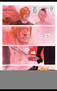
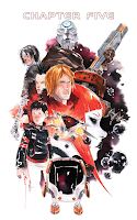
The overall tone of this volume, as the others, is a mix of very elegant whites, light blues, bright red, dark greys and purplish pink. Nguyen's style mesmerises because of his virtuoso use of watercolour and naked pencil to create futuristic images that have a very cinematic feeling. His rendering of close-ups of human faces is also wonderful. One of the things I liked the most in this volume were those pages in which three different vignettes show parallel action related to three different characters happening in the same page, very cool and cinematic.

The lettering is also great and helps bring to life and give a voice to different kind of characters, and creates a very distinctive ambient noise.


The Kindle rendering of the book is very good, with awesome quality details. The digital vignettes are glorious, with the texture of the paper quite noticeable; in a way it is like having the original vignettes in front of us, almost touchable.Double tapping individuates vignettes and allows readers to swipe between them effortlessly. However, the individuation of the vignettes is not enough at times to read the small letter and, so pinching out solves the problem. By the way, there seems to be a faulty vignette, with most of it missing, as it the image of that only vignette had not downloaded, which is very odd; a bug? 

Overall, this is the volume that got me hooked in the series.


Descender Vol. 3: Singularities by Jeff Lemire & Dusting Nguyen (2016)

, 8 Apr 2018

I wasn't sure whether to buy this volume due to the many non-enthusiastic reviews I've seen around, but I'm glad I did. I found some of the events and characters in the previous two volumes a bit unpolished, not well profiled, superficial, a bit silly, but once I read this volume, they all make sense. This is a flashback in time for each of the main characters, in separate chapters, and also a multi-time flashback for each of them, so we get to see and know from where they are coming from. To me that's was the right thing to do to give the story soul and psychological depth. Even the annoying Driller the Killer makes sense once we read the chapter devoted to it in this book.  As a stand-alone volume might not be worth buying, but if you are reading  or intend to read the whole series, this is a must.

 I am always mesmerised by Nguyen masterly drawing and water-colouring. It is a total delight to see each of his vignettes, no matter what he's painting, faces, landscapes, outaspaces, details, anything.  I resented, though, some of the imagery, which was too familiar and associable with characters I've seen in the old Star Wars and Totall Recall movies.

I love the lettering used in this series. Very creative and audible, if that can be said.

The Kindle rendering of the book is excellent, with awesome quality details. Double tapping individuate vignettes and allows us to swipe between them effortlessly; however, some of them do not automatically seize to the preferable reading size when there are vignettes with small lettering, but pitching out each vignette solves the problem.
 
Overall, very enjoyable, and I loved the story between Effie and Andy.   Also, very short and a bit pricey. 


A Wrinkle in Time. The Graphic Novel by Madeleine L'Engle & Hope Larson (2012)

, 22 Apr 2017

This is a graphic adaptation of L'Engle's classic book, originally published in 1962. It tells the story of siblings Meg & Charles who, with their recently befriended Calvin, start an unintended time-travel adventure in search of the siblings long-time missing physicist father, Dr Murray.

If you grew up with this novel, you will certainly approach this graphic adaptation and the whole reading experience very differently from how I approached it, as I read this novel as an adult and have no childhood emotional attachment to it.

The first thing I noticed about this novel, unaware of the original publication date, was that the kids and society shown in the story don't know the Internet, don't have mobile phones, tablets or super-duper  gadgets, something that millennial kids might find odd. However, this novel is wonderfully imaginative, fun, and is embedded with values and lessons of which any pre-teen or early teen will benefit: 
> It is OK to be different, you have to accept yourself the way you are right now. 
> You should not care about what other people think of you, and don't give them power over your own inner voice to dictate your self-worth. 
> Having a family that is different from the norm is OK, as long as the family unit is filled with love and the right values.   
> You have to learn to accept your part of responsibility for your own actions.
> Part of growing up involves you loving your parents but also finding a voice that's distinct and separate from them.
> Sometimes you have to trust people who are more mature than you, and need to believe that they know better.
> When you grow up, risk-taking is unavoidable. 
> You have to learn to be an individual, still being part of a community without giving too much power to your individuality or the power of the community.
> There are things in life that cannot be explained, but are real.

The novel also captures things that are very important when  growing up and approaching adulthood: the power of mateship, the value of trust, the first love, the importance of having a father and/or authority figure in your life. One of the most interesting parts of the novel is the visit to Planet Camazotz, as it teaches young readers important lessons: the difference between individuality and selfishness, the difference between a society in which the individuals are equal and have the same rights, and a society in which everybody is demanded to be and behave the same without deviation from a standard imposed over them; there is also a nice reflection on what true happiness is.
This is a science-fiction fantasy novel, so if I had read this in the 1960s, I would have been thrilled. However, this is year 2017 and it is a bit dated, to me. Science-fiction has had an amazing development and revolution since the book was written, mostly due to the proliferation of amazing original films, of our gaining knowledge about what is possible and impossible in Science, and because of the unbelievable world changes derived from the digital revolution. Modern readers have a more-scientific accurate idea of what time-travel implies, what makes possible life on other planets, and of other scientific facts that were unknown or poorly known at the time L'Engle wrote this book. Having said that, I found the concept of a five-dimensional Universe really brilliant. In the end, this is a fantasy novel, so let our imagination go wild and imagine the impossible.

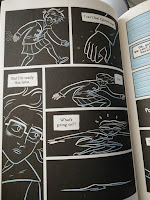
I enjoyed the graphic adaptation of the book. I cannot comment on whether this is a good adaptation or not as I haven't read the original. The graphics are rendered in black, white and sky blue, which is a pity, because I thought this would have been a wonderful book to have it full colour, as the characters' facial expressions would have benefited and be more powerful, and some of the landscapes depicted would have been awesome  in colour. However, Larson has captured the spirit of the novel, the characters' personality, and the 1960s flare. I especially loved Larson's rendering of Aunt Beast, the in-between time-travel transitions, and the depiction of events happening in the narrative past.


Overall, this is a lovely book for children approaching adulthood, as it is  both fun and wise. As an adult reader, however, I found this graphic book OK, not too exciting and a bit outdated. If your experience is different, well, good on you :).
 
A feature film based on the novel will be released in 2018.
 

Ghostopolis by Douglas TenNapel

, 31 Jul 2016

If I had to describe Ghostopolis in a few words I would say "Fun and adventure cinematic story." This is a book for young teens and adults young at heart. Ghosthopolis tells the adventures of Garth Hale after he is accidentally sent to the world of the afterlife. Frank Gallows (the agent who sent Garth there) and his ex-girlfriend ghost Claire Voyant, both former members of the Supernatural Immigration Task Force, decide to go to his rescue and  get him back to earth. Garth's strong life force attracts the attention of Ghostopolis's ruler Vaugner, who tries to capture him to get Garth's energy and use it for evil purposes. Garth happens to find her grandpa Cecil right after landing, although in a form of a child of his age who keeps growing and becoming an adult during the story.

This is  an old-style comic book, one of those I grew up reading when I was a kid: entertaining, imaginative, good graphics, full colour, battles, adventure, the heroes and the badies, fun, lots of fun!, monsters, skulls, skeletons, castles, mummies. One of those books you cannot put down until you finish reading it in a seating.The book targets children, so the narrative has the common clichés of the genre, and of course is predictable, but that doesn't rest interest or fun to the reading. 

The adventures being mostly in the afterlife, one would expect macabre and very dark images, but the contrary is true. All the creatures in the afterworld are likeable, funny, naughty  and not scary at all.  There is a bit of Christian symbolism in the book but it is very subtle, not straightforward, and not preachy at all. The creator is called Joe the builder, a Tuskegee airman, an Afro-American pilot of the WW2.
  

One of the things I love the most about the book is how cinematic it feels, and how funny is. The character of Frank Gallows is really a cracker, cheeky and likeable. Some of the names are also very funny, like Claire Voyant, or Boogie Boogie Avenue. Vaughner, the bad-man, looks very much like a punk-rock Bylly Idol, although the mouth is very much Marilyn Mason, and he is wearing skinny jeans! Some of the dialogues are also light-hearted and full of pun:
"Assemble my fastest team of night mares, a company of royal skeleton guards, and a carriage for thet wo lovebirds" [the skeleton king says when ordering to prepare his horses] (p. 183)
"Well show them that you don't have to have organs to have guts!" [the skeleton says] (p. 194)
The novel immediately reminds one of Ghostbusters, and of some of Tim Burton's early movie, in which the extraordinary and the ordinary live in dysfunctional harmony. However, to be fair, we cannot reduce the plot or the novel to a Burton-alike story because darkness seems always more natural than the normal world or normal people in Burton's Universe, and that is not the case here.  Unlike Ghostbusters, the ghosts in this novel aren't on earth to scare anybody, they are there to enjoy the peaceful surroundings as the afterlife is a bit messy.  In that regard, Man in black seems more in tune with this story, especially having a group of police officers devoted to capture intruder ghosts and bring them back to their own world. 

I don't think the book has anything really that would bother parents to give their children, even if they are agnostics, lapse Christians, Buddhists or Hindus.
 
PLOT HOLES
> If Garth is dying, why is his energy in the afterworld so humongous? After all he has just a few weeks of life left. I think the fact that he was so sick was a reason why the accident happened; otherwise, the plasma device would have not been taken him. Just saying!
> The appearance of Garth's son is senseless and breaks the rules of believality. One understands that the afterlife has not time or space. Great, but for the sake of the story, please show old Cecil.

THE GRAPHIC ART
Dough TenNapel is not only the author of the story, is also the main illustrator, drawer and penciler/inker.  He has a great talent and can do anything: beautiful rural escapes, cityscapes or action-packed crazy scenes. The arrangement of the vignettes is very dynamic and never boring, and every few pages there is a B&W silhouetted vignette inserted between the others, a kind of wink to the reader. I think that TenNapel shines when he creates simpler images, less busy visually, which are among my favourites. I loved the graphic depiction and development of some of the characters: Claire, Frank, Vaughner, the skeleton king, and all the mumies. I didn't like the depiction of Garth, his mother, and I hesitate about Joe as much .   

I found the subdued and washed out colouring very good, similar to  that in old vintage comics. Not my favourite sort of colouring, but splendid nevertheless.There is a large group of colourists who have to be praised: The lead colourists are Katherine Gardner and Tom Rhodes, helped by assistants Matt Laskodi, Aaaron Crayne, Wes Scog, Rick Randolph, Kenny Hitt, Ethan Nicolle, Eric Barnscume, Dirk Erick Schulz, Sean McGowan and David Kowalyk.

The author of the lettering is not mentioned in the credits, but the lettering is one of the best things in this book. I absolutely loved the lettering fonts, sizing and colouring, even the accurate onomatopoeyic wording of it.  The wording felt like real sounds in my head, not like other times when I read the ambience noises in a comic and I don't hear anything in my head. The lettering perfectly suits the book overall look and style, and it is in harmony with it. 


LET'S COMMON SENSE PREVAIL
This review is about the graphic novel not about the author's ideology of way of living or thinking. I'm not here to befriend this guy either. Too bad that he seems to have a name for being a very-conservative Christian and anti-gay rights person. However, this graphic novel doesn't deal with any of those things, it  is a children book. Although there is a bit of Christian symbolism (the book happens to be a story that happens in the afterlife, hello hello) the symbolism is very subtle. I would not be offended if an Hindu had created the same story and used the Hindu gods and goddesses in the book instead of Joe, so why would I be offended here? I don't think it will offend anybody who is not easily offended. As long as the author doesn't preach me anything, I am OK with that. This book has no preaching in it, so it is all fine with me. Kids won't be discussing this stuff. They will be commenting on the adventures they have just read. I got a comic book and I am reviewing *it*.  Then, if the author  makes an anti-gay comic or a white supremacist one, I would show  my fangs. 

MIND
More for mid-grade children than for proper teens, I think. I would say about 8-13y.o.a. Older children would be already reading adults stuff or complex books to feed their hunger for adulthood.

NOTE
A movie based on the novel is in development at the time of this review. TenNapel gave an interview about comic creation where he gives some details about the film. The interview is on YouTubbe (1h +).


The City of Ember: The Graphic Novel by by Dallas Middaugh, Jeanne DuPrau, Niklas Asker (2012)

, 28 Jul 2016

The city of Ember is the first episode of a series of four novels narrating the adventures of Lina & Doon. They are two teenagers who live in a mysterious and isolated city-state called Ember just assigned their profession at the end of their school days. They start to question whether the life in the city is good for them and become unhappy when the power outages and food shortage become increasingly frequent and they discover that the mayor is involved in some serious activities. After finding and deciphering a broken note with instructions on how to exit the city, they decide to escape. 

THE STORY
 The novel has the format of a traditional serial novel, with a lot of slow pace that builds up to the end, when the real action commences and a cliff-hanger is provided for you to hold on until next episode. I have never heard of read the original Jeanne DuPrau's novels or seen the movie, so I cannot comment on Dallas Middaugh's adaptation. However, I expected, a priori, a bit of chopping off for having done for the graphic book. Although I enjoyed the graphic novel, I felt that the story was a bit hurried at times, a bit too slow others, and a bit superficial others, especially with regards to the relationship between the characters.

Although I enjoyed the novel, I felt that the story was a bit hurried at times, a bit too slow others, and a bit superficial others, especially with regards to the relationship between the characters.  Also, I found some of the "next morning" text unnecessary, as the story itself and the images tell you that without the need to write it all the time.

The City of Ember, nevertheless, is a delightful science fiction story that is not just what it looks like. 

EXPLORING THE BOOK 
Many themes are touched in this novel and you can use the book to start a conversation with your children or with your students on different subjects. Some of the questions that came to mind were:
~~ Is it OK  to question authority?
~~ If affirmative, in which circumstances?
~~ In which way/s can a Government keep its citizens in the dark? Any examples in your country, region or the world nowadays you think of?
~~ Do you think of any circumstances when keeping somebody in the dark about something could/would  benefit them? 
~~  If you are kept in the dark, how do see what is real and what is not?
~~ Which government system does build a better society and makes individuals happier?
~~ Why do we fear a future of doom instead of dreaming of  a future where society is better?
~~ Can individuals help change society?
~~ Which things would surprise you in your daily life if you didn't take them for granted?
~~ How would you describe the things that surround you if you saw them for the first time ever?
~~ What is needed for any person to *see* the world for what it really is?
~~ Would society be better if instead of choosing our professions, the Government randomly assigned those needed and available?
~~ Would your life be different if instead of following a profession of your interest you were assigned another for life? Could you still develop your talent and qualities in any circumstances and profession disregarding which one is?  Could you still be useful or more useful to society?  Could you be happy?
~~ Do the plot, themes or characters in this book remind you of any others you have previous read?
~~ In which way does this novel relate to the Platonic allegory of the cave?  
~~ In which way is the escape of the womb of a city similar to leaving the parental home when you become an adult?
Niklas Asker is the illustrator of this graphic novel. I love his artwork. He has created an expressive world and a visual narrative that doesn't need of much text to be understood. I never take that for granted. The book feels very cinematic, the composition and arrangement of the vignettes and visual frames is varied and interesting, with interior, exterior and landscape scenes that are always appropriate and feel right to me. I especially love the indoors images as they feel warm and cozy, like a real home. The characters are very expressive as well.

The colouring by Niklas Asker & Bo Ashi is wonderful. The shadow work is amazing and very detailed, and helps tremendously to create ambience and mood. Ember is an underground city so one expects the images to be dark and lighted at the same time. This sort of colouring and lighting is always my cup of tea.

Chris Dickey's lettering is quite classic and, mostly, non-invasive. Dialogues are included in classic balloons, and narrative references in square marquees at the top or bottom of the page; the start of a chapter has a lovely broken piece of paper that mirrors the broken instructions sheet in the story. On the contrary, I didn't like the noise and ambience lettering, which was invasive, too bold, too large, and too much of a fracture. Although it has a narrative value and captures well what is happening in the scene, it is out of tune with the rest of the book's imagery.
  

THE NEXT GRAPHIC EPISODES, ARE THEY COMING  OUT ANY SOON?
There is nothing that I find more frustrating and irritating that  realising that a book I'm reading is just the first part of something that we don't know if is ever to be continued. DuPrau published the other three books in the series a while ago, so I wonder why making a graphic novel just out of the first book and not out of the whole series, or why not publishing the other volumes at a reasonable pace? Is this an ongoing project and other volumes will see the light (pun!) soonish? Or is this just an isolated graphic book that will never been continued? 

RENDERING FOR KINDLE
I am quite happy on how this graphic novel works on Kindle, the quality of graphics and colours in my tablet, and the fact that the size of the downloadable file is reasonable. There is no index in the lateral bar, something that I don't see why not and that could be easily fixed in the electronic edition.  


MIND
This graphic book is just an abridged version on the first book of the series.  This book is mostly for mid-grade children and young teens. If you want to read the whole series you better grab the written books.

Descender Vol. 2: Machine Moon (2016)

, 8 Jun 2016

Descender vol. 2, like the first instalment of this galactic saga, is a graphic novel with amazing visuals and an entertaining story. It is like one of those comfort-foods that you want to eat over and over again because, although it is not gourmet, original or new it tastes good, warms your belly and makes you feel good.

I'm always mesmerised by Nguyen watercolour and drawing mastery and artistry. I love his use of colour and the way he creates lights an shadows using positive/background space. I love how good he is a creating landscapes and characters that can be painted with great detail or just sketched and deconstructed but, visually, still fully there. That is the case of his long distance images and background crowd images; the more you look at them the more they look like blotches of colour, but they are masterly shaped to create the illusion of a full image. Like in Descender 1, Descender 2 has a cohesive colour palette, with colours and hues that are consistently used, some of them are there to depict the environment where the action is happening, but there is a preference for different hues of white, blue, pink and dark greys, with other bright colours popping up secondarily, like red and orange. I don't know if it is a coincidence, but a dark hue of pink is always in the image when Tim-21 experiences special moments in the story. Descender 2  story has more action than  Descender 1 so Nguyen plays more with the composition and layout of the vignettes to create dynamism and tension. Like in the previous volume, memories from the past are drawn in sepia tones with a superposition of scenes or developed scenes that have no vignettes; that is the way the mind and memory work -- as an amalgamation of images, words and feelings that are never square or structured. If you are into the Arts you will linger on each page, slowly sipping the watercolour work and Nguyen's artwork.


Once again the typography used in the book is very dynamic with different fonts being used to differentiate noise and ambience sounds, machine speech, robot speech, human speech, static signing, informative narration text and so on. This enhances the reading and makes the text more engaging and enjoyable.

As I mentioned for Descender 1, I love Lemire but I don't think Descender is his best work. Descender 2's narrative, character's depiction and dialogues  are still science-fiction déjà vu and cliches. Some characters are crowding the pages without contributing to anything and wasting a time and space that could be devoted to a more in-depth depiction and analysis of the main characters. Descender 2 is better at doing so than Descender 1, though, as there is a bit of more digging into who the characters are, albeit superficial and not deep enough to create round unique characters that don't remind you of anything you haven't seen or read before. Some of the characters that were a bit annoying, distracting and unnecessary in volume 1 are toned down and almost gone in volume 2, like Driller the Killer. However, we see others occupy that same annoying spot, like the funny-ugly predictable Blugger in volume 2.  Is he necessary to the story? Does he contribute to the story? To me, he doesn't, at least so far. The same happens with some of the dialogues, which are uninspired and a bit blah, and heard gazillion times in any other comic on planet earth. I found a bit ridiculous calling Effie the Queen in Between, jeez, I would have expected a bit of more creativity, a one word name that means just that...  


On the sunny side of things, the story seems to follow places that, a priori, we are lead to think that it would not happen. Like Andy popping up. We, or at least I, feared that Tim-21 quest would be met with disappointment, but Andy pops up in this volume and there is a great joy and intrigue. Andy is perhaps the most developed character in the story so far and I am intrigued about his motives. We get to meet some of the leading robots known as the harvesters, enter their mechanic moon, and get to know who they are, what they want and what they believe in. I enjoyed the mix of Huxley meets New Age beliefs that the leading robots have; there is a bit of gold buried there and I hope we dig it out in the next volume.  Although there aren't oneiric images in this volume, some of them are oneiric-like, especially those related to the fall into Planet Phages, and very lovely.  Finally, the story touches many interesting important themes: self-identity, individuality, race, alterity, ethical behaviour, what life is, what being human means, and what makes us connect. The more I read Descender, the more I see it as a quest for the ideal brotherly love and for connection, whatever form this might take and whomever is the being one connects with. The worlds in the Descender galaxy are multifaceted and interesting despite the flaws of the story.

The ending of this volume, although not a cliffhanger, gets me interested, and, once again, I will be buying the next volume hoping that the story follows unexpected paths, that we get some u-turns and surprises and that some characters have more depth, and being sure that Nguyen's artwork will keep me going no matter what.   


I read this book it on Comixology and the digital copy is fantastic. It makes you appreciate all the details of the artwork, and even the ruggedness and pores of the paper used for the paintings. One gets the impression of having the original in front of the eyes. I love that touchability of the images.


Descender. Vol. 1: Tin Stars by Jeff Lamire & Dustin Nguyen (2015)

, 28 Jan 2016

Descender is a galactic quest to find the child humanoid robot Tim-21, first; to decode his programming, second;  to use that coding to battle The Harvesters, a race of giant robots with the same coding as Tim, which attacked the planet where the United Galactic Council (UGC) has its see and threaten the whole confederation, third. This is also the quest of Tim-21 to find his former human brother. His quest is the only one that focuses on humanity, love and connecting, not on destruction, battling and use of any means to get what you want.

The main characters in this volume are: the uber-cool mega-cute android child Tim-21, his smiley-talker robot pet Bandit, Doctor Quon (the scruffy shave-needed father of modern cybernetics), Captain Telsa (a grumpy tight-panted carrot-headed healed well-connected young "commandress"), the rough-looking dieting-needed loyal pilot, and the good-hearted simpleton-conscious robot Driller the Killer.

Dustin Nguyen's artwork is stunning, really mesmerising regarding composition, framing, use of colour for narrative purposes, light and shadow work, watercolour and pencil technique, attention to the detail, and mood. His portraits are amazing. Besides, his images are very cinematic and stylish, and, let me tell you, some of the kido's clothing is just fabulous -- The work of the amazing painter he is. Having said this, I was a bit disappointed because some of the landscapes and the imagery of the characters reminded me of others already seen in  science-fiction movies. Nguyen talent as painter is undeniable, so I think the script might have limited him.  
   

Jeff Lemire is the author of one of my fav graphic novels but he is not drawing anything here, he is just the writer. The Universe of Descender is not especially original, with plenty of narrative elements and characters pastiched and amalgamated from well-known science-fiction TV shows and movies: Red Sand+Mass Effect, AI, Star Wars, Prometheus, I, Robot, Terminator, and Asimov's three laws. The script does not reinvent science fiction for sure, but it has cohesion, reads well and is entertaining enough. The story starts to get really interesting at the end of the first volume, when things that seemed lineal are not that lineal after all. Most of the characters, even the "good ones" are not likeable, they seem full of suppressed anger, full of secrets, untrustworthy. In that regard, they serve as a podium to enhance the character of Tim-21, who is innocent and likeable, more human than real humans in his approach to humanity. He dreams a-la-Asimov, not of electric sheep, but of electric rebellious robots inciting him to rebel against humans. I, robot. Tim dreams are painted in pink-ish tones, whatever that might mean :P


One of the things I loved in the book is the typography (funny because Descender is a word related to the world of typography), as different sort of fonts are used depending on who or what is speaking: humans, robots, computer system, inter-phone, plus the ambience and noise sounds. I thought the use of typography enhances the reading and made it clearer and more engaging.

I found two major spelling mistakes in the book. They don't make any favour to the authors, nor to the editor if there was any. Can you spot them?
> "Acadamy "instead of Academy.
> "You're father?" instead of "Your father?"
These could be easily fixed in the digital edition.


Although I greatly enjoyed the reading and will probably purchase the next volume, the book does not thrill me, probably because despite the awesome artwork and entertaining story, the book, overall, feels a bit déjà-vue. Let's hope that the main surprises pop up in the coming chapters and volume.

I read this book it on Comixology and the digital copy is fantastic.It makes you appreciate all the details that I would need a magnifying glass to see on paper.

Stunning artwork, entertaining story, at a great price.