Showing posts with label Graphic Novels. Show all posts

Julio's Day by Gilbert Hernandez (2013)

, 7 Feb 2016

Julio's Day is actually a book about Julio's (family) Life. A charming BW time travel from the coming out of nothingness of Julio Reyes in 1900 to his passing into nothingness in the year 2000. Although set in America's South, most of the characters are Mexican or from Mexican origin and culture. This is a charming trip for the reader, with so many things happening in the life of Julio's family. There is love and hatred, dark secrets, innocence, innocence lost, gay repressed sex and explicit sex, treason, murder, madness, hilarious bizarre moments, joy and sadness. The only chronological anchors are the references to the wars that spanned the 20th century, changes in clothing and some social references that are easily associated with specific decades. There is also a visual anchoring in the depiction of the town's progressive industrialisation.

I know that the author and the book have been defined as within the Magic Realism genre. To me, there is little or nothing of Magic Realism in this book. I think MR is used too often to describe works that have some oddity about them and people cannot categorise. In this book there are episodes of mental alienation, trippy, but that is it. To me, this book connects more with Latin-American family-saga telenovelas than with anything else.  Hernández does a great job at infusing this family saga with enough charm, realism, and lack of 'Manichaeism' to get the story away of extreme non-believable characters. The story feels organic, alive, as it was real.  The characters feel also real. In fact, I have known people who were like those in this book. On the other hand the characters are just schetched because there are many and the period covered isis very  long.

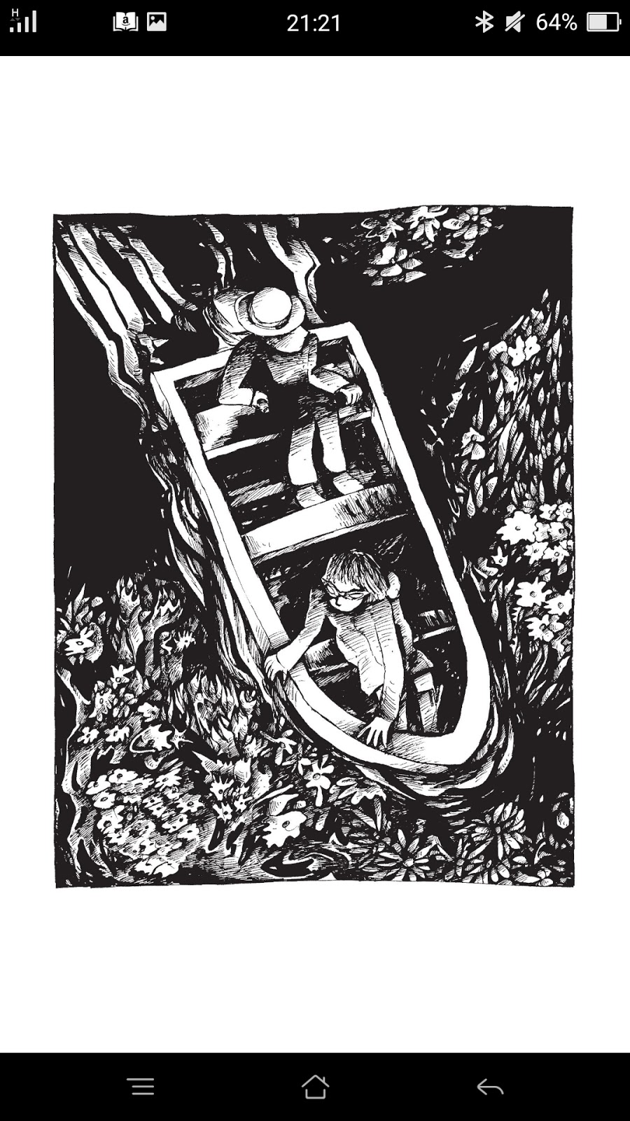
One of the main elements of Mexican culture (and Hispanic/Spanish) culture is how death is understood, perceived and faced. This is especially valid for Mexicans in the period Hernández describes. However, it connects with stories and attitudes that were common in rural areas during my childhood even though I am not Mexican. There is a familiarity with death, a presence of death and of the dead in life, because death is part of life, not in a creepy morbid horror way, you show r-e-s-p-e-c-t- to death because it is another passage rite. That awareness of death also keeps people more grounded in life and there is less fear, less avoidance. This is perfectly captured in this book. I love the presence of the hill with the tombstone crosses, and how some of the death of the characters is depicted. 

This is a male dominated story with strong female characters performing traditional roles. This is how it was in rural areas in many parts of the world decades ago, and I think Hernández captures this with veracity. In this case, Renata summarises well the role that some women played, and the sort of life that those women had in that historical context. Just one example. Renata is strong and caring, but she often says "women need of no reasons", which sounds a bit like women are irrational. In that context, though, women used to say this sort of thing because they had proof of their reasons, or inner knowing, or they just knew, but didn't want to speak about it. Araceli's character is perhaps the most interesting in the whole book. I would have  loved that Hernández developed a bit more her character; she appears as a nun-ish good samaritan, but there much more juice about her that was not explored.

I found the male characters interesting and varied enough to make the story entertaining. Julio's character seems, in comparison, a secondary one  not the main one. He is always there, a sweet gentle man, mostly in the background. This has a narrative purpose, of course. There are very few scenes in which we seem him happy, and they always revolve around a person. We see him feeling, alive, in just one scene close to the end of the book. I cried at the end, out of sadness for the character, and because I know men like him in real life: people who live life without the courage of being true to who they are, lead a pleasant empty life that does not satisfy them inside, aim to the unattainable probably because it is a fantasy that  doesn't require of them doing something to create their life experience.  Living is not just existing. In that regard, Julio's Dayim shows just that. Julio has an existence of 100 years but he really lived for one day. A microperiod of real life between two big empty holes of nothingness separated by 100 years.  I liked the quote by Samuel Becket that Evenson's chose for his brief introduction: "one day we were born, one day we shall die, the same day, the same second, is that not enough for you?". Life is like a fleeting moment is another way of putting it.   

I have a mix of feelings about Hernández's visual style. I love his shadow silhouetted landscapes, and his long distance scenes, theyare superb: beautifully composed, lyric, and with enough pathos to be another character in the story. I love some of the facial expressions in children, and some shocking scenes with the WW1-veteran neighbour. Although I enjoyed the vignettes, I found some of the pages and vignettes too crowded and the depiction of some characters too "chunky".  


This is not a book for children.

Wicked Chicken Queen by Sam Alden (2014)

, 31 Jan 2016

Wicked Chicken Queen is an example of how 25 pages of simple imagery and very mindful text can create an epic story that will resonate with many people, and keep readers in wonder afterwards. You might need to re-read the book several times to get it. And the book offers a few readings or interpretations, something I always love.

I love Alden visual style made of sinuous lines that move elegantly, in a continuum, converging, diverging and intersecting in a whimsical dance, creating a rich and colourful world and characters out of simple-not-so-simple black and white drawings. There is grace, fluidity, and freshness in Alden's Universe, as if the book was  for children. His book touches, though, on subjects that aren't childish or simple. There are also hints of humour in the book, and a sprinkle of provocation. If you take the time to look at the drawings properly, you will find delightful mini-scenes.

What will captivate you will not only be the art in this tale, but the overall story. I have read a few reviews saying that the story didn't need of text, well, I think it quite differently. I would have loved this a silent book, that is for sure, but in this case the text just takes it to the next level, and allows the reader to explore a world of treasures that are hidden right in front of their nose.

So, what is WCQ all about? Oh, figuring that out is the best part of the book! Here are  a few questions that readers can ask themselves to go through the book and 'squeeze' it a bit:
> What is the first reaction the cover has in you? Is the chicken good or bad?
> If the title was "wicked!" as in awesome, or wicked as in witchy, would the meaning of the story change?
> What changes dramatically in the depiction of the kingdom from the first image to the last one?
> What changes if any are in the relationship between the queen and her subjects?
> Re-read the last piece of text out loud several times. Then wander the space where the queen lived her final years. How do you think she felt? Why was she alone?
> What does the main human character think is missing from her life?
> Why do you think there is a shift in the story, from the story of the island to the story of one of the islander? Anything in the images that can help you answer the question?
> Which sort of Society does the book depict at the beginning and at the end?
> Which sort of vibe or feelings change from the beginning to the end?
> If the chicken queen wasn't a character but an "element", which element would it be? 
> If the chicken queen wasn't a character but a feeling, which feeling would it be?
> Do you see any phases in the relationship between the chicken and her  subjects? 


This is a little-grand modern fable for the young and the old that will leave you  in awe, in ohhhhh I would say, even though you might get the ohhhhh, as I did, minutes after I had finished the book.

This is the first book I read by Alden, and I am impressed. I came across this while perusing some lists of best graphic books of the 2015, and I truly think deserves to be there despite its 25 pages.

 Although totally different, in style and characters this story  reminds me of an Indie BW German short animated film I saw a few years ago, that impacted me profoundly, called Bärenbraut by Derek Roczen. 

Waterwise by Joel Orff (2004)

, 30 Jan 2016

Waterwise, might be presented as a surreal and apocalyptic story by the editorial house, but that is misleading.The only thing I consider a bit surreal is the cover of the book, and not even that.

Waterwise is the visual narration of the unplanned meeting of two childhood friends, Jimbo and Emily, in their native town. Jimbo is visiting after breaking up with his girlfriend in a crossroads sort of situation in her personal life. Emily is leaving town next day to start a new life and a new job. He is an artist, she is a computer analyst. They couldn't be more different, but they have a strong connection despite not having seen each other since High School. Waterwise is the story of the night these two friends spend together, remembering their childhood, and talking about the past, the present and the future, who they were and what they have become. 

There is no structured plot or ending. The ending left me gasping for closure but some answers can be found in the first pages of the book. The story is more intriguing the more you linger on it.


Waterwise is a book in black and white, with just the cover and the last vignette in colour. I like Orff's chunky drawings and cubist-ish images and the way he depicts water, underwater, and the night. Orff's interiors are enveloping and surround the characters in ways that can be overwhelming and even menacing, but they are also cosy spaces for reflection, places of shared secrets and intimacy, as if the rooms were listening. On the contrary the outdoor images, the night, the water are expansive and joyful areas, they are fluid, they are the ones that show the past and the present lived to the fullest. I love the use of water and fish as a metaphor of life, life is like water in movement, never stopping, never stagnant, always flowing towards the infinite.


Despite the absence of plot, Orff has created a story that captures emotional intimacy and what a real inter-gender friendship is, a moment lived in the present, a zen interlude.

The book has a good mood and tempo as well.

This is an alternative comic, published by the label Alternative Comics. I really liked it. I just wanted more.

Descender. Vol. 1: Tin Stars by Jeff Lamire & Dustin Nguyen (2015)

, 28 Jan 2016

Descender is a galactic quest to find the child humanoid robot Tim-21, first; to decode his programming, second;  to use that coding to battle The Harvesters, a race of giant robots with the same coding as Tim, which attacked the planet where the United Galactic Council (UGC) has its see and threaten the whole confederation, third. This is also the quest of Tim-21 to find his former human brother. His quest is the only one that focuses on humanity, love and connecting, not on destruction, battling and use of any means to get what you want.

The main characters in this volume are: the uber-cool mega-cute android child Tim-21, his smiley-talker robot pet Bandit, Doctor Quon (the scruffy shave-needed father of modern cybernetics), Captain Telsa (a grumpy tight-panted carrot-headed healed well-connected young "commandress"), the rough-looking dieting-needed loyal pilot, and the good-hearted simpleton-conscious robot Driller the Killer.

Dustin Nguyen's artwork is stunning, really mesmerising regarding composition, framing, use of colour for narrative purposes, light and shadow work, watercolour and pencil technique, attention to the detail, and mood. His portraits are amazing. Besides, his images are very cinematic and stylish, and, let me tell you, some of the kido's clothing is just fabulous -- The work of the amazing painter he is. Having said this, I was a bit disappointed because some of the landscapes and the imagery of the characters reminded me of others already seen in  science-fiction movies. Nguyen talent as painter is undeniable, so I think the script might have limited him.  
   

Jeff Lemire is the author of one of my fav graphic novels but he is not drawing anything here, he is just the writer. The Universe of Descender is not especially original, with plenty of narrative elements and characters pastiched and amalgamated from well-known science-fiction TV shows and movies: Red Sand+Mass Effect, AI, Star Wars, Prometheus, I, Robot, Terminator, and Asimov's three laws. The script does not reinvent science fiction for sure, but it has cohesion, reads well and is entertaining enough. The story starts to get really interesting at the end of the first volume, when things that seemed lineal are not that lineal after all. Most of the characters, even the "good ones" are not likeable, they seem full of suppressed anger, full of secrets, untrustworthy. In that regard, they serve as a podium to enhance the character of Tim-21, who is innocent and likeable, more human than real humans in his approach to humanity. He dreams a-la-Asimov, not of electric sheep, but of electric rebellious robots inciting him to rebel against humans. I, robot. Tim dreams are painted in pink-ish tones, whatever that might mean :P


One of the things I loved in the book is the typography (funny because Descender is a word related to the world of typography), as different sort of fonts are used depending on who or what is speaking: humans, robots, computer system, inter-phone, plus the ambience and noise sounds. I thought the use of typography enhances the reading and made it clearer and more engaging.

I found two major spelling mistakes in the book. They don't make any favour to the authors, nor to the editor if there was any. Can you spot them?
> "Acadamy "instead of Academy.
> "You're father?" instead of "Your father?"
These could be easily fixed in the digital edition.


Although I greatly enjoyed the reading and will probably purchase the next volume, the book does not thrill me, probably because despite the awesome artwork and entertaining story, the book, overall, feels a bit déjà-vue. Let's hope that the main surprises pop up in the coming chapters and volume.

I read this book it on Comixology and the digital copy is fantastic.It makes you appreciate all the details that I would need a magnifying glass to see on paper.

Stunning artwork, entertaining story, at a great price. 

Fox Bunny Funny by Andy Hartzell (2007)

, 23 Jan 2016

This is a short silent allegorical graphic novel that touches on the subject of being different, feeling different, wanting to be different and not fitting within the group that is suppose the group you belong You were born with a gender but since your childhood felt that you are the opposite gender. You were born with a specific sexual orientation that is not "straight". You were born within a religious group that you struggle to fit in. You were born within a family of high-end professionals who wanted you to be like them, but you feel that you are a different sort of person. You were born in a family of lefties but you are very conservative. The examples could multiply to the infinite. Fox Bunny Funny depicts all of them masterly. In a way, this is a modern Aesop-sort-of fable, the lack of moral preaching is actually the moral of the story.

I love the cute drawing, which goes from the merely cute children cartoon style, to the not so childish childlike gory, to the tripy and almost psychedelic images at the end of the book. I love the overall humour of the book, and the imagination displayed in the conception of the world of rabbits, the world of foxes, and the mixed world. I found very inventive the shot guns that the foxes use, the church of the rabbits, the somewhat "depraved" and "subverted" mixed world at the end. There are many graphic elements that I considered inventive and humorous, which  put a smile in my face. 


The book is silent. However, the action and the expressiveness of the characters speak loudly. Being able to speak to everybody without words is just something difficult to achieve. On the other hand, there is much more to silent books than the specific explicit message drawn by the author. Silent stories allow the individualisation of the reading, to make the story just yours, to adapt it to what you want the story to be and what what the story tells you, specifically. They are Universal, but also less of a monolith.

I found that the transition from the childhood part story to the adult part was too abrupt. I would have loved some transitional elements and I think the book needed a few more pages at the end and also in between.The book is still good without them.

This is one of those books that can be read by pre-teens under supervision, as it tackles important issues about identity and fitting in Society in a very light and easy way, and it could give way to great discussions in the classroom or at home. The book might be disturbing for very small kids unless they are showing an important identity issue already.

A great graphic book.

Andy Hartzell is  an American interactive graphic designer and cartoonist.  


Lost at Sea by Bryan Lee O'Malley (2003)

, 22 Jan 2016


This was the first graphic books by Canadian renowned cartoonist Bryan Lee O'Malley, the author of the Scott Pilgrim series, who wrote it when he was 24 years of age. 

I have many expectations about this short novel. Firstly, the ratings are over the top on Amazon and Goodreads, and, secondly, I love Scott Pilgrim. Unfortunately, this books falls a bit short, even though there are glimpses of the best O'Malley.

Drawn in a lovely black and white with doll-ish characters, Lost at Sea tells the story of the unplanned road trip, and the musings of Raleigh, a gloomy girl who finds herself in the middle of nowhere in a car with a girl and two guys she barely knows. She is the daughter of divorced parents, not very talkative, and she doesn't feel much either. She thinks that she lost her soul somewhere, and that a cat took it. In fact she sees cats everywhere, even when she sleeps. 
The book is good at capturing how some teens transition into adulthood: how they talk, how they behave, which sort of worries and angst they have, how even the smallest thing is analysed microscopically in their head in search for meaning, to find a connection with the world out there, to fit, to belong. The romantic part also shows the infatuation teens go through, where everything feels so profound and deep, but that is never the case when one looks back. Fortunately for the reader, the book has a sense of humour, which makes the bunch of narrative and character clichés a bit more palatable.


We all have seen and/or read a bunch of coming-of-age movies, books and comics. For any new story to work, it has to go where others have not, to be genuine and authentic but also original and innovative.. Unfortunately, this is not the case of Lost at Sea. In fact, I felt that the novel ended when it had started to get interesting, and the vacuous pseudo-philosophical approach was forgotten and the unknown, the world of  wonder and the unreal appeared: the constant presence of cats, the photos found in the wall of the hotel, are wonderful exploratory narrative element that are just sketched and never developed. Thanks gosh, Scott Pilgrim came out to appease our hunger for something new in the world of teen comics, and came out with a gong. One has also to understand that this is the work of a very young artist, trying to find his voice, so in that regard, reading this book one comes to appreciate how a mediocre first novel can help an artist to clear his vision to produce something as good as Scott Pilgrim. 


I think this might be a very lovely book if you are 13-16 and you haven't read much literature. If you have, well, you might find it a bit irritating.  
I read the book in an electronic edition for Comixology. The rendering is fabulous and uses Comixology versatility at its best. A truly wonderful reading experience.  

Black Eyes by Claire Connelly (2015)

This is a short but very intriguing wordless novel. I did not read the summary of what is supposed to be. I saw a few pages of the comic book and found them intriguing enough to buy it. 

I am glad that I didn't read anything because this is one of those books that has many possible readings. I 'read' the book several times and I came with two different stories that fit perfectly the imagery. It could be a criticism, but it is not. Anything that feeds my imagination in this way gets a clear wow from me.
 
The book has a glorious black and white in general, it is very minimalist and stylised, with and a clever use of the white space to create mood. The atmosphere is heavy and ominous, and there is tension in the air from the very cover of the book. All the characters are thin and edgy, not even the shining sun is friendly. Kane, the main character, is a also very intriguing character. He is a mix of modern Quixote, 18th-century Japanese farmer and folk monster. The ominous presence of the black sun, the sun-like aspect of the black eyes at times, makes both things indistinguishable at times, as if they were one and only, and even more intrigue. 

The 'official' story reminds me of the folk story around which the mystery of the Japanese manga series "Monster" revolves. You can see the animated tale in full, in English, here: The Nameless Monster.

I think Black Eyes would make a terrific short film.

Claire Connelly is a young British (?) freelance graphic artist, and this book is a self-edition. Well done. I really love it.  


The Underwater Welder by Jeff Lemire (2012)

, 17 Nov 2014

The Underwater Welder is a black and white fiction graphic novel that focus in the strange circumstances surrounding the life of 33y.o. Jack Joseph --an underwater welder who works in a rig--, and her expecting wife Susie. The accidental finding of an old forgotten childhood watch and an accident happened during a rutinary shift will bring Jack to question reality, his present and his past. 

Jack loves working and diving because down there he gets the solitude he craves, he is alienated from his mother and progressively alienated from his wife, whose most basic needs he finds difficult to tend to as the same pace that his mental confusion grows. He is obsessed with the death of his father, who died at his same age, in the night of Halloween, and sees progressively identified and mixed with his father's memory and "ghost". The isolated inhospitable rugged shores of Nova Scotia are a perfect setting for this intriguing novel.

The novel  has many of Lemire's themes and characters archetypes also present in other of his works: the role of memory in your present life, the thin line separating past and present in people's memories and emotions, lonely alienated characters who want to connect emotionally but are progressive frustrated by their lack of success at doing so, the line the separates reality from non reality.

The novel also shows again Lemire's drawing mastery and graphic versatility to convey into images stories and situations that are far from easy or straight forward to depict. Also common to Lemire are his wonderful landscape composition, and the framing and composition of his vignettes.

The novel reads easily and with gusto, and is very intriguing. However, it has a predictable ending that you can sense from half way the novel. Perhaps the tempo of the novel should have been different and some of the information provided at the beginning omitted so the reader would have had less clues to unveil the mystery. Having said so, the story is intriguing enough and odd enough to keep you interested. The characters are well sketched psychologically, especially Jack, although sometimes the reader, or at least me, wanted to know more about Susie.
  

The undersea images are great, specially having into account that they are drawn in black and white. Also great is the graphic depiction of the progressive mental alienation of Jack and his almost-oneiric and trippy living in his deserted town.
It is amazing how our brains can create all kind of ways of avoiding the truth

 A very enjoyable reading overall.

Blue Is the Warmest Color by Julie Maroh (2013)

, 26 Oct 2014

I had many expectations about this book after learning that the movie based on it had won the Palm D'Or at the Cannes Film Festival. As  usually happens, high expectations aren't always matched.

"Le bleu est une couleur chaude" (Blue is a Warm Colour, funnily translated as Blue is the Warmest Colour) is the first major work by French graphic artist Julie Maroh. The book narrates the sexual awakening of Clementine, her coming to terms with being a lesbian, and her relationship with Emma. This is a posthumus story, as the book starts from the ending with a flashback narration of the love story as told by Clementine herself in her blue diary.

The artwork is wonderful. The use of colour is just another character in the story, if that can be said, because it gives the book its melancholic mood. Sepia tones are used in the flashback, only highlighted by Clementine's blue diary and Emma's haircut.  The story told in the present is painted in a mix of pastel blues, greens and ochres. Maroh has a great eye for detail and her depiction of the city's streets, parks and skyline, as well as the beach scenes, are truly beautiful.  She uses a mix of watercolour, pencil and mixed media to create precious images. 


I found the narrative simple, realistic and believable, but also a bit over-melodramatic at times. I think the story reflects well the hurdles that gay people find when they discover they are gay, first, and when they come out of the closet, then, having to deal with their not-always-accepting friends and families. I think the book also succeeds at depicting gay people as individuals, not as bunch of people who act or think the same, or who reacts to their own sexuality in the same way. As the character says:
 "For Emma, her sexuality is something that draws her to others, a social end political thing. For me, it's the most intimate thing there is". p. 131.
I have gay friends, and all of them fall on Clem's side. On the other hand, the book is unbalanced, because most of the story focuses in Cleme's teens years, while her adult life with Emma is barely sketched. This being the case, the ending feels hurried as we don't know why Clementine is feeling alienated from Emma, what is going on in her head for her to be deluded and act the way she acts.  

The book has explicit sex scenes.

Queen's Day by Leela Corman (1999, Reedition 214)

Queen's Day was released in 1999, published after being listed in the September selection of the Xeric Foundation's comic awards. I have read it in Kindle format, as it has been released in electronic format this year by Alternative Comics.

This is more a booklet than a book, with just 69 pages. It contains three separate unconnected stories, some of Corman's early works, and as such they have to be appreciated. 

The stories are  drawn in a glorious black and white, with a predominance of a bright black and greys over white. The style is very expressionist (the cover really doesn't reflect the style of the comic), with angular characters. The texts are reduced to a minimum.

In "The Baba Yaga". An old Russian "witch" rescues a little girl that has fallen asleep in a freezing cold river. In "The Myth of Never Being Sick a Day in Your Life", a young lady visits her grandma and the mountain area where her brother lost her life. In  "Koninginnendag", a girl living in Holland is cheered up by a friend.

Despite the sobriety and brevity of the whole, the stories are engaging. There is something non-explicit that gives them a melancholic mysterious tone and blends them together, especially the first two. The elements that I personally see commonly reflected in all them are:
> gloominess.
> The forest, the mountain, and the power of Nature.
>  Ascension.
>  Support and care.

If you love rare non-mainstream comics, this is one of those. 

Clumsy by Jeffrey Brown (2003)

, 21 Oct 2014

This is the first book by Brown I read, and the first book in the "Girlfriends Trilogy". 

Clumsy is a glimpsed window to Brown's personal love life and her long-distance relationship with Theresa.  A memoir structured in short episodes of his daily life that tell us about meeting, dating and falling in love with Theresa, but also the day to day elements that make a relationship grow despite how mundane: from hugging, to farting, sex tons of sex, condoms, insecurities, discussions, moments of indescribable happiness and others of tension. Life as you live it when you relate to somebody. A depiction of intimacy in its beauty and rawness.

Brown is good at telling a story with honesty and in a way that appeals to the reader disregarding the gender. Being a woman, I especially appreciate how Brown tells his love story, so very different from any woman's way of telling it and living it. I am sure that if Theresa had written or drawn her version, the tone of the story, the elements and moments selected would have been very different. The book, for obvious reasons, is appealing to men, especially those who, like Brown, are a bit clumsy, weird, sensitive and a bit needy, the post-modern male if you want.

However, what makes the book appealing is not only the approach to the memoir genre, and the way the story is built by decomposing it in micro-pieces, but also the fact that Brown puts his heart in there.  The result is a very charming naughty and tender love story.

Visually speaking, the book is drawn in a "rudimentary" sort of style. Like a comic strip in a newspaper. The pages are filled with six vignettes, drawn in a clear black and white, with lots of white space, very clean and clear, with little elements of distraction. Despite the simplicity and the lack of shadow work, the images are very well composed and framed, and Brown does a terrific job at creating complex expressive intimate images with very few strokes. I especially love his use of horizontal and vertical lines to create perspective and depth in images that, otherwise, would be flat. I love the way he draws nudity, the way he depicts body hair, and the facial expression of the characters.  All very cute.


I like the economy of Brown's text. Very effective, and right to the point. They perfectly complement his drawing style and his graphic narrative.

The book is for adults, adult themes, sex, nudity and all the goodies that we want to find in comic and graphic goods. If you don't, well, back off.

I have to confess, that this book's cover is one of the most boring ugliest cover I have ever seen on any book. A major sin and put down, taking into account that the author is a graphic artist! Hellooooo. 

Pride of Baghdad by Brian K. Vaughan & Niko Henrichon (2008)

, 10 Oct 2014

Pride of Baghdad is a beautiful allegory of the events happened in Iraq after the fall of the Hassam Hussein's Regime. It is based on a true event occurred in April 2003: the accidental release of a big group of wild animals from the Baghdad Zoo after a bomb destroyed part of the premises. The book focuses on the wanderings of a group of four lions, two female (Safa and Noor), a male (Zill) and a cub (Ali) throughout the city after their escape.

The story exemplifies the questions that the world was making after the international intervention and occupation of Iraq, and the problems that the liberation and freeing of the Iraqies meant, de facto, for the Iraqies. The book uses the characters and the script to question the real meaning of freedom and living in peace. The book succeeds at presenting, in very simple but very effective terms, dual concepts for further thinking: civilised vs uncivilised, freedom vs oppression, instinct vs reason, wild vs tamed nature.

I would have liked Vaughan giving a step forward and creating something more profound and universal, which is impossible because the story is set in Iraq. For an allegory to be successful, the less time-place references, the better. That is why "Animal Farm" by Orwell is still a classic, understood and meaningful to people all over the world, decades after it was written. While Reading Pride of Baghdad, I thought that the book was very good, but it could have been brilliant, but it never got there because the dialogues and part of the story needed of further developing.


"There were other casualties as well". I loved that!


I absolutely love the artwork. Without Niko Henrichon's vision the book would had been way less effective and enjoyable. Henrichon's drawing technique, composition, colouring and use of lights and shadows are masterful; he is able to create stunning crispy-clear expressive images without crowding the page with too many vignettes, just the right amount. The book has an overall warm golden-orange tone that I absolutely love, with the sporadic presence of luscious bright green natural elements and dark-blue/green interiors and night scenes. One of the things I love more about Henrichon's drawing in this book is the use of sun shadows, I mean light shadows that are not dark, something he does with a wow easiness. The book is visually impacting because of the darkness of the story is rendered in bright yummy colours and aesthetically pleasing images. I always love that.

I thought the rendition for Kindle was pretty good!


A must have for lovers of graphic books lovers. Not for small kids. I think it is great for mid teenagers under supervision.